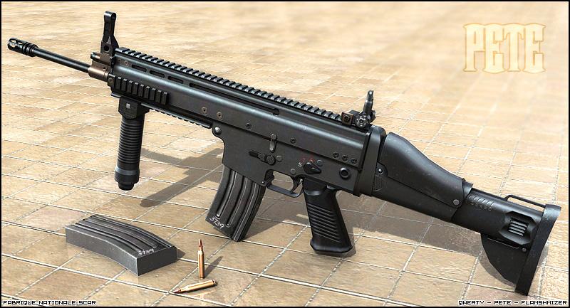
[page=Texturing the SCAR-L Rifle]

Pete: Before I start i'd like to note that the way I texture isn't the only way to do it - as different people have different approaches, varying tastes and so on they'll do things differently. You get the point ;]
Okay, time to start this.
Preparation
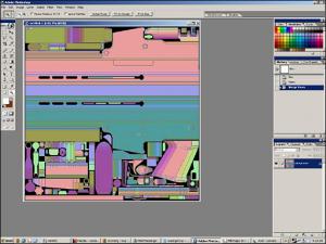
Below is the plain uvmap, which is on a layer by itself (Adobe Photoshop). This map's on a 1024x1024 map, while the mag, vertigrip, and stock are on seperate smaller maps, but we won't bother with them for this. :]
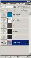
Firstly I load up the base textures i'll need for this; metal and polymer, and paste them in. Just a note here, my bases are desaturated, ie they have no colour in them. For me, this makes it a lot easier to keep the colour in control - otherwise working with the base later on would screw with any colour that might be already in there. Speaking of colour, the way I add mine is with 3 different layers.
-'ambient colour': goes right at the top. it's a medium, light-ish blue. the blending mode's 'color', set to an opacity of around 3%.
-'reflected colour': as you know, materials reflect their surroundings. what i'll be doing is making the weapon appear to be reflecting blue for parts facing the sky, and brown for those facing the ground. this layer's set to "color" at 5%, when used above metal. With polymer, which doesn't reflect as much, it's better to use another layer with the same settings, just at ~3%.
-'oil/discolouration': part of making a weapon look used and therefore a bit more believeable is making it look a little bit dirty. For this it's set to "color" at 11%, though i think if you're going for an dull, old look then i'd go for "overlay" at around 20% (depends on brightness of stuff beneath).
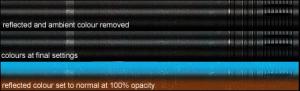
There'd be dirt too, but that comes later. Colour's great for adding some depth and contrast to textures, but as with all things.. too much and it looks bad. In this picture you should be able to see the subtle difference between no colour and some slight colour. The third part shows how it's painted in the layer when not set to the final settings.
Lighting/details
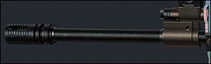
Now to get started. The way I started this was by doing the pistol grip (it looked like fun). I find starting with parts you like is good to keep motivated. After that I started on the barrel (i like starting with the front and moving towards the back, it's easier to see how much you've got left). For small or basic objects such as these I use the dodge and burn tools to do the lighting (dodge set to 'highlights', burn set to 'midtones').
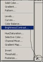
When the lighting was applied, the barrel seemed too bright, so I applied a brightness/contrast adjustment layer and lowered the brightness by about -20 (see below). Adjustment layers are really useful, you can make changes to the layers below without physically changing them.
Doing the details on the barrel was simple, there's some little cuts on the flash hider, and a little bronzeish part halfway along. Anyone could do the little cut bits so i'll tell you how I did the bronze parts. Simply enough, I just selected the area that needed the colour and applied a hue/saturation adjustment layer, and played with the settings until it looked okay. For consistency I used this same layer for all the bronze-coloured parts around the skin (parts of the front sight area, some of the screws, etc).
Then I did the reflected colour (as shown above when i explained colour).
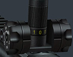
As for details elsewhere, it's always good to get as many references as you can (preferably large, with good quality). Add every detail, trademark and serial number you can find, it's good for keeping the texture from looking plain and boring.
Back to the lighting.
For the plastic parts, I find that to get a smooth glossy look that you get with hard plastic:
-start with relatively low contrast on the plastic base
-make a new layer, set to normal, paint the 'shine' onto the object and lower the opacity to anything around 15-30% depending on preference.
-then do the rest as you would. I find this method's also quite good for when you're unsure about the placement of the 'shine', as you can move the layer around and tweak the placement until it's right.
Here's how it looks:
If you're going for a softer more grainy plastic then do the same, but with half the opacity and with some dodges set to highlight as well.
When doing metal, I always use dodge set to highlights, or the above method for plastic but with the layer mode as overlay, which gives a more metallic shine and brings out the texture a little as you get with light shining on metal.
Finishing Touches
As said earlier, dirt's good to use as it makes it feel a bit more real, as well as adding contrast and making your texture a bit more interesting. The way I do it is with 2 layers, dirt and scratches, using dirt/'grunge' brushes.
For the dirt layer, I used dirt brushes set to black, with a layer mode of 'soft light'. This makes the dirt a bit more visible in light parts of the skin and a bit less visible in dark parts, which seems more natural. Because I was going for a clean look, I used quite a low opacity, so the dirt's hardly visible but contributes slightly to the look of the weapon, it's not about making things glaringly obvious. :]
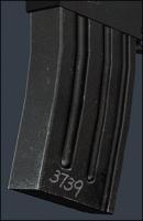
For the scratch layer, there's two parts to it. I started with selecting white and setting the layer mode to 'overlay'. For what we're doing, this is like 'soft light', but more pronounced, which in my opinion works well for scratches and worn parts. Ok, so first, the scratches themselves. Using the paintbrush tool set at 1px and a low opacity (around 20-40% works ok for me), paint some scratches on, mainly on the edges where it could come into contact with stuff. Then get some (smallish) dirt brushes and similarly, paint them mainly around the edges. The magazine's the most scratched part of this texture, so here's how my scratching efforts ended up.
After some more work, one last check of the references, and some ingame testing, it's done :]
Hopefully you might've learnt something from this texturing tutorial, and enjoyed reading it as much as i did writing it (ouch, cliche). Thanks for reading!

Written by Pete & originally hosted by Game-Artist.Net ( Game-artist.net ), the community to grow as artist. Monthly contests, many tutorials and interviews with industry experts.
Very good attention to detail, man! Comprehensive and compact tutorial.
Thank you and how about making a tutorial about your style of unwrapping, next?
Would be cool to see all the steps in making this gun, as your work shows a very high quality.
Great!
SinKing
Very pro tutorial, I'm hoping to get into Skinning so this should help out :)
wow that was rather in depth but still very complicated i'll try to understand it later...
Either that was very lacking in detail or im missing something, which means that isnt an intermediate guide but an expert guide. From what I can see you are talking about UV mapping lighting into your model, in which case I suggest changing the title to reflect that. If you are talking about UV mapping the who thing you have missed alot of stages, unless ofc you assume the user knows how to do this.
Otherwise its a very good guide and should help me out.