[page=Lighting]
This text is part of my book"The Hows and Whys of Level Design". This example extract only contains around 65% of the full chapter! Some things were cut out.
My book covers both the visual and artistic side as well as the gameplay aspect of level design. Don’t expect any technical how-to tutorials in the book, this book is about the "why". Rather than writing yet another tutorial/book about how to create a virtual room this book is about how to make that room look cool and play well. Expect tips and techniques as well as explanations of the logic and reasoning behind art and design decisions. How does the gameplay in a level work? What’s the reason this kind of architecture gives this kind of feeling or looks better in situation A or B? Why does this color combination work so well? What kind of floorplan can I best use to improve gameplay and why? What type of sound setup should I use?
More information about my level design book can be found on Book.Hourences.com
Lighting
The theory behind lighting out your levels. How to create an interesting setup and what to watch out for.
Introduction
Lighting is one of the most important and influential elements in environments. It has the power to make or break the visuals, theme and atmosphere.
Lighting is often forgotten or underestimated. Designers often add it quickly and without much love. While in the past that was partially excusable by the weak hardware and game engines, these excuses just won't hold up anymore. Lighting is just as important as geometry. Without lighting there is no environment but just a group of 3 dimensional objects. Lighting has the capacity to bring life to a group of objects and take them to the next level of quality. Its purpose goes further than just giving the players the ability to see where they are going.
It creates atmosphere. It makes places look scary/cozy or warm/cold. It augments the three dimensional feel of objects and it creates composition and balance to lead the player's eyes around. Yet considering all of that there is a very large group of games and levels out there which use nothing more than white ambient lighting everywhere.
The source
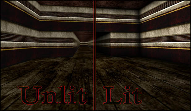
The most basic rule of lighting is that it always needs a lightsource. Even more important, and this is the second rule; the light should appear to be cast by a source. It is impossible to have lighting in an area with no source, like in this bad example.
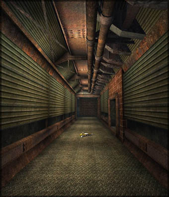 |
| Info P083: UT2004 level DM Rankin – Personal work – Owned by Epic Games – Modified version to fit the example |
While there is plenty of lighting in this corridor it's impossible to tell where the light is coming from. This completely breaks the illusion and looks fake.
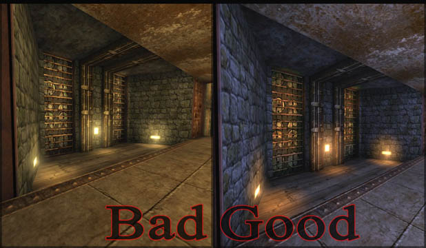
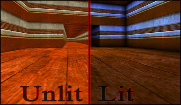
Also to be avoided is lighting that is out of balance with the size of the source. For example, a small light source that somehow manages to illuminate an entire room or corridor, like in this bad example.
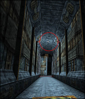 |
| Info P084: UT level CTF Ortican – Personal work – Owned by myself and textures by Epic Games – Modified version to fit the example |
Keep things in proportion!
Light sources can be anything: small or large lamps hanging on walls or from ceilings, the moon or the sun, crystals, lasers and other type of high tech beams, fire, mirrors, magical effects, water surfaces that bounce back light, lava or radioactive slime and so on. Everything is possible as long as there is a noticeable source.
The same goes for the brightness of the source itself. If the lighting is very bright the source itself should not be dim. It should be just as bright and, if possible, have effects like a glow to enhance the brightness.
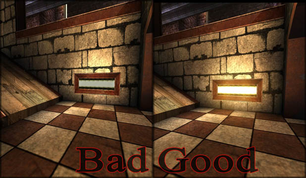 |
| Info P085: UT level DM Sion – Personal work – Owned by myself – Modified version to fit the example |
The left example is bad because the lamp appears to be disabled even while the environment does seem to receive lighting of it. The brightness of the light source and the brightness of the lighting in an area must be balanced and appear equal.
Related to this is the next important aspect. Show the player where exactly the light is coming from. The area near a source should look the brightest. A logical thought.
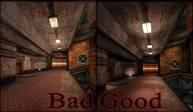 |
| Info P086: UT level CTF Raid – Personal work – Owned by myself – Modified version to fit the example |
The first example is bad, the second one is good. The first one is bad because the entire area has an equal brightness which is strange. It doesn't feel as if the lighting is really coming from the lamp. The lighting should be considerably brighter near the source than ten meters further away in a corner. It should fade out as it travels further and further away from the source. It should show variation and that's not only more realistic but it also helps the lighting composition. Show a direct influence from one element on the other!
Colors
The most complex rule of lighting is that colored lighting is a must and absolute requirement in almost every situation. Colors can make or break a composition; they shape the atmosphere and emotions associated with an area and they simply make environments more interesting and ively to look at.
Most light sources in the world cast lighting that, in one way or another, have color. Therefore it is not very realistic to place white lighting in the environment. For example, a lamp might cast yellow light because it is surrounded by yellow glass. Or perhaps it is an old lamp and the glass is beginning to change color due to the wet environment it is in. Or perhaps the light is shining on a yellow wall thus causing the light rays to bounce off and carry the yellow color to another surface which results in the seemingly yellow lighting.
That bouncing is the radiosity effect and as up to now there still aren’t any games which can offer correct and complex radiosity lighting.
Therefore, until there is such technology available, one must color the lights oneself instead of relying on how the atmosphere or materials might enhance the lighting. They won't because of the limited technology. If color isn't added, the result will be very bland and fake.
Another aspect of lighting is the light temperature. There is a theory that says light is energy and the stronger the light the more energy it has and thus the warmer it is. The temperature influences the strength.
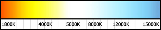
Info P091a: lighting temperatures – Owned by myself
1600K is sunset and sunrise and 1800K is a candle. 2800K is a regular light, 5000K is midday sun and so on. Thus the chance that the light in the game environment would cast pure white lighting is rather small.
Also notice that red is actually colder than blue. Arc welding or lightning are blue because they are much hotter and stronger compared to a pretty weak, regular, orange fire.
A warm blue and a cold red contradict what you will read in a few pages about the warmth of a color. Remember that blue is only warmer than red in a scientific perspective. Emotionally, on the other hand, red probably feels warmer than blue. Common color associations are at the base of that feeling. When something is hot it will glow red while cold things like water and ice are blue. They influence our perspective toward colors. These are very powerful clichés.
Another reason to use colors is the composition. In fact one color is not enough most of the time; at least two colors are needed or else creating contrast will be impossible. If only one lighting color is used, that very important color contrast is lost and the result would again be very bland.
Info P091: UT level DM Sion – Personal work – Owned by myself – Modified version to fit the example
Change is also necessary in order to form a composition and one color can not offer the necessary changes.
The colors used need to be balanced. They need to strike the right balance between providing enough contrast yet still complement each other. Harmony is the word to remember well when dealing with lighting.
Before being able to work with lighting colors one must understand how colors work. There is a huge difference between the regular colors used to create textures and the colors used to light an area with. Lighting is made of RGB, which stands for Red, Green and Blue. CRT monitors and TV's use this system as well.
On the other hand paintings, pencils, prints and so on are CMY. They operate on three totally different primary base colors: Cyan, Magenta and Yellow. Or, in very simplified terms, blue, red, and yellow; the primary colors - which are often learned about when one is very young.
The real difference between the two systems lies in how they create colors; or how they mix. CMY colors will end up as a brown black mess when mixed together. Think about what happened to all the colors when someone mixed all the paint together back in grade school.
RGB on the other hand will end up as white when mixed. Shine multiple colored lights at one spot and they will end up creating a white spot.
The important difference for us is that certain color combinations which work great in a painting will never work out in lighting! And the other way around. It is impossible to use a color combination that works in CMY for lighting because of two reasons.
First off, any color viewed is a mix of the three primary colors. RGB mixes differently so the colors it creates simply will look different than those created by CMY. This is especially a problem when one color accidentally mixes with another in spots, something that is bound to happen when working with lighting. Mixing blue and red in CMY might look nice in paint but when red and blue are used in lighting they will create purple spots. Certain variations and mixes of colors are not the same in both types.
Secondly, lighting RGB (notice the word lighting in front of it as what's about to be explained is only true for lighting) simply doesn't have all the colors CMY has. Converting color combinations is therefore not always possible. RGB does not have dark yellow, dark red and so on. It can't create dark colors because lighting cannot be dark - it is always light. It can however be more or less saturated or intense but not dark. Black light doesn't exist. And thus neither does gray or brown light exist.
One could say that lighting uses simpler colors and has more limitations. There are fewer colors and less subtle changes to use because of the lack of dark colors. Lighting is constrained to a relatively small set of colors that can be used.
What makes this even more difficult is that half of those available colors almost never work out well in most themes and subtle changes in hue or saturation are barely noticeable. Colors like purple or pink are almost impossible to use in most themes and styles because they simply do not fit in nor look natural. Using them will most likely result in some weird and unrealistic disco style rather than anything else. The palette of colors to use is very small and mainly consists of yellow, orange, blue, cyan, red and a tiny bit of green.
Never use painter logic and rely on mixing brighter lights with darker lights to create changes in your environment. Dark colors do not exist! One can only see a difference when a light's color or saturation radically changes so subtle changes won't be noticeable. Here's why: Light is always a gradient. It always creates a lighter area and a darker area. Lighting simply starts somewhere and then fades out as it travels further away from its source. If one attempts to create contrast by using darker and brighter lights of the same color then the result wouldn't show a contrast at all but would look weird because some lights would appear too weak to be possible.
Now that the theory of color has been explained, it is time to apply this knowledge to light application in a level. The idea behind colors is to allow them to add to the theme and atmosphere and to let them create a composition to aid the eyes and to keep things interesting.
Colors continued: composition and choices
Colors offer various types of contrasts and feelings. It is essential to understand them and use them correctly in order to create interesting and fitting lighting for the level.
One should almost always use more than one light color in the level. As mentioned before, the key to create an interesting look and composition is to create well balanced contrasts. Too little or too much contrast is bad.
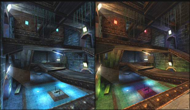
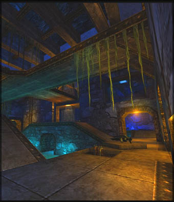
Info P092: UT level DM Sion – Personal work – Owned by myself – Modified version to fit the example
Neither looks good. The first picture is very repetitive and thus boring because everything has the same lighting color. The second picture has so many different lighting colors that there's no harmony and it looks completely random. This is undesirable.
Avoid weak compositions or very harsh ones. When transformed into the flow charts, previously seen in the composition chapter, the above two pictures show clear problems.
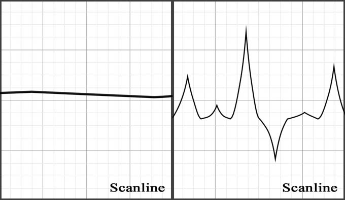
Info P093a and P093b: Scanlines
The line either has very little change or the change is so hard and sudden that the eyes hit several steep walls when they follow the line.
The line should show changes that are quite noticeable yet flow enough to not hurt the eyes.
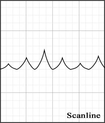
Info P094: Scanline
It is for this reason that the right combinations and placement of the lighting colors are needed. I personally always use two main light colors such as blue and yellow and then a third color, like orange, to give extra contrast and difference to a few special elements.
The third color is to prevent the two main colors from becoming repetitive. Too much of the same combination can also become boring. The third color's purpose is to occasionally break up that combination.
I refrain from using four colors because too many colors can make things look random. It should never look like a mess; unity is the goal.
Composition-wise, lighting colors should follow the same rules as highlights. Their composition must be evenly spread out so there are no large spots of the same color which could unbalance the visuals in that area! If the entire right side of a room only has blue lights and the left side has blue and yellow lights it might appear unbalanced. This also depends on the composition of other elements such as the architecture and any moving geometry though.
Now one may wonder what colors to use and combine. Combining colors in lighting is about more than just finding a random combination that looks cool. There are systems and arguments that help create the right combination. The lighting colors should not only enhance the visuals and the composition but they should also enhance the theme and atmosphere. The choice of what colors to use depends, for a large part, on the theme and desired atmosphere. A scary theme requires cold colors for example.
There are different types of color combinations and each one of them offers another type of contrast.
First of all there are cold and warm colors. Some colors feel cold, such as blue, while others feel warm, like orange. Cold colors are blue, green and purple. Warm colors are yellow, red and orange. It is logical that combining a warm and a cold color can give nice results.
Another type is the strong and easy color combination. Some colors are very aggressive and powerful while others are very easy and relaxed. Strong colors grab a lot of attention even if they are used in small amounts. Red is the best example of this. It is such a powerful color that even a small spot in an environment can be dominating.
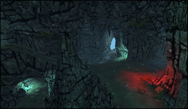
Info P095: TCOS Carnyx – Personal work – Owned by Spellborn NV – Modified version to fit the example
In this picture the one thing that stands out the most is the red light. Red is incredibly aggressive and thus should be used with caution since it can make the player forget everything else in the scene. That might not be the desired effect.
Other aggressive colors are orange and then yellow. Easy colors are the colors that invoke comfort and calm. They rest the eyes. Easy colors are blue, green, and purple.
The last type of color combination is the light and dark one. Is the color closer to white or closer to black? The simplest way of checking if a color is light or dark is to think what would happen if it was converted to grayscale. Think of what a copy machine would do to it. Red is a dark color. It becomes almost black when converted to grayscale. The same is true for blue and purple. On the other hand green, and especially yellow, are bright colors.
Choosing the right color is not just a random choice. The better the choice the better the contrast will be and therefore the better it will look. Two cold colors should not be chosen as the main light colors, for example. One is better off combining different types of colors together like a warm orange with a cold blue.
The best combination of colors to use in lighting is yellow with blue and all the variations on it (for example orange-blue and yellow-turquoise).
Yellow is a bright, aggressive, and warm color while blue is a dark, easy, and cold color. It is the only combination that manages to use the opposites of all three types, which is also the reason why it is used in so many games. The yellow also is subtle enough to not draw all the attention to itself like red would. And next to all that it is also the most natural combination. More on that later.
To complicate things more, there is one element which can make the effects of each of these different types stronger of weaker and that is saturation. White is a special color that feels neither cold nor warm, aggressive or easy. Apart from being a bright color, it is very neutral so lowering the saturation of a color can neutralize the effects a little and that can be useful. In order to achieve a balanced look it's necessary to find the right saturation for the colors. If all the colors are one hundred percent saturated the result would probably be a very harsh look with very strong colors.
Info P096: UT level DM Sion – Personal work – Owned by myself and textures by Epic Games – Modified version to fit the example
While creating contrast, unity should not be forgotten. In the example above the contrast is way too harsh resulting in an ugly, unbalanced, and unrealistic situation. It is the balance between the two that forms the key to success. I usually pick colors that are only fifty percent saturated but whatever works for the particular situation is good.
Slightly desaturating your main colors is, in most cases, the way to go although there are always exceptions. For example, colors like red will turn pink when desaturated. There are also a couple of light sources that always need very saturated light; fire for example.
The amount of saturation something has can greatly alter its look or feel. A very white blue feels colder than a very saturated blue. This is important when one is after a cold feel.
And that brings us to another very important point: theme. As mentioned before colors are not randomly chosen. 'Because it looks nice' should never be the sole argument about why color X is being used. The color combination should not only fit together but it should also enhance the theme and atmosphere. For example, if the theme is an ice environment, then lots of warm colors, like orange, shouldn't be used.
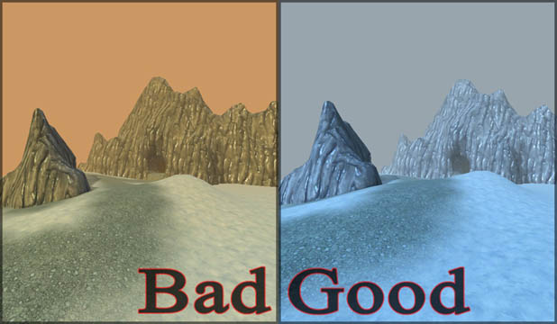
Info P097: Example – Personal work – Owned by Spellborn NV
The first example is bad, the second one is good as it feels colder. A cold environment needs cold colors; blue for example.
People associate colors with feelings. The whiter the color is the cleaner or colder the area will appear while darkness is experienced as scary or depressing. When I design a new level I always ask myself the question 'What color do people associate with the theme I have in mind?' If I design a lava environment it's very clear I will need a lot of red and orange lighting.
After I have my first main color I always try to find the second main color. The second main color has to create a contrast yet look nice in combination with the first color. When my theme involves lots of water or a sea my first main color will be blue and my second color yellow. A dawn environment asks for yellow or perhaps even a deep orange as the first main color and blue as the second main color. Humid environments
feel better with some green and so on.
As mentioned in other chapters it is about clichés. People need to quickly recognize something and they can do that through clichés.
Sunlight is perhaps the best example of how radiosity and contrasting colors work and how the atmosphere affects the color. Unless it is noon, direct sunlight is always slightly colored. Think of what color the sun has in the evening or at dawn. It will appear as orange or yellow most of the times. Indirect sunlight has a color as well. It is usually a blue/slightly purple color.
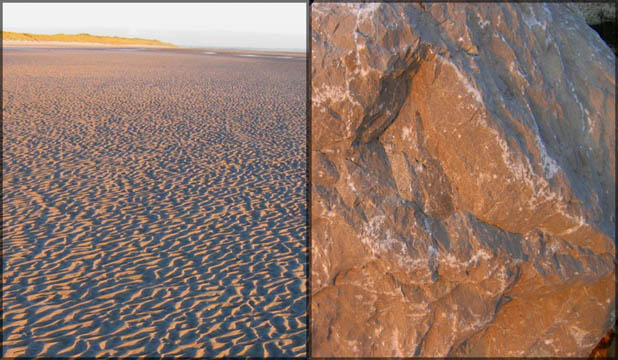
Info P098: Examples – Personal work – Owned by myself
In these evening beach photos the color of the sun and ambient lighting is readily apparent. The direct sunlight is orange while the ambient light is blue. White lighting is, in almost all situations, unrealistic; just as coloring an entire outdoor area with the same color is. In most situations there should always be two colors around. One for the direct sunlight, which is likely a type of yellow, and one for the indirect sunlight, which is usually a type of blue. Not only is this realistic but it will also look much better.
Texturing and lighting
Texturing can make or break your lighting. Textures are the base for the lighting. The texturing of the world carries a large responsibility. While I already explained this theory in the texture chapter I would like to give a few common mistakes extra focus.
If a texture is too dark it cannot be lit well. The same goes for overly bright or white textures. They will look very bright when lit.
Info P099: Examples – Personal work – Owned by myself
A solution could be to up or downscale the intensity of the lights but that is not the best way to go. In the end the fault lies in the texturing and not in the lighting so it is the texturing that has to be fixed. Fix the cause, not the result.
Changing the light intensity will also cause trouble if the level uses a combination of dark and bright textures (a snow level with dark buildings for example). Downscaling the light intensity would make the darker textures appear even darker and if one were to upscale it the bright textures would look way too bright. Therefore the textures used in an environment should be balanced and have roughly the same level of brightness!
The same is true for colors in textures. The colors used in textures can influence the look and feel of the lighting and they will. It is essential to foresee which lighting colors to use while texturing the level. If the textures in an area are, for example, very orange and yellow it might end up weird when they are later lit with blue lighting.
Info P100: Examples – Personal work – Owned by myself
If the design is to light the environment with many blue lights for whatever reason, then, during texturing, it should be ensured that the textures are desaturated enough or have roughly the same color as most of the lighting.
The point is that the texture choice can heavily influence the lighting. Textures and materials are the base for lighting, and if the texturing isn't in harmony with the lighting, then one of the two is going to suffer. All elements in a world are connected and influence each other.
This is one of the best mapping tuts IMO.
Hey man, awesome tutorial. Lighting techniques tend to be lost with most begginner mappers and color theory is rarely applied. Good stuff. :)
cause it was made by a proffesional mapper, and it was a part of his book?
it made me think about buying it.
What book is it and where can i get it?
Amazing read! Good job, It's a fantastic help to me, atmosphere is all about lighting!
Great guide. Will prove handy thanks.
This comment is currently awaiting admin approval, join now to view.
Hi Hourences,
I want to translate this article into Chinese, can I have your permission please?
Noah
This comment is currently awaiting admin approval, join now to view.