[page=The Tutorial]
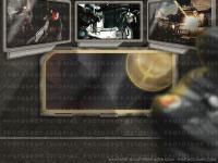
PlanetQuake.com has held a contest for visitors to design a PlanetQuake/Quake 4 themed wallpaper. Here is my submission and how I did it.
1. The stairfield was done by going to FILTER / NOISE / ADD NOISE, with the foreground color as black, and the background color as white. By dragging the noise slider up, you get more "stars". Then, to make the starfield more varied in it's intensity, I went to IMAGE / ADJUST / LEVELS, and dragged the 3 triangles around until I had a starfield I was satisfied with.
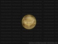
2. I am recalling as best I can how I did the planet, as I didn't get the idea to write out the steps to this wallpaper until after I'd gotten the planet done. I basically made a new layer, made a circle, filled it with a desaturated, medium-light brown. I then gave it an inner-shadow (LAYER / LAYER STYLE / INNER SHADOW) so that the circle looked more like a sphere. I then created a new, blank layer beneath the sphere layer, and merged the 2 - so that the inner-shadow became one with the image, and I wouldn't have to worry about it later.
Now unfortunately the following is quite vague, as I don't remember the exact steps in bringing the planet to a more planet- like state. It really was just experimentation, which is probably 75% of my Photoshop work in anything I do. I just created a couple new layers, keeping the same circle shape, and coming up with textures that I blurred (FILTER / BLUR / GAUSSIAN BLUR).
By CTRL + CLICK'ing that layer, I am able to select just the shape(s) on that layer, thus I had a perfect circle selection. Then I would do a spherize filter (FILTER / DISTORT / SPHERIZE) on the final planet texture, to give it some depth as a planet. I then made another layer and experimented again until I was pleased with the planet's look. Lastly, I created a layer beneath the planet, CTRL + CLICK'ed the planet layer, expanded the selection by 5 or so pixels (SELECT / MODIFY / EXPAND), filled it with an orange-yellow color. Then I deselected the layer and gaussian blurred it, to give the planet an atmospheric glow.
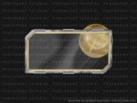
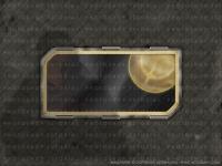
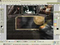
3. For the window frame, I did the frame outline with the polygonal lasso tool, and smoothed the selection's edges (SELECT / MODIFY / SMOOTH) and then filled with a medium gray. Then, I CTRL + CLICK'ed the frame layer, contracted the selection by 30, smoothed the selection by 10, and hit delete, leaving the basic frame outline to work with. To get the metallic look, I used the DODGE and BURN tools rather randomly all over the frame with subtle darkening/highlighting, added a bit of monochrome noise, CTRL + CLICK'ed the layer and did a "blur more" (FILTER / BLUR / BLUR MORE). More dodging and burning to give the metal it's scratches and worn look, using small airbrush sizes, and varied dirty brushes. Alternatively, you can CTRL + CLICK the frame layer, make a new layer, and do a black/white cloud render (FILTER / RENDER / CLOUDS), and blend that in with the frame layer. I did this in addition anyway, and then darkened the frame. To give the frame a beveled appearance, I did a white fill on a new layer, within the shape of the frame, and filled the inside of this with white. I then CTRL + CLICK'ed that layer, contracted by 12 and hit delete. I was left with the same frame-shape, in white, only half the thickness. I then dropped this layer's opacity to 50, and set it's mode to overlay, and then merged it down with the metal frame. To give further depth/thickness to the frame, I made an inner-layer that would be the inside of the frame, and made it medium-gray.
Then I added noise, and did a radial blur (FILTER / BLUR / RADIAL BLUR) with zoom. This gave the inside of the frame the decent perspective. I also added a highlight to the inner crease/bevel, and added 6 'clamps'. The glass was merely a gradient that was desaturated and set on screen, and dropped opacity - along with some motion blurred 45 degree angle lines of varying widths, on low opacity. I also gave the frame some subtle glow coming from the planet, by selecting the inside of the frame, expanding, filling with orange, contracting and deleting (so it's a thick orange outline), and then blurring the outer side of it.
4. For the padded wall, I drew upon a 100 pixel grid, 2px thick white lines. Then I selected the grid of lines, inverted the selection and copied the wall "cells", onto a new layer. These were given an inner-shadow. A new layer was made with added noise, which was then gaussian blurred, and then halftoned (FILTER / PIXELATE / COLOR HALFTONE) -- then gaussian blurred, and desaturated some, then inverted and it's blend mode set to multiply. This was to give the padded wall a bit of texture. I then gave the wall a general green-brown hue and randomly dodged/burned it with various brush shapes and sizes to give it a more worn look. To give a little more depth to the padding, I CTRL + CLICK'ed the original cell layer (which selected all the cells), contracted by 2 and nudged the selection by a few pixels in up and right directions, then hit delete. The remaining white lines were gaussian blurred and given a yellow-green hue. The layer was then set to overlay and merged down with the wall layer - and this was desaturated -60. The marine reflection was a Quake 4 screenshot I manipulated in, with a bit of perspective correction. The shadow was merely a horizontally flipped silhouette of the marine, guassian blurred - and opacity dropped.
5. Another Quake 4 marine has been put in at the right. He was gaussian blurred, and a light-orange layer was painted upon his back-side for a glow from the planet. This was gaussian blurred, and the opacity lowered. Also placed a shadow behind him, same way from the previous marine. The bottom strip running across the width of the wall was just a brown-hued gradient, with added noise and blurred. Then I applied mosaic tiles in small amount (FILTER / TEXTURE / MOSAIC TILES), and guassian blurred and contrasted the strip.
6. At this point I felt I was getting a little carried away with the setting theme, and started to implement more Quake 4 items. I started working on the display monitors. I used the same method for the metal frame for the monitors. The leftmost and rightmost monitors I used perspective on to angle them (EDIT / TRANSFORM / PERSPECTIVE), and to give them a little depth - I made a similar metal layer behind them, same shape, and nudged it behind the monitor, darkened and merged. The Quake 4 screenshots were placed on the monitor before any other manipulation, as was the faint scanlines on the monitors. These were done by duplicating the screenshot images, and using halftone pattern (FILTER / SKETCH /HALFTONE PATTERN), with line as pattern type. That layer was then given a blending mode, so that the colored screenshot would show beneath. I then added some LCD text, and dirtied up the monitors.
7. Wires!
The pen tool is your friend here, and if you're familiar with it you're probably aware it's tricky to use at first, but once you got it down - it's great. I started by putting 2 anchor points at the very left and the very right, below the monitors. It doesn't matter where you place them vertically at this point, since the final wire(s) will be moved up and adjusted accordingly. I then added 2 more points in the path so I essentially had a long, thin rectangle path. On the topmost line of the path, I placed a few anchor points - and repeated just the same on the bottom path line. Each point on each line would be moved up in conjunction to make the wire. An easy way to get generally the same wire thickness all around is to select a point, hold SHIFT and tap the UP-ARROW key, to nudge that point maybe 5 times, then repeat the same with the point below it. I then right clicked the path, filled it with a medium-gray, then deleted the path. To give the wire some depth, I used an inner-shadow. For some reason I couldn't see the inner-shadow in preview mode, or when I committed it. I think I may have been low on memory, so I copied the filled wire into a new document and worked on it from there, then pasted back in the document. By playing with the shadow's distance and angle, you can get a more varied shadow, rather than one just just follows the outer edge of the wire. It looks more convincing, and remember that the shadow shouldn't be too hard or too soft. It depends on the effect you're going for. The wire was then merged with a blank layer beneath, so the shadow effect would be one with the wire layer. I made a layer beneath the wire for the shadow, by CTRL-CLICK'ing the wire and filling the new layer with black, gaussian blurred, and then rotated a bit. I dragged this down to where I wanted the shadow to be. I repeated this general process with a couple more wires at different thicknesses.
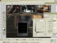
 8. Finally, the PDA. This was my last idea, and one that would finally tie together PlanetQuake and Quake 4. I filled in the basic shape with a medium-gray, and again used the same method for the frame and monitors for the body of the PDA. I wanted this PDA to be plastic and black though, so the method was used in moderation. The general plastic was done with a copper gradient, desaturated and then adjusted by curves (IMAGE / ADJUST / CURVES). With curves, you can make metallic or plastic graphics have a more realistic sheen and metal/plastic quality to them. Just experiment. The sheen on the plastic was done by white-to-transparent gradients at different opacities. I put in the Quake 4 logo, and some icons from the font "Webdings", along with "approaching planet quake" text.
9. The hand holding the PDA. Yes, this was done in Photoshop as well. I don't like using photographs in any of my hand-drawn/manipulated work, and well - it shouldn't be too hard to do a hand for me anyway. I start by getting the basic shape in a tan color. I want the thumb and part of the hand visible behind and around the PDA. Then by using the dodge and burn tools, I shaped out and gave the hand/thumb depth. I then added in some knuckle creases with an airbrush - one white layer, one black layer, dropped their opacities and merged. I then added noise the thumb, blurred and adjusted the contrast and brightness for the thumb and pda.
10. And finally, I added in the strip with the PlanetQuake and Quake 4 text/logos, did a little final contrast to the entire picture and that's it. I'd say it took within 6 hours to do total.
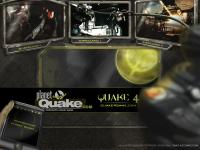
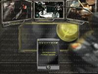
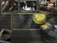
And here is the final image, 1600 x 1200: