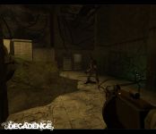
One of our promises we speak of on our website is that we will not feature a HUD in Decadence. This is somewhat still true today; it just depends on where you draw the line. As of today; we have no HUD elements in first person view. The damage information has been taken care of by a damage shader which blurs and darkens your vision. The same technique is used with Zoe’s and Nikita’s poison arrow. When you get hit with the arrow, the screen will get a green tint and blurry to disorientate you, not to mention the changes to your movement and mouse speed. You’ll know when something happen to you, that’s for sure.
Another feature that just got finalized the other week is the ammunition indicator on the weapons. Every weapon has unlimited clips, so the only thing you need to keep track of is the amount of bullets in your current clip. While there’s no way of saying exactly how many bullets you still got in your clip, a warning light will come on the weapon when you’re running low. This light can be anything from a LCD display as we got on the more advanced weapons, to as simple as a reused Christmas light on another weapon. When you’re low on ammunition, the light will start flashing alerting you to the problem.
We have been play testing Decadence since pretty much day one, and testing is something very important to us and the way we work. To us, iterations are the way to go. Decadence has been in the state of tuning for quite a while now. This means that no big design changes are being made and we try to present the features and gameplay we got in a polished state. We have had some students and teachers come over and visit us at our little office at the university, and the feedback we got from these tests were positive while there were a couple of things we needed to address. Many of these comments were player feedback related, such as problems with knowing where the capture zone was, player identification, the ability to revive and so on. Some of these can be solved by information represented in the game world, such as a yellow and black warning decal on the ground to indicate where the capture zone is. Others were not as easy to solve, and this is where we will probably ignore our no HUD rule a bit. We want Decadence to be easy to learn so using some on-screen information is necessary. We’re talking about adding a small icon above your team mate to indicate that the character is friendly, the same with the capture console. You don’t want your players to be confused when they start a map, but at the same time, you don’t want to use too much graphics and interface to interfere with the immersion. However, a bit of abstract graphics to convey information won’t break the immersion and we believe that this is going to solve many problems for new players. However, if you do like the no HUD approach you can rest assured that we like it as well, and we won’t go overboard with information on your screen; just the right amount to help you out.
For more information, go to www.decadencemod.com


I'm really looking forward to this mod! I like your decisions.
Very nice.
One of the few mp-mods I'm really looking forward to.
No HUD?? I MUST try this.
this all sounds fantastic, I can't wait to play!
Im blown away by your website and your idea, keep it up!
You guys never disapoint me. It seems that alot of the best mods have come out of University projects and mod teams from education or school projects.
Really looking forward.
Iff concealment isn't going to make a big part of this game, so paint their shirts of a same color, such green and blue, green for one and blue for the other team. With concealment became a prior for gameplay, make a invisible suit like Crysis/Spy(TF2).
I disagree severely with this idea... Most of the characters detail and stylization would simply disapear if you did that!
Invisible suit? What? no way.