Hey guys,
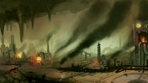
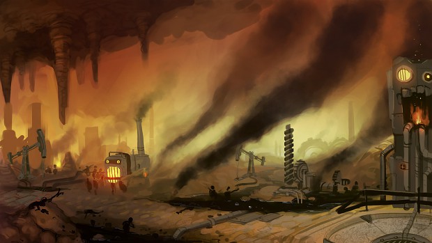
We are moving right along with the concepts and wanted to show everyone the first artistic rendition of Purgatory. We currently have two color schemes... which one do you guys like best. It's subtle, but it'll make a difference...
Let us know what you guys think. Remember to check back on our blog often for new updates. A birdie told me a technical blog post is coming soon.
Alex


I think I like the green better. It provides a nice different color pallette compared to the rest of the game (that we've seen). I'm almost thinking about even thicker smoke. Choking green mist-like smoke near the ground, and thick, inky black smoke that makes the ceiling almost impossible to see, and with the stalactights poking out of the blackness like jagged teeth from an abyss up above.
You gave me a good idea...
I like the green one, too. The colour seems to be more dull, and that's exactly what this lvl should look like.
I got a tip for your concept artist. Make three layers: foreground, background, middle. Place the smoke only in new layers between them. This way you get more depth than when you paint it all in one and the colors stay clearer.
I like the red better, since there seem to be ironworks, etc around. Molten stuff is red, in my opinion.
Most definitely the green. It's not that the red is bad-looking, by any means, it's just that red/fire is more hell than purgatory. Green is decay and mould, perfect for someplace you'd spend forever waiting.
Isn't purgatory part of hell?
And you don't spend your time there waiting, you're burning for your sins.
Purgatory is the place where spirits wait to be judged for their sins. Once judged, they either go to Heaven or Hell...
I like for the green, as well. It looks horrid(in a good way), and is a nice contrast to hell.
Also, those forges/melters are all tenso!
why not a mixture of the 2 but make it blend well because the rocks in the green image look much better then the red but the furnaces and other machines look much better in the red. also i noticed the small added details in the green compared to the red like the added light little red light near the drill and the lights and more detail on the pipe running across the path also the little bit red tint near the oil on the rock. it is kinda of like a night and day pictures the oil and smoke stick out more in the green also then the furnaces and machines. the people stick out in both.
Agreed, mixing may make this seems quite better, but anyway, how about making the background color white and orange, to make a mixture of Hell and Heaven too?
Like the man said, it's a subtle difference, but if you intend to make a reddish hell, a greenish purgatory would give more variation to the player.
BTW, the art is looking great! Kudos!
i love the green one^^
I always imagined purgatory as the waiting room in a doctor's office.
I like the green
You guys were pretty much in line with what we were thinking. We wanted to contrast Purgatory to Hell a significant amount but still maintain some similarities. We want the game to transition smoothly from world to world but still offer differences.
Thanks for the feedback!
I perfer the green. BUT, I disagree with your vision of purgatory ENTIRELY. Purgatory, atleast in the Church of GiffE, is not a fiery demonic place. You are not condemned to hell when in purgatory, your just waiting. Its an empty "undecided" place, you shouldn't enjoy purgatory but you shouldn't be burnt and tortured in fiery pits.
I would make purgatory MUCH less hell-like (which is why I said the first) I wouldn't put it in a sub-terrain place either but clearly that ship has sailed.
The best thing I would relate purgatory to is floating in the middle of the ocean on a foggy day, or in the middle of a barren desert.
I agree with you. Not sure why the cave made it in, but our concept artist insisted. Purgatory is a place where you pay penance for your minor sins. We wanted to express this with machines and work. People aren't suffering, but they're not particularly happy and they have to constantly work to keep purgatory functioning. We extended this idea by having them work at getting other souls out of purgatory... so all of purgatory is working to allow the souls that have made it out to leave. Like a giant bureaucracy.
Definitely the Red. Gives it more of a "Fire And Brimstone" feel.
But it's purgatory.
Purgatory looks nice. I always thought purgatory looked like a blank space you know with a door in front of you. Like FMA:brother hood
I like the red style, it gives more of a "Hellish" feel, maybe towards the later parts of the game the colour can slowly change to show your escape from hell
They're both very nice, but I'd go with green because it allows the red objects (machines, creatures, points of interest, etc.) to be highlighted against the background in a different colour.
Green. It's purgatory, not hell. Looking great guys.
one idea would be to have the green mould and decay feel overall but have a sort of red demonic ambiance around the machines.
Definitely green. Fire colors have been done to death, green smoggy colors feel a little newer.