Hey all,
About a week or so ago we put out a Sin Profile for Lust. We got some tremendous feedback from the community. Since it was so juicy, we decided to make some changes according to what you guys had to say. Take a look and let us know what you think again.
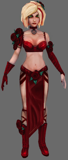
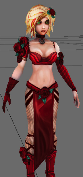
The old Lust The new Lust
Better? Worst?
Alex


Better :-D
the new one is much better in my opinion
Oooh, a very nice improvement
It is quite a nice improvement, but I do standby my opinion that the original concept's hair offers a much more lustful look.
exactly what i think
better but not perfect
but i wouldn't mind if you keep her that way
I like her old 'bra' better, but the rest is a huge improvement.
better but hairs are strange,
Yeah it seems that the highlight are a little too defined.
my bad, double post :/
The old lust have better cloth and body, but the new one have only better face. Well that's what I think :\
nah, body is better now
Now this is Lust, much much better . . .
only for jap manga yeh?
... is it just me or is the only thing that changed the bits of red in her hair? That and the flower in her hair is moved a bit and the haircolor is a bit darker.
I don't see much improvement. I still think the very first original one was the best as said in comments above.
Lost in a hard drive crash :(
There's something about that hairstyle... I'm not sure what or how, but it just doesn't have the smell of lust. The face is good improvement but how about wider lips? Imho wider lips will move the lust-o-meter up. I also think that the very first one was the best choice for symbolizing lust...
P.S. Perhaps putting a pair of tiny curved devil horns will also help for lustful appearance.
Thanks for the suggestions. I'll pass them along to the artists.
Very good improvement on the new image i would say the only changes i would make is the eye brows look a bit thick, also the Calv muscle near the boot with the rose on it sticks out like it is not connected to the rest of the leg also there is a green line that makes it look like that part of the leg is not connected with the rest, and the uncovered shoulder looks to light for skin color maybe darken it to match the arm or hand. and i know hands are the hardest thing to design when it comes to characters but try and rounding out the finger tips just a little bit more so the finger tips don't have that box look. the eyes begin completely shown and the brighter color of red and diffrent design pattern for certain parts really helped and also the diffrent hair style and more forward rose is nice also. one more thing i just noticed there is to many little particles that are noticeable if you look at the ring that is connected to the choker maybe clean that up just a little bit but be very careful. idk if my eyes are playing tricks on me but it looks like the more non revealed part of the face near the chin looks more like a bruise spot maybe to much lighting or the stray darker black line i am not sure but like i said maybe my eyes playing tricks on me. Well i looked forward to more keep up the good work.
She's going to be pretty small in the final game, so all those details won't really be noticeable.
Basically, you just improved the colors of her textures, and changed a bit in her hair, face and boots, it got really nice, as it didn't make too much noticable difference.
Kinda looks like it was just run through a sharpen filter and someone painted in a few new highlights. I think the critiques were in favor of a completely different face / hairstyle more akin to the red head sin concept you posted ages ago.
Party of Sin....when I read the title, I thought it was about decadent sex. To baad.
I'd agree with everybody saying that the redhead concept was the best. I'm neutral towards the new highlights.