
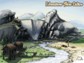
Greetings to all, this is our first post here on IndieDB. As first time I'm posting I wont announce big news like unveiling the release date of ATO or any details of the game. But I'll show you the new logo made for the game. It took some time to finish it and I think it came out pretty well.
I'd drew like seven sketches in SketchBook Pro. Then I dropped them all :)
First I wanted to make something more "modern" looking like nowadays fashionable slate look and feels, but I think it doesn't fit the fantasy theme that well as a metallic look does.
So after I finished drawing the vector stuff in Illustrator, I've created the metallic material and textures in Fireworks. The blue background was painted in Photoshop.
Then finally the lens flare effect was added in Fireworks based on a public tutorial on the internet.
Probably this ain't a big deal for a skilled designer, but I'm not being a full time artist (sadly :( ), I'm happy about that the game got a "good looking" logo that can identify it in the future.
Thanks for reading.

The logo looks great, simple, easy to read and good design. I don't like the lens flare, it's for me over used and dosn't really give anything to the image, could you please upload one with out so we can compare? =)
And of course it's up to you to keep it or not
Thanks for your comment! :) The flare and glow is just for the sake of presentation, but the logo will be something like this in the game itself:
Indiedb.com
Simple and clean. :)