As always, I'll start the new post with an obligatory link to the new OverDose website and forums. Over the last few years our servers have had the personality of a chronically depressed lemming and have had the tendency to drop out of existence at the best of times. Thankfully, we have been on the new server for a good while now and it’s as solid as an IT nerd on the front row of a swimsuit modeling contest. So, the big shiny logo below, go ahead and play whack a mole with it:

This link will give you access to the main OverDose website where all the news gets posted first, as well as access to the [TBG] forums, which we think of as kind of our "EXTRA!" area. We post a lot of development junk, pictures and info in there that doesn't make it to the main sites, so if you want first hand access to the inner workings of OverDose, get your filthy mitts on a forum account and get posting!
Character Animation Tests
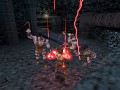
Before I dive into the main subject of this post, I’ll talk about our current progress with regard to character animation. All characters in OverDose share the same character rig, which allows us to recycle animations over multiple classes. Models are set up with various channels for blending, with legs, torso, head and facial features each having its own channel for blending. This allows our legs to run, while our torso gives orders, while our head looks around and our face screams some random war cry. Its simple, but its effective. We haven’t shown to much with regard to facial animation just yet, but we have animations for various features such as screams, laughs, pain and the like, as well as separate animations for every phoneme available which allows us to blend the mouth into any formation we want, which allows a great deal of flexibility when it comes to lip syncing. Screaming out “I’ll murder your dick!” will actually look some what believable. There’s also ramblings of automatic on the fly animation with regard to VoIP… But I’ll say no more. That’s a possibility we are looking into.
So, here’s the gravy. Some animation tests for you to bite into, thanks to Ben as always for his constant devotion to the cause:
And now for something completely different…
Designing a Heads Up Display
A Heads Up Display (HUD) is one of the most important factors in a game. Often overlooked or designed by under trained chimps, the HUD in many games these days is usually disappointing. The reason for this is that many devs focus too much on how pretty a game is without thinking of the user interface experience. It still shocks me that so few designers even TRY these days to provide a functional UI/HUD experience. Now there are quite a few factors into why this would occur. The most obvious of which is of course, consoles.
The Console Experience
Think of console gaming the same way your grandmother uses a phone, the same way she would need a PC to work. She can’t use small buttons, she can’t see them. What’s the use of fancy effects, when all she needs is a simple phone number to appear in large letters? She can’t see small things remember, so let’s make it huge, simple. I used the word large in various forms there several times, but that’s really the problem with console gaming in general. I myself have a 1080p 40” TV hooked up for gaming, and its bliss. But average Joe doesn’t use that. Average Joe is still gaming on a SDTV, likely around 20” to 25” in size. He can’t SEE small elements. To make matters even worse, his face isn’t 2 foot away from the screen like us PC Gamers, he’s usually sat on the couch, 10 odd feet away, straining to see what’s already there. Plus the resolution is so poor that theres no point even displaying small text. Dead Rising anybody?
Oh, and he’s also used to having his hand held through EVERY. SINGLE. GAMING. MOMENT. He knows no better, to be fair on him. He hasn’t played Deus Ex 1 on a PC. He never cried when Aeries died. He probably couldn’t even tell you what a resonance cascade is without using a Google search on Shakespeare. In other words, this is a new generation of gaming, and lets be quite honest… To us old school gamers, it SUCKS. To us, if there’s a USE key in a game and a weapon on the ground, then maybe we can pick it up. We try, and it either works or it doesn’t, but we remember. We try because we have that instinct to try everything. Remember walking around Duke levels hearing nothing but uh uh uh uh uh uh uh where is it? Uh uh uh uh uh uh uh…. Yeah, we figure things out for ourselves. But this new generation… It only works, if you are told it works. PRESS X TO RELOAD. PRESS B TO OPEN DOOR. RAMIREZ, TAKE OUT THAT ENTIRE ARMY BY YOURSELF.
Face it guys, this sucks ass… Through a straw.
You Be The Child, I’ll Be The Adult
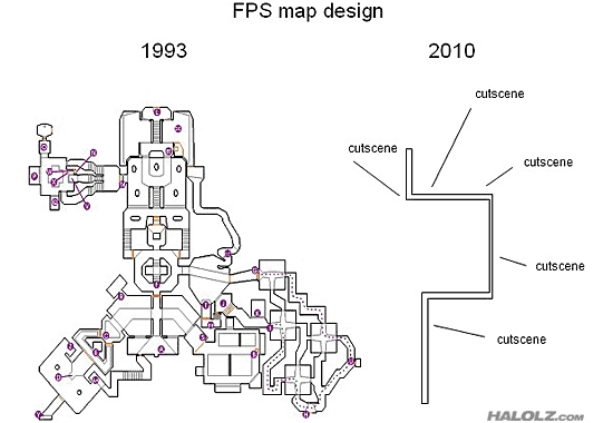
The point I’m making is the new generation of gamers are lazy. They don’t expect to work for things; they expect to have their hand held. Go here. Do that. Kill him. There’s no sense of exploration anymore, there’s no sense of freedom. You can either do it, or not, and if you can do it, expect to be told. Now a lot of gamers SCREAM for a change in this system, and I totally agree. We need to go back to how it used to be, we need to set the standard once again that PROMOTES freedom, not discourages it. Let’s look at the new Deus Ex game, and let me start by saying I can’t wait. Seriously, the first game is in my top 10 and for good reason. The second… Well... Why did it fail? Oh right, of course… Because they made it for the xbox first and foremost. What did that end up working out like…?
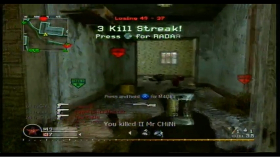
Do I need to even mention what’s going on there? The first thing you should see when looking at a game play screenshot is… Well… The game? I can’t see anything. All I see is this HUGE blue thing, with so many confusing things it doesn’t even require me talking about it. Do I need to know what weapons I’m carrying at all times? Do I need to know my selected perks? Do I need to see the face of the person I’m speaking with?
Let me answer for you… No. I don’t. Leave it for another UI if you need to, but keep it off my gameplay screen, I can’t see what I’m doing. As for Deus Ex Human Revolution, I have to say I’m worried a little… While it doesn’t look as bad as Deus Ex 2, those glowing ladders, boxes and doors… Get rid of them. I don’t need to know where I can go, I want to find out for myself, thanks.
The Perfect HUD?
So does the perfect HUD even exist? Why yes, of course it does. It’s a HUD many games have done, even. Let me show you…
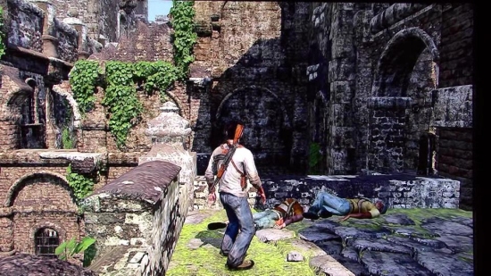
See guys, it IS possible. Let me start by saying my love for the Uncharted series is just insane. Honestly, if it wasn’t for Naughty Dog, my PS3 would have been sold a week after buying it. I won’t start a fan war here, but let me just say that the Uncharted series of games is by far one of the best gaming experiences I’ve had this generation. But let’s get back on topic… Look at the pic. What do you see? Nothing, that’s what. Do you know why? Because the HUD in Uncharted is entirely relative to the current situation. If you are walking around with your weapon away, do you need to know your ammo count? If you are nowhere near an event, do you need to know X will turn the crank? No, you don’t. Now let’s look at the Uncharted HUD in action.
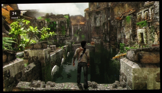
HOLY COW, I CAN SEE!!! Look at it. Just look at it… Any dev out there, LOOK AT IT. It’s about as perfect as it gets. Let’s dive deeper into what you are actually looking at by breaking this down for you:
1) The HUD is entirely relative to the situation. It fades out when not in use.
2) The crosshair isn’t needed if not in combat, so why show it at all?
3) The HUD is entirely context sensitive to what you are doing. Move to a usable object, tell the player to press a button. Simple. Sure it’s hand holding, but its selective hand holding, it works.
4) Do you see any orders there? Do you see current objectives? No? Leave those on another screen.
5) What does the player NEED to know, and at what times? He’s got his weapon out, so he needs to know his ammo. That’s all.
6) Nathan Fillion as Nathan Drake. Just saying is all…
So, could it be improved at all? Well yes, anything can be improved. But this is about as perfect as it gets, and what remains all having reason. The weapon icon is there because it’s a third person game and you can’t always tell a DEagle from a Glock when the body is covering it. The ammo counter is of course useful, and the background picture is there for vision reasons so that you can always see the text in any situation. Remember, white digits may look nice, but what happens when you are in a white area?
But what about what you DON’T see? Well, health, that’s pretty useful right? Uncharted features rechargeable health, so they display a red halo around the outer rim of the screen when hurt which changes in opacity depending on the condition of the player. If I’m at 100% HP, do I need to know but seeing huge numbers/bars on the screen? But could this be improved? Sure, you could show the damage on the player instead, make him limp, rip his clothes, bloody his face etc. But with a game that recharges health, it’s hard to really show that realistically. Maybe if the game had health packs that would make more sense, but here, the red screen effect works. The crosshair isn’t visible in this pic, but when in combat/ADS, it appears. Great thinking. If you aren’t aiming at something, why do I need to know what I’m pointing at? I have eyes don’t I? Plus as I said, when things aren’t in use, they fade out.
That right there is the perfect HUD. But… And let’s flip flop for a second. It’s entirely relative to the current game. The HUD is perfect, because it suits the game it’s being used in. It won’t work in ANY game, or ANY situation.
The OverDose HUD
So let’s talk about OverDose for a bit. What type of game is OverDose? Let’s break it down to the basics.
1) It’s a First Person Shooter.
2) It’s a multiplayer title.
3) It’s an objective based game.
4) It’s team play orientated.
5) It’s made first and foremost, for PC gaming.
Basics covered, good. So, lets adapt our HUD design a little, into what we NEED and what we can discard.
1) We need an ammo counter, but we don’t need a weapon icon. Its first person, we can see the weapon on the screen, so we know what we are using. So that means ammo in the current clip/magazine, and how many remain in total.
2) Secondary weapons info, such as grenades, need a number. But it also needs a simple way of defining it 2x ICON works, but what about just showing the icon twice, in a small overlapping space?
3) A radar. Yes, it’s needed, but how large and how small? Round vs square? Opacity? What’s shown on it? Well, round works better from what you can see, but it also works as a circumference to the perimeter of your vision, so it makes sense. What would be shown, are team mates, enemies visible, objectives… But what about the actual map? No detail, at all. Keep it simple, at all times. We don’t need Google Earth level maps, we just need simple to read basic shapes.
4) What about team mate conditions? Entirely subjective. I don’t need to see the health of every team mate at all times when they are on my screen. If I hover the view over them, then sure, display a little info, but leave it disabled the rest of the time. As a Medic, its my duty to know the condition of all team mates, but we can develop the UI to take advantage of the class by drawing his focus on heavily injured and down team mates. Again, it’s subjective and totally relative to the situation. This works for dishing out ammunition too.
5) Objectives. To display, or not? Well, yes, we need to know what can be destroyed/built etc, but they don’t need to be on the screen at all times. In fact I would even hazard them not being on the screen AT ALL, and simply moving its information as to another UI as part of the objective list.
6) Text pop ups, objective info, chat messages and kill info. Keep it small, keep it simple, keep it out of the main view. As a PC game, text chat is important, even more so in a team play game, but it doesn’t need to be in the way. Its important to know that the CMC have constructed the bridge, but it doesn’t need to be in HUGE WORDS in the middle of the screen. Keep it small, out of the way in its own notification area, and also play a sound that’s linked with your team completing an objective. A game should be playable with ZERO HUD elements before you even think about designing a HUD, after all.
7) Health. OverDose has rechargeable health “levels” meaning that for each 25% segment of health, you can recharge up to the next neighbour but no more. Display it as an onscreen red blood rim effect in varying opacity.
8) Make all of this small enough to be read at a target resolution of 800x600.
9) Make all of this entirely context sensitive, and fade out what’s not needed when it’s, well, not needed.
The simple rule of thumb to follow is that if I don’t need it, I don’t need to see it. If I’m not in ADS, I don’t need to see a crosshair, I don’t need to know my weapons ammo count. If I’m not looking at a team mate, I don’t need to see his health. But also, make all of this optional. While the HUD fading out is the better choice for some, there are players out there who need to see their current ammo count at all times, so allow them the option of enabling/disabling the HUD fade.
But above all else… Remember the GAME is the most important element here. The HUD should never be too large, it should be small but readable. It should never obstruct game play, but always be there when you need it. It should be adaptable to ANY situation you throw at it, and never leave you wanting. EVERYTHING should always be available, be it in a separate UI or when required.
The perfect OD Hud:
Let’s get back to UI designers actually having a large role in game development. I won’t go into UI’s this time, but you can be sure when I’m ready to talk about the OverDose UI I certainly will be talking about it. Here’s a hint on what I will dive into there and what not to do… Crysis 2. Need I say any more?
Thanks for reading!
good job personally my favorite hud of all time is quake 3 all you can see is ammo hp and armor in clear but non obtrusive way and weapon selection only appears when being used same as text
The Console Experience is correct! These days they tell you everything. I love Crysis. BUT! I hate that they always tell you what do to. NOMAD DO THIS, NOMAD DO THAT! The entire game they yell at you and tell you where to go and what to kill :P
Because the goverment just wants you to stay their workhorse.
Nice rant.
Can't say I disagree with you though...
My favorite HUD is the one used in the two Dead Space games.
God I miss non-linear gameplay being the industry standard.
Indeed,i agree with what you have posted.Games strength as a medium of entertainment is their ability to give the player freedom of choice.You cant decide what the main character in a movie should do nor can you change how characters in books act.In a game you can.Most dev,s need to realise that players dont need hints.A game is an interactive medium not a semi-interactive movie[i,m lookin at ya COD and all ya COD clones]
I SUPER F*#$** AGREE ON ANY POINT YOU MADE UP THERE
f#$**&#xng; console gamers...
God, game developers have really gone Down Syndrome ever since the first fcking xbox was released, I swear.
I miss the good old days where you could just roam around maps and do random crap the entire day instead of having to move down some stupid *** boring linear path going from A to B shooting C and D the entire bloody day wasting every second.
I want my duke days back.
Dude seriously whats wrong with being board of the PC for a little while so I go play my Xbox? Its fun.
"The point I’m making is the new generation of gamers are lazy. They don’t expect to work for things; they expect to have their hand held. Go here. Do that. Kill him. There’s no sense of exploration anymore, there’s no sense of freedom. You can either do it, or not, and if you can do it, expect to be told."
Very well said. I've had some discussions with 'new generation' gamers lately and I just fail to understand how those people can still enjoy their games and they fail to explain it lol. Oh and maybe I'm falling in the 'new generation' too with my age of 20, but I'm definitely not that kind of player :P
sof 1 has some good quality,s too
just look at sof 3 and compare that ;)
SoF Payback doesn't even deserve to use the Soldier of Fortune name. It was a total attempt at cash in from Activision using their Budget title to disguise what an abysmal abomination Cauldron created. Even the gore was wrong. SoF3 FTW. Make it happen Raven Software! Oh, and some good points Gav.
Havent read the post.. but nice work on the animations :)!
Couldn't agree more. I miss the huge, winding levels of games like Unreal where the environment felt real and there was a real bonus to exploring and the narrative wasn't forced down your throat.
Bulletstorm, for example, was great fun but probably half of the game wasn't actually a game, it was cut-scenes or un-controllable events. What's the point in buying a game just to watch things happen? Surely the point is to be involved, not just watch badly written and animated cutscenes?
This speaks more sense than any gaming related articles ive seen for a good while now.
Hate this current gen of games and their boring lets-make-more-money-coz-we're-corporations approach to development.
BF3 looks like it will bring a promising HUD...
But ya, I agree with your points....
Nice rant. One point though. A crosshair while outside combat has very well a use, for example if a game requires the player to interact with objects which might be small (a button for example or some object jammed in some narrow place). Without a crosshair it's really annoying trying to do such interactions. One reason I had to put in a crosshair as otherwise interacting with the environment turns into a trial-and-error experience and that sucks. But in general you are right. Less HUD is better in general. That said DX1 HUD I like a lot too and it contains quite a bunch of information on-screen without feeling cluttered like DX2 (as you mentioned).
Yup, like I said its a totally situational thing, sometimes you cna get away with it, other times it just gets in the way. I think OverDose will have a crosshair when not in combat simply for the reasons of it being a FPS title, but it can still be disabled by the user, as can any seperate HUD element in the game.
You could have different kinds of crosshairs. When you're in combat, or better yet, when the AI goes into alert mode and knows where the player is, the combat crosshair appears. After X amount of time after combat, the crosshair could change to a tiny semi-transparent dot.
As long as the game has an aim button, I personally would rather have no crosshair at all. Usually that's something only in hardcore difficulty in games (unfortunately).
Do you plan to differentiate between hardcore mode, and harder difficulties?
In a multiplayer only title...? No, we don't :p
Yes, I see how that might be a problem
:-P
Hear, hear.
And current gen gamers and developers,
******* LISTEN.
Totally true, PC gaming is a shadow of is former self now. :(
And i completely agree with you on the UI, make it a situational thing.
Lazy developers? **** yeah, but lazy gamers? Hmm, maybe not. Let me explain, sure I want my HUD's to be sexy as balls, situational bitches, and I didn't ask to be dragged around by the ****, but when was it my decision, when did I ask for opposite of that? The answer is never.
Pie charts, and supposed user preferences became the norm when developing games became big business and not a labour of love. I don't buy games that try this ****, so does this make me a lazy gamer? I don't think so, the only lazy thing I do is protest quietly.
I've re-read, re-written this several times and I don't think the point I'm trying to make is coming through, but it's the best I can do. There are lazy gamers, but their also not all on consoles.
Interesting read, as I was reading this it went through my mind how much Halo's HUD is actually like this. For example it shows a red X when teammates die just so you can know that an area is dangerous, or in custom games you can set it to show player positions all the time if that suits the game type. Halo 1 and certain parts of the sequels are very open and I think don't encourage lazy gaming at all, but I do agree that too many games today are getting crappy HUDS. I like Fable III's hud, it was fun to use. Anyway Nathan Fillion FTW!
At least that **** has a purpose. Halo's HUD has a lot of elements, but in terms of functionality it's as utilitarian as it gets. It ONLY shows what it needs to. Now, mention any Capcom game and there's a completely different story.
He should have mentioned The Darkness. Or King Kong. Two Console exclusive shooters that may as well have no HUD at all.
Actually, King Kong just flat out has NO HUD.
Rockstar does a pretty decent job at this stuff too in Read Dead, GTA, and LA noire. Gears of War has a great HUD too.
The major problem I have with gears is the health icon.. gets in the way and it never seems to work properly.. it's either off when alive or on when dead, there doesn't seem to be a middle ground to it.
Yeah, but I find it useful when blindfiring because it's right in the middle of the screen. It kinda gives you a small advantage when you're close to death.
King Kong actualy had a fantasic HUD, in that you didn't have one. The way you had to actually check the ammo count was pretty amazing. The trouble was, it was stuck in a **** poor game that was made in about 4 weeks... So nobody cared. Plus it was too hard for average Joe to come along and have to press a button to check the ammo.
Like I said, few and VERY far between.