Getting 3d models and textures of fancy spaceships into your game isn't enough to make it enjoyable or even just playable. Lots of additional work has to be done to deliver a polished gaming experience. One of the more obvious tasks for Nexus mods is making actual ship icons. Here's my take on it...
I seriously suck at art, so drawing icons from scratch to resemble their virtual counterparts wasn't likely to get me results good enough. Leaving them out completely or using some generic class-based icons wasn't an option as well, since you absolutely need to immediately recognize each shiptype while looking at the contacts list. "Hey", I thought, "I already have some great 3d models in the game... why don't I make a screenshot of them and make that into an icon?"
While being a good idea in theory, it turned out be hard to distinguish between the spaceship and the background of the screenshot... cutting away the background stars and nebulas to get the actual ship and nothing else takes quite some time and wasn't really practical, given the sheer amount of ships I still had to do it for.
How do movie people solve this problem to mix live-action footage with CGI stuff? Right, the greenscreen. Getting my "actors" in front of a pure green background would allow me to get a clearcut image of the ship by just cutting away the green stuff. I already had the ships ingame, so it was logical to utilize the game engine to set up my greenscreen stage. I created a large green texture and added it as a background nebula in the solar system editor while also removing any other nebulas or stars, which could disturb the pure green I was going for. After a few minutes I had this:
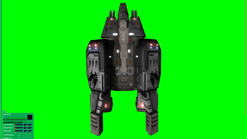
Now it was trivial to cut away the green background and just get the actual ship's appearance. All that was left to do was to reduce the image size, apply some color filters and to tweak the overall brightness and contrast to get a good icon. Of course each race also gets its own color scheme to quickly distinguish between Terran, Vasudan or Shivan ships.
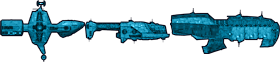

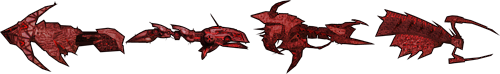
![]()
![]()
![]()
![]()
What do you think of my ship icons? Any comments or suggestions on how to improve them further?
To improve them further will be like challenging perfection to change... an absolute paradox. Great ******* job with those icons.
This man speaks the truth.
You're doing the game proud.
i agree with Mularac 100%
i only wish i could do as good as you with making icons
Agreed - they look perfect to me. Clear and easy to read. Taking them from in-game is also nice, since you get the luminosity map effects in the icon as well. Great work :)
Well, to be honest I remade all icons in Lightwave instead of the game engine about half an hour after writing this news article. That allowed me to use ortographic 3d projection instead of the usual perspective projection to get a better view of the ships. The ingame perspective distorts some of their proportions, especially on the capital ships like the Vasudan Sobek-class corvette.
... I didn't feel like rewriting the news post, though, as the icons generated with that method look pretty good as well and maybe it'll be helpful for other modders to speed up their own icon creation process. ;)
Great work, those look really good.
I would declare those Icons FINISHED!! I can easily make out what is supposed to be What....
Great job! Can't wait to see them in game with the interface.
improve?they look perfect :)
Excellent job on the icons. AWESOME SAUCE!
good work
Nice work.. love the icons... looking good on the ships.. a classic reborn... just picked up Nexus on steam the other day as it was cheap. My brother borrowed by hard copy and never returned it.. :(
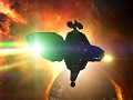
and the Ravanna, Sathanas and Collosus (plus an other GTA ship I don't recognize.. the one behind the orion) are there. Excellent, as always.
That's the GTD Hades, which didn't make an appearance in FS1 or FS2, but was the "boss fight" in the FS1 expansion "Silent Threat".