Are you guys excited to see what happened to the Unreal Star Wars : Battle Tournament 2014?
Well, you are probably wondering why we haven't put an update out for a while. There are several reasons: one is that it's not easy working here on the beach in these hot days of the year; the second is that there are many distractions that pop up and cannot be missed! Having said that, we are still here working hard to tame the epic power of Unreal Engine 4, which we have been having a lot of fun with.
As you all probably have seen already, DICE have been having fun teasing us with the Star Wars Battlefront video they revealed on E3. We as fans first of all were really exited too and looks like they have some interesting graphics there that certainly have inspired us.
Enough chit chat and lets move onto what we have been cooking...
Our amazing looking website made by Mandosis has been officially launched for some time now and if you haven't already registered you might want to do that! Also some might wonder what's up with our moddb page. Thanks to him again, it has been redesigned for more unreal scrolling through news and images.
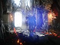
Cloud City has also been worked on heavily during the last month and we have a few screenshot of the new areas of the map that have been in the work and some not so new but has taken a few upgrades from our last
update.


Next, we would like to show some HUD concepts that we have been working on, because we know how it's good to have a nice HUD that's easy to use. So if you have any suggestion we will be glad to hear them on our forum.
Note: We have used just some backgrounds, they are still not functional.


Last, but not least we are proud to announce also the discovery of moving images. Yes, this is not a joke this time. It's happening, the revolution of technology at it's prime form. It might not look polished but it's still in the works with animations that are still mostly placeholders.

Until next time folks,
And may the force be with you
The Star Wars: BattleCry team!
Your customized ModDB design looks really cool!
I didn't even notice it was ModDB page until you stated this, These guys did great with their skin!
I'm not really sure about either of the HUDs. I don't really like the slanted styling of the second (or at least to the degree it is slanted at) and the first I really dislike the minimap. The arrows around the outside don't really do it for me and the right side of the screen is kind of confusing to look at. Overall i'd say the second style is better. Its far more modern and I think could be awesome.
Here are some ideas on how to improve the design of the 3D like HUD. Look at the angling in battlefield 3/4 as I feel it will make everything look a loooooot better. I also think the blue is a little dark, and having the words health and stamina over the bars is pretty pointless as after like 10 mins of play you will have got that completely and having them there kinda makes everything look a little cheap.
For the 2D like HUD (which I personally don't like as much though it is more true to the original) I would cut down on the amount of blue. Perhaps having black outlines and just blue in the middle would improve the overall quality (as it did in battlefront 2). I would remove the arrows from around the minimap and I would try to clear up the right side of the HUD by having the ammo and the gun icon on the same level. The score bar is perfect though as is the capped places.
This is just completely my personal opinion and I know it sounds like i've listed off a lot but they are all minor changes. The overall design for both is pretty nice. The map is also looking amazing as are the particle effects. Overall its been a great update and I cannot wait to see more :)
Thanks HaMM4R, we'll take your feedback into account. Also, please feel free to have a go at creating your own concepts - we'd love to see other peoples' ideas.
I wish I had the ability to. I am but a humble programmer and have no skills in any form of art. Plus I'm mostly good at giving feedback rather than actually creating stuff myself :P
No worries, thanks for the feedback!
Even after saying that I still took a shot with my amazing paint skills. Check out the thread on the forums :)
This comment is currently awaiting admin approval, join now to view.
I really like both huds they got a real star wars battlefront hud style design going on with them
great update, i love the second hud with the round radar.
Nice update!!
I like it and i can't wait, I seriously can't wait, *starts to have a panic attack*
but with that blaster fire and the cross-hair position is the gun going to shoot like that always? It appears to be shooting at a strange angle but the laser/blast shot is going straight ahead? That .gif or that short video animations there the blaster almost appears to be aiming at the poll in-front of the man but the laser/blast is going to the right of it.
and for the HUD I like an idea where you blend those two mini-maps together to make it a little different or use a lot less blue on that one on the right, I like the gun option you have on that one on the right, makes more sense. I am however not a fan of the slant you gave them, it's awkward, I'll assume you were going for a helmet view? I'm not sure.
I waited 7 YEARS for Black Mesa Source to come out (technically it still isn't "out" yet on steam) -- I can wait a bit for this haha. So take your time guys and I'm glad to see progress!