Games are a continual cycle of iteration; destroy, rebuild, improve. If something isn’t working visually, or goes against the core mechanics and flow of your game, it might be time to go back to the drawing board, or wacom tablet in my case. Phil Fish remade the artwork for Fez at least three times during its development. It was after Supanova that we decided that the game needed to go through this process. We needed to engage our players more, and give them something else to do besides grappling and fighting. So a huge whiteboard was borrowed, ideas were hashed out, arguments exchanged and the team collectively redesigned Grapple Knights core mechanics from a new perspective. You can read a more in depth article about this redesign here.
This redesign also included a complete overhaul of the artwork, from scratch, to bring the game up to a better standard that would give us a benchmark to work off. In this article, I’ll be going through my experiences of learning pixel art, some of the decisions I made when reworking the art, and the tools I used to help me get there.

Blocky Beginnings
I’ll admit that before I started working on Grapple Knight, I hadn't done much pixel art before. Except scribbling in MS Paint back in school, but that probably doesn't count. When I joined the team, I started out by doing some rough concept sketches for different enemies, including the fearsome Beargull, a pedobear lookalike with tiny seagull wings. Or the Gullbear, a perplexed looking seagull with oversized bear arms, that could punch the player really hard. Yeah, it was probably better that I let Charles stick to designing the characters. Since Gonz was busy building the levels and running the ship, and Charles had some experience in creating pixel art characters before, I fell into my place of designing the environments. I felt like this was the right position for me, since I’ve always enjoyed immersing myself in game worlds and taking in the small details the developers had created. Charles had already created some basic grass and dirt tiles when I came on board. It looked a little sparse, so my first test was to create some basic terrain decoration. And thus, treedude was born:

This was the first piece of pixel art that I created. Please, hold your applause. Ladies, line up over there. The tree wasn’t much good on its own, so I whipped up a quick mock up screen of what the background could look like:
 “Those trees shouldn’t have any antialiasing” Gonz said to me. First noob mistake, pixel art should be clean, crisp solid pixels with no transparency or blurriness. Point taken. I continued by editing the dirt and grass tiles that Charles had created earlier, getting to grips with working on a such small scale. I was mainly creating these tiles in photoshop, with the grid set to 19x19, and copy pasting tiles across when I needed to make sure they tiled seamlessly. This workflow was quite slow and cumbersome. After a few weeks of playing around with the dirt tiles and slowly learning as I went, I was tasked to create a background with several scrolling layers. You’ve probably seen this background in our earlier builds.
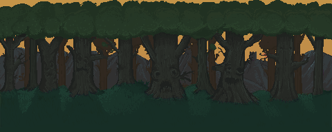
Yep, that one; with the faces. I was pretty happy with it at the time, but looking at it now I could have done many things better. First off the trees were drawn haphazardly, without much reference or player scale being taken into consideration. It doesn’t look like a real forest, since there’s only one other layer of trees behind the foremost ones. Thick, messily drawn pixels were used for the outlines of the tree trunks, and not much thought was put into the lighting source. The sun was obviously behind the trees, but they still looked flat and unlit. Lastly, there wasn’t enough contrast in the colours being used, they were all too similar to one another and all blended into this ugly green and brown pixelly mess. Creating the background was admittedly more enjoyable for me than working in a 19x19 square, as it gave me more freedom to work with. But even for large scale images like backgrounds you must still focus on the detail at a small scale, as it is still pixel art.
Back to the drawing board
Most people that played the game at Supanova and iFest didn’t really comment much on the art, but you could tell they weren’t wowed by it. That’s not the reaction you want when someone plays your game for the first time, even if it is a very early version. Gameplay is always the deciding factor of course, but good visuals are an important part of the equation. We needed to take a step back and reevaluate the art from a critical standpoint, and the decision was made to scrap everything and redo it. Destroy, rebuild, improve. But sometimes, it’s for the best.
We agreed that our art lacked a common direction and something needed to be done about it. At this stage, not much of the story or world lore had been developed, it was just a generic vaguely medieval fantasy setting. We knew it had to emulate the classic 16 bit era, but wanted the environments to be vibrant and convey a sense of mystery and a larger world that existed outside the levels. It is important to work out these rough details early, as they can dictate what kind of world your game takes place in, and subsequently what its inhabitants and environments will look like. We spent a while collecting reference from image searches, playing and analysing some pixel art games with distinct visual styles, namely the Iconoclasts and Legend of Princess by the talented developer Konjak. After some scouring, we found a few active pixel art communities that would hopefully give some useful feedback. Namely, The Spriters Resource and the Pixel Joint Forums.
The former was a much more active community, so I went ahead and created my thread there. After some of the harsh feedback Charles received from posting his character art there earlier, I was somewhat apprehensive of the response to my work, as I was expecting it to be ripped to shreds. It’s important to remember that all feedback, positive and negative exists to help you learn and improve, and it’s never a personal attack on you. The first reply I received read; “Why isn't the background at the same scale as the character?” Well, shit. This was a mistake I made early on, that could have been avoided easily. Another one: “The ground tiles seem less like they're effective at conveying ground, and more effective at conveying a bunch of random, brown noise.” Turns out they’re not a fan of the brown noise.
Surprisingly, the thread turned out to be quite helpful, most of the people were happy to give some advice, one even offering to recolour my background to give it better contrast and lighting. I returned there a few weeks later and posted an early version of the new dirt tiles, and the response I received was much more positive, which was encouraging. It’s always great to see communities that are willing to help out those just starting out in something, and I will definitely be returning there to get feedback on future work.
Tiling, Tools and Tutorials
Now that I had received some helpful feedback, it was time to get to work on recreating the tiles. During one of our Skype sessions while frantically posting threads from the Pixel Joint forums, I came across this extremely useful tutorial. I also found a few more on Deviantart that were quite helpful. Sure, there are plenty of pixel art tutes all over the net, but this particular thread went over many of the fundamentals and basics of pixel art that I was missing. I would definitely say that this thread and others on the PJ forums were instrumental in helping me achieve the look of the new tiles. Part of the problem with my tile workflow at the time was the tools I was using, which was Photoshop. If I wanted to create a repeatable tile, I would have to copy and paste the current tile, move it to the adjacent grid spaces and make sure the edge pixels lined up, all the while constantly zooming in and out. It was a slow and frustrating process, and was hindering my progress.
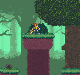
It was one day, as if by fate, the internet gods conspired for me to come across this amazing program, Pyxel Edit. It would entirely change the way I would create the level tiles. Instead of having to manually copy and paste the tiles, I could create as many instances of the tile I was currently working on, draw one one, and it would update all of them. I could also flip the instanced tile in X or Y, and create an instance of the flipped tile. This feature was deceptively simple, but so much more powerful for easily making repeating tiles. Once a few base tiles were complete, it was easy to bash out a little mock-up of what the levels might look like:

The ability to also export the tiles to an XML sheet was very useful for creating our texture atlases. Needless to say, I was pretty excited about finding this program. It sped up my workflow exponentially, and it was great to see all the pieces coming together to form a cohesive level.
Redoing the Background
The deadline for our Greenlight submission was fast approaching, and the daunting task of redoing the forest background still loomed. To avoid past mistakes, I carefully planned out how I would go about this. I collected a heap of real life and pixel art references to see how others went about creating the classic forest level that you see in many video games. Again, Pixel Joint was a valuable resource for collecting reference material, as was this great pixel artist Henk Nieborg. This iteration of the background required several independant scrolling layers to create a parallax effect. It was also important to get the scale and perspective correct this time around, to avoid the “huge trees/tiny player” effect. Picking out a limited colour palette for each layer was beneficial too, as it gave me some limitations on what to work with.
After having worked on the tiles for some weeks, I found working on a large scale background while still focusing on the small details quite frustrating at some points, as it is quite a time consuming process. I found the best solution was to block out the rough shapes of the trees first with a solid colour, then add details like leaves, shadows and lighting in several passes. Starting out with the back layers first was the easiest approach I found, as they had less detail, and then working towards the front layer with the most detail. The best advice I can give for creating background art is plan stuff out early, and don’t be afraid to make mistakes!
We unfortunately missed our self imposed deadline for the launch of Greenlight, but that didn’t mean we would stop working. Our next big event was EB Expo, where we would have the chance to demo the game to potentially hundreds of people! The resulting weeks prior to the expo was a mad rush to get the background up to a presentable level, and add any polish necessary to the remaining tiles. Needless to say, there was a lack of sleep and level of pressure that was felt by the whole team. The hard work paid off, as we had many people complimenting the look of the game as they played it, saying it reminded them of various 16-bit era classics. Definitely an improvement over iFest!
Conclusion
Throwing out your work and starting again can be hard sometimes, but the benefits can outweigh the cons. You’ll be constantly learning from your mistakes, and be improving with every iteration your work goes through. We now have a much better looking product, with a benchmark of quality to base the rest of the art on. What you currently see in the game is by no means final either, everything will get that extra level of polish towards the end of the development cycle. More decoratable terrain pieces and animated elements will be added to give extra life to the levels. Overhauling the environment art for Grapple Knight was definitely a learning experience for me, and who knows, maybe one day I’ll scrap it all and redo it again! (heh).
Thanks for reading my article, hope you enjoyed it and hopefully learned something!


Hey, I love these articles. One thing I think could be improved with the background is the flatness of those trees
btw. u've inspired me to improve my pixel work too, thanks :)