Hey everyone, I'm EvilGoodGuy, a relatively new level designer on the Guard Duty team. When I was brought onto the team I had a desire (as I still do) to bring a more logical and artistic style of mapping to the team.
I am assigned to re-creating maps in the Chapter "Duty Calls", which had already been mapped by a previous level designer. The purpose of this DevBlog is to show the comparisons between the previous level designers version and my iteration; and the process I go through when designing a map.
Before I even begin mapping I ask myself the questions: "what is the purpose of this area?", "what is the theme/style of this area?", "what is the main attraction of this area?", and "what could I do to make this area more realistic/appealing?", etc.. I then research any photos/information I can find that may relate to the area I'm creating and use it to aid me in my re-creation.
In the beginning areas of Duty Calls, the player finds himself in sub-level storage/maintenace area. The resonance cascade has occurred, so lights are flickering, alarms are going off, and a sense of gloomy chaos fills the area.
In the previous mappers version of the map (as seen below) the original areas have been re-created with a similar structure to match the original, but have some issues:
- The area was enlarged, when it should be kept as small, if not smaller, than the original, in order to preserve the feeling that you are in a sub-area for storage and maintenance.
- The entire area was drastically over-lit with bright white light
- There were mis-matched props everywhere and props/detail brushes scattered everywhere that made little to almost no sense existing in that area.
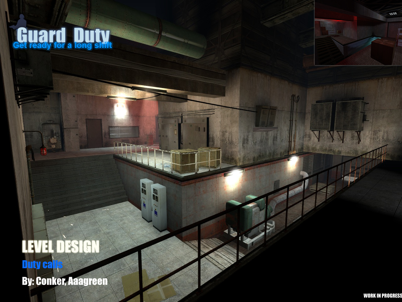
(WIP screenshot of previous mappers version)
In my iteration (as seen below), I decided to start from scratch and made a great deal of changes to the area:
- I kept the area very close to the original size, and even shrunk some areas in order to give the player the proper feel of the room.
- I styled the area with dim lighting, red emergency lights, broken/flickering lights, etc, in order to convey the feeling of the disasterous situation and felt that a darker atmosphere would fit this area better in accordance with its theme.
- I populated the area with props that matched the storage/maintenance theme and only that theme. It is better to have a few correct textures/props, than a crap load of wrong ones. Just because a map is littered with props, doesnt necessarily mean it's "detailed".
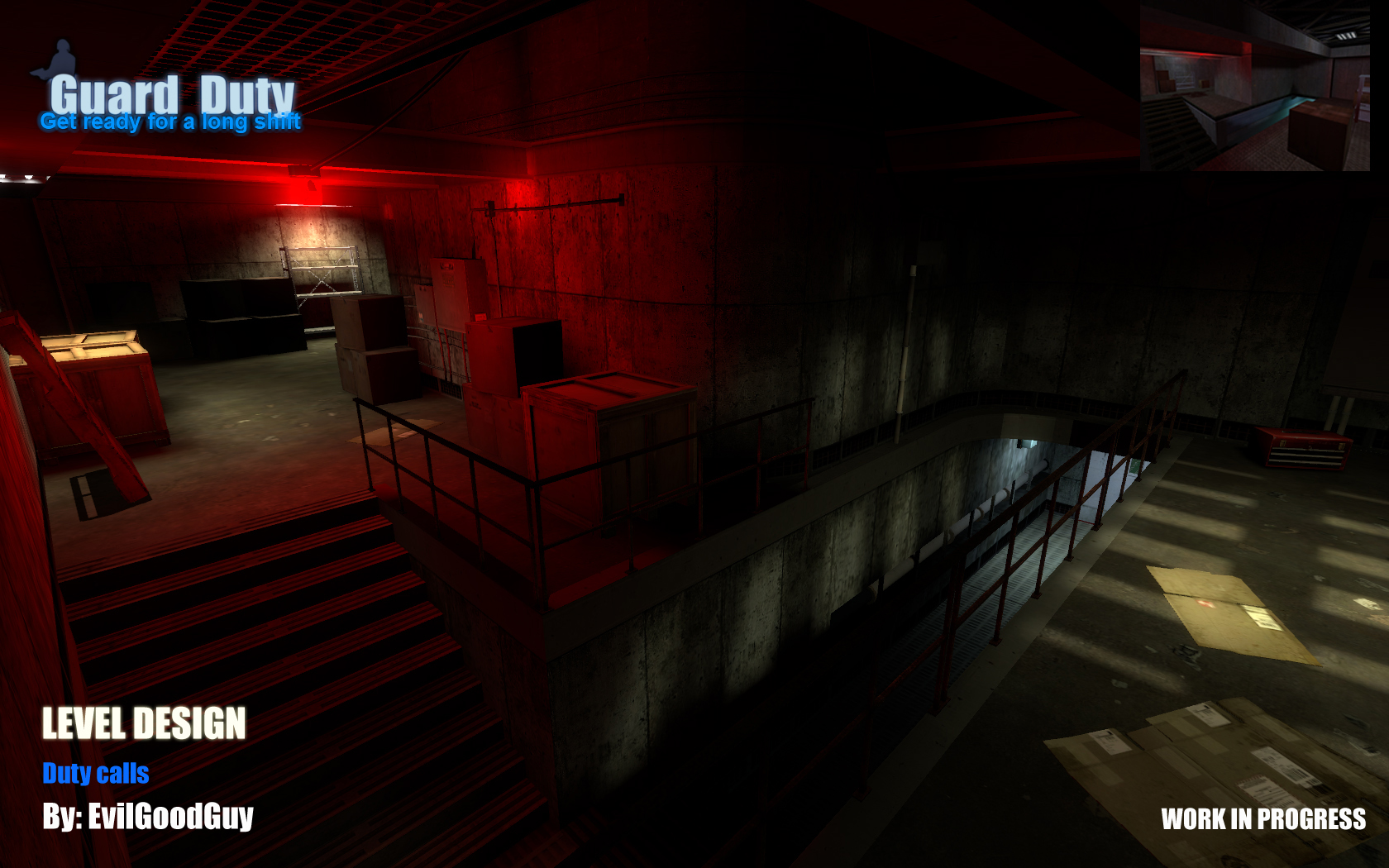
(Early WIP screenshot of same area made by me)
It is to be noted that my map (as seen in the screenshot) is still very much a Work In Progress and does not reflect the final level of detail and structure that it will have in its final stage. Even at its early stages of development, I believe my iteration displays a much more appropriate and styled area.
Well, that concludes my first devblog. Hope you guys learned a little about my mapping style and stay tuned for future devblogs ![]()

Guard Duty is currently in need of skilled modelers as well as texture artists.
Modeler:
-Must be skilled in high and low poly as well as baking.
-Must be able to unwrap own models.
-Must be able to to produce clean models.
-Must be able to work well in an eviroment with other modelers and developers alike.
-Texturing is a +.
-Being well versed with the Half-Life Universe is a +.
Texture Artist:
-Must be able to produce high quality textures for enviromental piece and weapons.
-Must be experienced with the use of texture maps.
-Being able to unwrap is a huge +.
-Being able to output textures fairly quickly without sacrificing quality is also a huge +.
-Being well versed with the Half-Life universe is a +.
These are currently Dire needs for us considering we are going through a major overhaul within the modeling department. We would be greatful if anyone out there would be able to offer their services to Guard Duty. If you don’t see your position listed here, you should check out the full list of available positions right here.
Thank you... hopefully your shift isn't delayed ![]() .
.

Wow, your version of the area is very nice. Good work :)
the map by conker looks better to me
Well, we decided to redesign as most people called for darker atmospehere. Current version more true to the original and is way more better in my opinion. The old one was just too bright and it felt wrong.
(buried)
I hope you never learn to map then.
And then you look at the overly usage of props, there's a generator in the middle of a hallway, makes no sense, the lighting is rather dull, power boxes and electric gear everywhere... A cardboard box on the floor? The list goes on, I commend the new mapper for what he's done, improved lighting, more claustrophobic and more focus on brushwork than prop placement.
That is a correct attitude to take, maybe the mapping looks worse (which it isn't. WE try to capture the feel and atmosphere of the original while improving the fundamentals.
The old version was well made but I prefer the new version, it's pretty atmospheric, good job.
I like yours better MR.sugar
Technically Mr.Sugar didnt make that map, EvilGoodGuy did.
Poor previous mapper :(
Still, while I don't think his stuff looks terrible, or even bad, it was a little bland and lacked any real sense of place, it just looked like another room in HL2 really, so average I guess. Your stuff it looking nice though, so congrats, looking forward to seeing more.
Looks much better and much closer to the original. Lighting is much clearer and well-defined too. Nice shadows on the right.
Look better than the original and the first remake !
The redesign reminds me much more of that area good job. Although the first was not bad.
I think the 2nd/new one is better - i know it sounds stupid but it feels like it's underground more than the other one. The 1st version looks pretty generic, and a lot of stuff makes no sense at all
I'm also with the idea of sticking fairly closely to the original.
However conker did do alright on: Moddb.com
and
Moddb.com
So I guess he just didn't quite get this area in the same way mr.evil did.
It should be noted that Conkers version was uber WIP. He's a great mapper in all our opinions. I too prefer EvilGoodGuy's version, like many people have mentioned it evokes a really interesting atmosphere.
i liked the door and the window that you cut off ._.
but I love them both o_o however the improved one is better ofc x3
+1 Tracker!
i love you map design and idea!
Oh I need the flashlight in the second area :))