This is the first in what will, hopefully, be a semi-regular series of developments logs about Lament. In the early days of development I had tried to get a couple of screenshots out every one-or-two weeks, which I have since realized was a terrible, terrible idea. So, in a similar vain, I'm starting these Dev Logs, which I wanted to start a while ago, except that I had nothing to actually write about at the time.
Let's get started then, shall we?
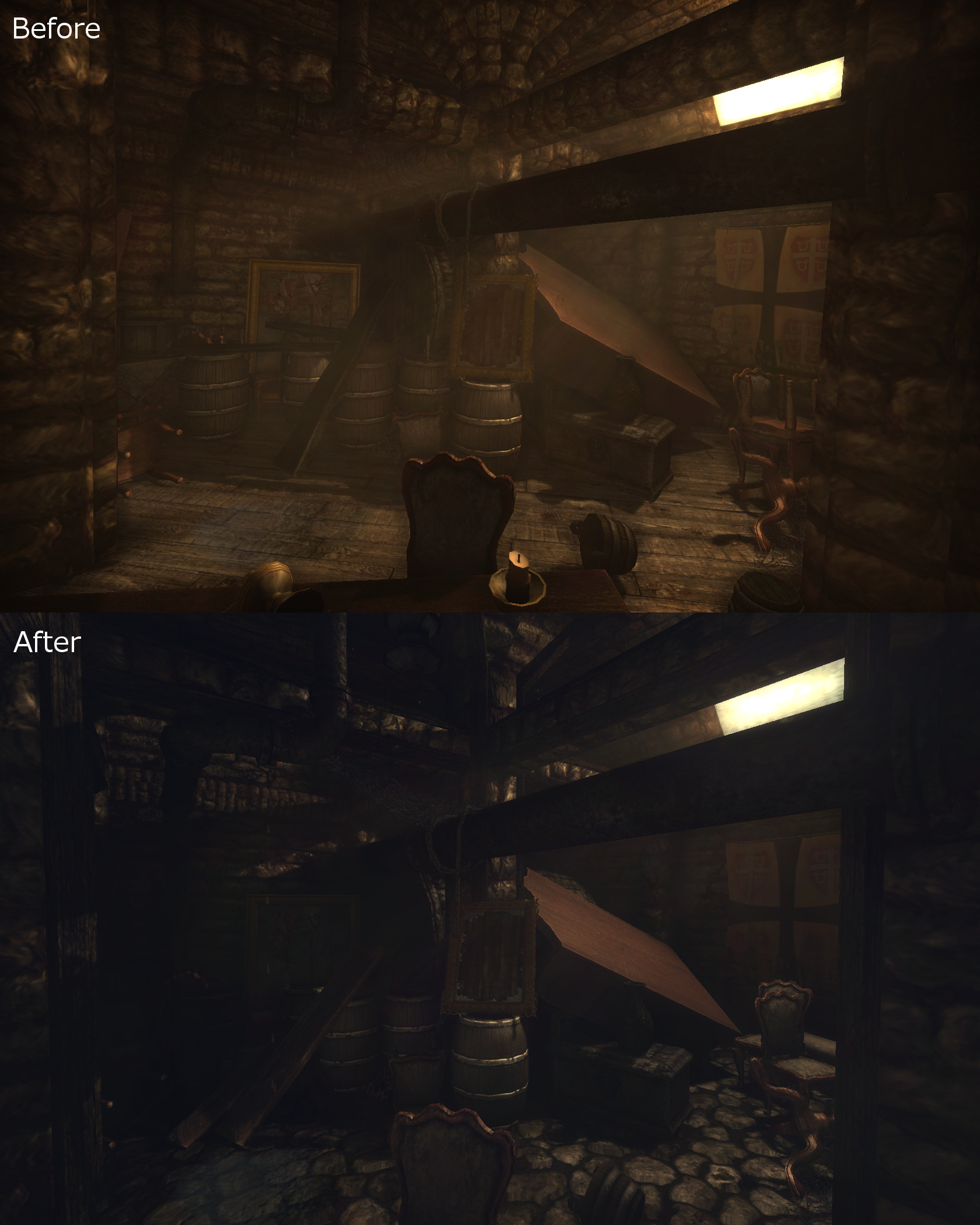
This is the color/lighting part, if you hadn't guessed.
A major focus of some of my more recent work has been getting just the right amount of contrast in the lighting and colors of the individual levels. In the old palettes I focused primarily on emphasizing one color, usually orange, red, blue, or green. The basic idea was to unify the overall palette and lessen the game's rather muddy contrast. In that respect, it was a success, but in doing so it bleached out any depth the colors may have had before.
I also found myself with shadows that were far brighter than I wanted, but the only remedy seemed to be darkening the ambient light, which just made the dark areas muddy and sharp again.
By this point I realized that my dissatisfaction came from an excess of "luma" contrast (the difference between shadows, mid-tones, and highlights) and a lack of "chroma" contrast (the difference in shades of color). Getting to where it is now was a long process that involved a lot of trial-and-error, swearing, and fog volumes, but I can finally say that I'm happy with the result.
Those guys over at SOMA have it easy, they've got HDR post-processing and tonemaps. All we have is fog and swear words.

I've also been doing a lot of optimization work, deleting objects that are unnecessary, have more geometry than they really need, or whose families just won't miss them very much.
I felt particularly smug after cutting out almost 1/4 of the trees in the forest while retaining it's dense and overgrown appearance, which is exactly what I was hoping to be able to do.
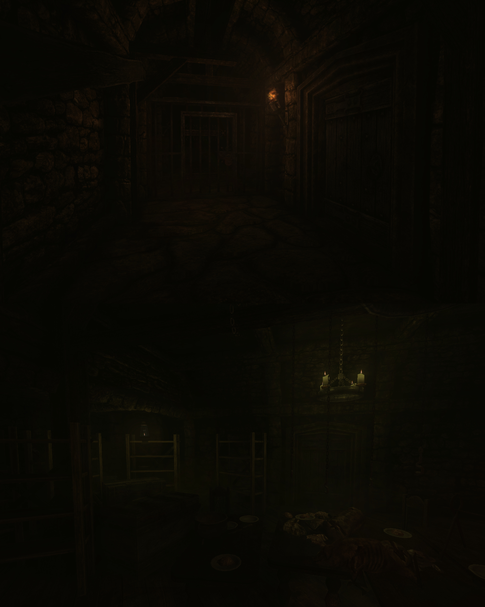
The other part of my work, which actually goes hand-in-hand with the other parts, has been polishing off the less-tasty parts of the levels and making them either A: prettier and more atmospheric, or B: actually relevant to the gameplay.
A big problem with some of my older work was a tendency to add areas that could be seen, but not explored. Things that you'd see in the distance, and maybe even want to explore, that were little more than window dressings. After playing Penumbra: Overture and Dark Souls again, these things started to nag at the back of my mind while I worked, until I finally decided that something needed to be done about them.
This led me to the very difficult task of connecting previously inaccessible areas of the game to the parts that you could actually go to. In a perfect world, this would only mean adding hallways and stairwells between two rooms, but it's rarely that simple. The connection process usually involves tearing out entire corners or sides of the two different areas, and then forcibly joining them together in a way that they were not originally designed to do. When the ordeal is over, we're left with a more interesting and enjoyable level overall, but I'd be hard-pressed to call it a happy reunion.
That's all I've got for this Dev Log, hope you found it interesting, maybe even a little entertaining. Next time, I want to show off some of the new particles systems and lighting entities I've been cooking up. Should be fun.
I remain,
Craa

Insanely good lighting!
this is really damn good lighting!
Please for all that's holy finish this mod.
Fantastic, it looks so stunning!
The lighting! How do you do it?!
Holy hell, I didn't expect this much of a response!
Truly, thank you. You guys are what keeps me going.
good