Ah, a visual dichotomy not nearly as old as roguelikes themselves, but nonetheless of great significance today.
While a game's visual style need not always be rooted in its underlying mechanics (especially the case with traditional turn-based roguelikes), the choice between an ASCII or tileset map representation obviously has a major impact on the experience. And that impact occurs at a deeper level than "oh this looks better than that," affecting even the efficiency and precision of decision-making itself. Not that any individual preference for ASCII or tilesets is right or wrong, or one is inherently better in every way. Each representation has benefits and drawbacks, and to suit all types of players many popular roguelikes have the option of using either, as will Cogmind.
The Good and the Less Good
This discussion doesn't seem entirely necessary given that Cogmind will be both ASCII- and tileset-enabled, but the topic also serves as a background against which to explain the choice for Cogmind's primary tileset.
So what's so good about ASCII?
We can't look to roguelike origins for the answer, since early usage was born of limitation rather than free choice. To an extent we can attribute ASCII's modern relevance to tradition, continuing to use it because those who came before did the same. But the choice to use ASCII (as now it is a choice) must be more meaningful than that, because traditions that have lost their meaning tend to die out to be replaced by more meaningful approaches.
It turns out ASCII is actually quite practical, with a number of inherent benefits that are difficult or even impossible to replicate with a regular tileset.
Certainly ASCII's purely symbolic approach appeals to players who enjoy experiences more reliant on the imagination, but that feature is more a factor of personal preference. Here I'm interested in comparing the technical qualities of ASCII vs. tilesets that can be used to inform the tileset selection process. From another perspective, simple symbolic glyphs help distill information for tactical decision-making into its purest form--i.e. with no "superfluous visual distractions." In that respect my initial vision for a future tileset when starting Cogmind was something akin to "icons" in their simplicity.
ASCII also benefits from the fact that we can leverage years of experience distinguishing a very specific set of symbols to identify them even when densely clustered and/or at small sizes. Our eyes are already well-trained to parse alphanumeric information--all that's required is learning to associate symbols with specific objects. After learning those associations, visual information can be absorbed both quickly and with a very low chance of error. This is even possible using ASCII fonts only 7~9 pixels tall.
Tilesets simply cannot do this to the same degree of readability, so our "training" obviously has its advantages. Unfortunately that benefit is at the same time ASCII's biggest disadvantage. Those years of training also apply to the glyphs' meanings, which we must re-associate with a new meaning in the context of a game. Many players have difficulty making that conceptual leap, preferring instead to associate new meanings with new representations (or in many cases representations based on similar previous representations that are already familiar for that same object--e.g., a drawing of an orc rather than an 'o').

A comparison of Dungeon Crawl: Stone Soup ASCII vs. tiles mode (a similarly crowded but not identical scene). Assuming you know what the symbols represent, the ASCII here is far clearer despite showing 50% more creatures, and doing so with less space overall. As an aid for beginners, a symbol key is provided at the side of the ASCII window (not shown).
Interestingly, the process of learning and using a new tileset is somewhat the opposite of ASCII: the association step is fairly easy, while differentiation can be more time consuming, especially when dealing with numerous smaller pixel sprites.
In the above DCSS example, without help or experience we have little idea what those letters mean, while we can pretty easily guess what most everything is in the tiles version. However, it is highly likely that anyone equally familiar with both systems will take a moment longer to read the entire situation on the right compared to taking in most of the information provided by the ASCII. The difference might be mere milliseconds, but that processing time adds up with every turn, more so when taking actions quickly and many creatures are moving around.
At least the tiles are fairly large at 32x32--the smaller the tiles the greater the lag, while ASCII doesn't suffer that same problem.
Of course, compared to the task of parsing and differentiating tiles, associating letters and numbers with objects is generally harder because it is less based on prior knowledge (roguelike ASCII conventions aside), thus the average player will always choose to play with a tileset.
Tiles also have the benefit of increased pixel space and freedom to convey more information than ASCII, and a well-designed tileset can overcome many of the readability issues, or at least make up for them in other ways. In any case, unless they're incredibly simple (e.g., not DCSS tiles) they still can't beat the readability of alphanumeric glyphs displayed against a solid black background.
In that context, let's analyze some Cogmind tileset concepts...
Tileset Concepts, in Game
I took the most complete and promising concepts originally submitted here, and dropped them into the game to see what they look like in action. This is an opportunity to see them in color as well as how they work together as a whole. Some things to note:
- None of these are the original submissions you saw in the tileset poll. They are subsequent updates based on feedback the artists received either from me directly or from reading my discussions about the art direction with other developers (it continues for about four pages, and gets increasingly detailed). I didn't ask that anyone provide additional samples, but each proactively updated their set to more closely match the style and needs of the game.
- Don't bother comparing glyphs between different tilesets for what they are. The tileset concepts being only samples, in most cases there were not enough sprites to go around, so I sometimes simply applied sprites to completely unrelated robots or objects just to get them in the map for viewing.
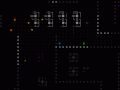
- The images below are small excerpts from possible scenes that can occur in game. The left side is from the beginning Materials floors; the right side is the Factory. (7DRL players will remember the names of these areas, though their contents have changed significantly since then.)
- Notes specific to some sets: Artist F provided no items, so they are all left blank (the empty spaces); Artist P provided only one item (a key, which actually doesn't exist in Cogmind), so I used that as a substitute for all items.
")
Cogmind tileset concepts, as they appear in game (click to open full size).
Assuming the goal is readability, we want something that shares the clearly defined and easily distinguishable shapes of ASCII. This implies a need for less detail, though we can retain some inner detail since the monochrome requirement helps make it more apparent where one object ends and another begins when in close proximity on the map. (Incidentally, regardless of the tileset, monochrome sprites reduce the map's visual noise overall, a useful feature that makes use of one of ASCII's inherent advantages.)
My analysis comes as 20/20 hindsight because honestly I didn't realize all this when advertising for an artist, otherwise I could've used the information to give applicants more guidance for their initial concepts. At the time I was still unfamiliar with the best practices of using a tileset that can mimic ASCII's look and feel, and was even unsure if that's what the ultimate goal was! I suppose this demonstrates the value of having concepts to analyze and draw conclusions from in the first place.
My take on each of the concepts above:
- [A]: The original A concept looked great on its own, and was noticed by a good number of roguelike regulars commenting on the tilesets. However, there were some dissenting voices that this and other similarly shaded tilesets were not "Cogmind" enough. I'd have to agree. The revised "ASCII-fied" version reduces the shading and does seem more appropriate, but loses a good bit of its appeal as a result. Its heavily line-based appearance makes it more difficult to read individual objects on the map when bunched together, as lines tend to stream into one another in adjacent cells. The seamless blending of the Factory walls is excellent, though I think for Cogmind we'll probably be going with discrete wall segments.
- [F]: The version of F shown above is completely different from the original concept, switching from what was a stylized version of my original 7DRL tileset to something more unique. Compared to other shaded tilesets, this one handles the shading better because it has more room to do so, using a surprisingly large number of the pixels for each robot (in many cases leaving no rows or columns completely empty). It has both detail and easily recognizable form. (Note that Factory wall might have been intended as a door, but I used it as a wall for now--overall the walls are less important where concept comparisons are concerned, because Cogmind's terrain is far simpler than other objects and doesn't require nearly as much variation.)
- [L]: This is a contentious tileset. In its original form, which lacked shading, commenters either praised it for its uniqueness or directly opposed it as a jumble of pixels. The new version vastly improves its readability through effective but not excessive application of shading. I love this set for its detail, though once the number of sprites is increased beyond what you see here it could become necessary to pay attention to that detail in order to differentiate objects, making the set overall somewhat less readable. Playing Cogmind often requires that the player interpret large groups of sprites, and this set does not seem as suitable for that purpose.
- [P]: The original concept for P was rather dark and went unnoticed by many, though I saw potential in its form. Sure enough, the artist later provided a brighter version that really stands out from the others. Rather than use lines and pixels to convey detail, P relies on thicker shapes with recognizable outlines. Much like ASCII, their contiguous form does an excellent job of keeping individual sprites in one piece and enables them to be distinguishable even in dense groups, very much like ASCII. Solid walls separated by space also do a good job of translating the ASCII look and utility into tileset form.
Cogmind Tileset
If we focus purely on readability, tileset P is without a doubt the top choice--it's the most icon-like and preserves many of the advantages of ASCII. However, to me the style doesn't quite feel like Cogmind. The only other tileset here to emphasize a solid cohesive form is F, and I also quite like its appearance, which aligns more closely with my vision for what the world actually looks like.
At their current scope, neither shows enough to be sure of which would provide a better final product. It remains to be seen how effectively each style can be expanded to include a variety of robots and other objects without resulting in too much similarity. Also, neither shows how well items fit into the style. The map objects we have to consider for Cogmind's tileset are basically just robots and items, so we're essentially missing half the picture here.
Therefore I've chosen to hire both artists, F and P, to do a complete tileset at only the base 12x12 size, then from that determine which to use as the "official" set and further expand it to all tile sizes. Now that we've made a decision, welcome to the team Kacper Woźniak (F) and Austin McGuire (P)!
It is also possible to expand both tilesets to the full size range, or even hire additional artists depending on the results of these first sets. We know that different players enjoy different visual styles, regardless of readability (a definition which can very somewhat from individual to individual, after all), so I hope to have the opportunity to provide more tileset options for those of you who will use them. Please leave comments on the sets I've chosen, or any of the many others that weren't.
I can also imagine some interested players will eventually add their own tilesets, because they're very easy to add and don't require a huge amount of work.
For now, check out what these look like in action--disregarding the fact that not all objects resemble what they actually are, and some are duplicates ;).
")
Tileset concept F, in game. (Remember this one's missing items completely.)
")
Tileset concept P, in game. (Remember this one substitutes a single key icon for all items.)
I should mention that the comparison here is aimed at the robots, since items weren't provided, and tiles weren't the focus of the concepts (P is obviously better in that regard). It's a question of do you prefer the more "realistic" look of F, or the "symbolic" and readable appearance of P.
i love a and l they are very aesthetically pleasing. keep up the work man
A and L, eh? Oops, the ones I didn't choose for now. In any case, we'll see how F and P turn out.
Id say A or F, they have solid definition to the levels borders. Are you planning on a public beta or demo for this?
The game is technically in pre-alpha right now, and the first alpha version will launch in a few months as a public early access crowdfunding type deal (but not KS). Within the next few weeks I'll be announcing the details.
I should add that there will eventually be a demo, but not until the more expansive 1.0 release is ready (maybe late 2015?). Before then it will mostly be for long-time followers who already know it's a neat game worth playing ;)
I like L
Thanks for your feedback. That was one of the most liked in general from the original batch, though looking ahead I can see it might not work too well once there are a lot of different robots around. I have however told artist L (whom I happened to know personally beforehand) that we may hire him in the future anyway.
F looks great
Good to know! Can't wait to see more from that artist, who will be working on the set starting next week :D
agreed.
I also liked F and P the most, so I'm glad to hear you've chosen these two! I really like the way F did the robots, making the robot icons so large helps in recognition at a glance too, even for newbies since the guns, drills and legs are very easy to recognize. Of course, a mass of robots may blend together, but it's hard to say how much from the screenshots given.
I think the biggest advantage of P is not the robots but the walls. In all other tilesets they are either too distracting or don't look like an actual obstacle (like the "glass pane" walls in A). P does them really well, though, solid but not grabbing attention, as they should be. Its doors also looks quite well. I think I would love to see F as robot design and P as the environment...
I wonder how will items fit into all this, though. So far we've only been shown a key...
Items are one of the first things I'm having the artists do some concepts for, and they're likely to be rather small, but we'll see. Either way, they'll need to be sufficiently distinguishable from robots.
Your analysis of F is spot on. He did use a lot more pixels to make those cool robots, and they barely fit in the spaces. I'm really hoping it will work even with more robots and in more cramped situations, because they look great.
The P walls are everyone's favorite, for sure, my own included :D. Such a great job on those. Can't wait to see more of them. Artist F apparently attempted some walls in his robot style, but it's likely they won't tile well (not a problem, since we probably don't require style consistency there).
But only now have the artists gotten hold of the full specs and a copy of the game to play around with, so both tilesets will be improving dramatically over the next couple weeks. I'm showing you guys the rough of the rough here =p
its still really good. all the people here love at least one of those tile sets. am i right in assuming u can swap out the tile with custom ones?
Yep, you can swap them out pretty easily, and add custom tiles, too. I'm sure there will eventually be additional sets for download; some artists and future players have also expressed interest in making their own free tilesets available for everyone.