Before we get to any of the substance for this post, we'd would like to thank everyone for their feedback so far. The response to 0.9 has been very positive, and we want to thank everyone for their support in the past and hopefully going forward as well.
Now, on to the major areas of feedback. This is by no means meant to be an exhaustive discussion (not going to mention stuff like individual missing strings or specific unit balance), I just wanted to hit on some of the more common areas and bigger changes.
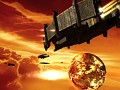
Planet Defenses: Ineffective because of a bug, not design. Been fixed.
Starbases: Coming, just early in production, and not the same uber powerful all-in-one style.
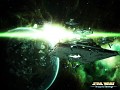
Galaxy Gun: One per customer. Cannon shells cost extra, some assembly required. Opt in with heroes.
UI: Menus good, icons questionable. More feedback requested.
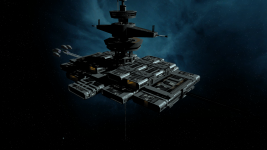
...Planet Defenses & Starbases...
There was some concern during the initial release about the ineffectiveness of planetary defenses. This was actually the result of two rather unfortuante bugs with planet shielding and Golans, which have been addressed. We are, however, increasing planet health as well. I wrote a bit more about this in the description of this image, but that's the gist of it.
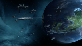
Second in this category is concern over the lack of starbases, which was not helped by my own poor choice of words in responses. We maintain that we have no intention of adding Sins-style starbases into the mod, but I should be more clear about what that means, specifically. By Sins-style starbases, we mean the all-in-one essentially armed planets that acted as immobile (or not, Orkulus) Titans militarily, while providing large economic and cultural bonuses. Those kinds of structures didn't exist in Star Wars, and we don't want to make them exist.
We do plan for each faction to have more specialized and less individually-powerful, deployable starbases however. We didn't want to talk about this until there was more progress on the assets, but considering it's my fault for the confusion I'll talk about it in some general terms. The current plan is for each faction to have two starbase options; one military, one non-military. They won't be the one-structure fleets/planets of the base game, but they will still have considerable power and utility in their respective areas. These will be included in 1.0, so we'll talk about them more once we've got more progress on them (we only recently even decided what specific structures to use, so it'll be a bit).
This is part of a larger point where we want to emphasize that people should not come into the mod with the expectation that this is Sins with a Star Wars facelift, and it shouldn't be played as such. Nor is the point of a Total Conversion to just tack features on. Features that we feel work and suit the material are kept or added (fighter supply, degrading systems, etcetera), and features that we feel don't work will be removed as necessary (all-in-one superbases, bypassing travel nodes, pirates). The end result will, we hope, provide a unique and well-fleshed out experience where features aren't just there for their own sake, and instead serve the larger purpose of reflecting the source material and creating a cohesive gameplay style.
...The Galaxy Gun...
This is a bit more simple. The Galaxy Gun is meant to be a very powerful (meaning no, we will not give you a way to avoid it once it has shot) weapon which is, crucially, very rare. In 0.9, considering you can't make availability scale with map size, on some maps it lived up to this while on others it was a bit too ubiquitous. We've made a few changes which should hopefully put the Galaxy Gun where it should be.
First, it's unique. You get one. Don't lose it, and don't set it to autocast or you'll waste one of your 20-minute-cooldown shots. Secondly, it costs resources to fire. Third, since this seemed like a popular request, it's now tied into the upcoming hero system (meaning at the start of the game you decide if you want heroes and superweapons or not).
...User Interface...
The response to certain UI components has been mixed. Some people have said they love it, others not so much. Our general perception of the feedback is that while people tend to like the overall design (main menu, sub menus) the achromatic theme of the buttons is less appealing to some. This is
an area where we're still deciding how to progress with the feedback, so if you're one of the people who dislikes it we encourage you to give as detailed feedback as possible in the comments on what it is you dislike about it, planet icons notwithstanding since we're already working on those to make planet types more identifiable.
...Networking...
As many of you have noticed, the site is currently down. There was an issue with an automatic server upgrade which took down the Star Wars: Rebellion Network of which our site is a part, and our hosts are currently working to fix it. While the timing is obviously unfortunate, everything should still be there when it gets back up (although there will be a bit more downtime later in the month as other maintenance is done, this should come with a warning beforehand). We thank everyone for their patience in this.
In response to the UI: theme was I like the direction you guys were going, however, even after several hours of play, I have a hard time figuring out what is where and what it is in the buttons ie: capital ships at the factory. To me, either colors or clearer images are needed, preferably both.
On mobile please forgive typos. additionally, the current images on the buttons are hard for me to read or understand at a glance, it takes me about a minute to figure out if I'm building the right thing or not... Not ideal. Vanilla sins' system where the icons have color and clear distinct images is in my opinion ideal, I can find what I need in a glance, and know if I can build it or not.
On this specific point its important to keep in mind, however, that it will always require some sort of additional symbol to distinguish ships. This is part of why we emphasized them and tried to use icons that would emphasize the differences instead of simply being an image of the ship in the first place; most of the distinguishing information has to come from them. In base Sins part of the reason that solely pictures works is because each ship is more distinct. In Star Wars, a lot of ships for the same faction share the same basic shape. Distinguishing an ISD, ISDII, VSD, VSD, Vindicator, and Praetor from a 30x50 side shot is more difficult than you'd think, and in our experience this aspect has caused more confusion than the achromatic aspect or symbols, however since its the "new" part it's the more obvious focal point for people to attribute confusion to.
I'm not saying you're wrong though, just that its not quite the whole story/that simple.
I aked galaxy gun for Thrawn revenge for FOC tell me in private if you plan to add
Then I think the current images don't differentiate enough between ships or structures. Perhaps use the abbreviation as the major part of the images ie: ISDII or have that part of the image change color.
Well, I really believe when you say you can't find your place. I was just like this in the firt... 15-20 minutes in game.
Since then I almost completely find myself arround. My only problem is that I always search for the Naval command in the tactical slot... For your capital ship problem, I think you are wrong. It is pretty much the same place as it was in Sins, so of you use your well learnt experience on that you will have no problem...
I really think it is quite easy to understand what the icons mean. The only problem is the still missing ones, but hey, this is a beta release...
Yeah i find the UI/Icons "Bad" too.
soo complicated to find the right things.
While not quite a direct analogy, remember when you first played Vanilla Sins. How long did it take you to understand the interface like you do now? We are not really introducing anything too new on the interface front, so about 95% of the icons are in the same spot, just with different silhouettes. Not to mention many Star wars ships have nearly identical silhouettes, so it can make viewing ship hud icons very difficult to see differences (What we attempted was a ship icon shorthand on one half of the ship with a top down profile on the other, but the size of the ship icons really mute those details).
This is not an excuse. I just wanted to add a little perspective to how you are viewing the icons right now. We will be revising them.
You guys deserve the praiseful feedback, trust me. If not for your work on the mod, your patience with the community during the mod's development should at least be commended.
But yeah, I actually love the UI itself. The universal symbols for many of the buttons, like the base game, is really appreciated, although I can understand some people's issues with the ship/building icons, but it's gonna be difficult to tell if you're fighting an ISD I or II no matter what until you get up close/read the string.
Is there gonna be a small hotfix-like release of just the fixes you made so far?
(No new contents just maintenance.)
(0.901 :) )
Below I will list all the problems I have with the UI in an overall list, feel free to add to this in order to show any furtherance of issues:
-There's a slight over-complication in the iconography for just about everything, and there's certainly a distinct lack of color in any of the ship icons, ect, in the research menu, and planet menus. This makes it so that quick glances in a menu when upgrading isn't possible, and causes issues to those that have color blindness such as several of my friends. The color distinctions have to be more pronounced, especially when layered over a highly complicated object with multiple layers of design.
-I feel as though it's hard to differentiate between ships in battle due to the lack of specific enough design in their world emblems. This causes problems in combat because I'm unable to figure out what ships I should focus my fleets on, and what pose the greatest threat to my ships. Basically, it's hard to learn each ships specific symbols.
-The monochrome colors of the menus is slick, and very modern looking, however it causes issues when just giving a quick glance to certain menus, and sometimes it's best to differentiate the menus with color coding, ect.
-The uniformity of the UI between factions is nice, but it also takes away the feeling that you're playing a new faction each match. I'd like a bit more distinction between each faction, and adding in a new UI design for each (While being time consuming, and somewhat difficult to do due to Sins memory limits) gives each their own prominent ascetic, which further adds to the atmosphere of the mod.
For the most part these are my personal issues with Ascendancy's UI, and perhaps some of these will be altered. None of these are exactly game-breaking, but from a game design perspective they are limiting. With all that said, I'm absolutely LOVING Thrawn's Revenge II, so keep up the good work!
Thanks for the detailed feedback! When we sit down for our next UI meeting this post will definitely be brought up.
I and the rest of the team really appreciate you taking the time to write this.
No problem, glad to help.
On the issues of tech icons; I have to disagree. It's so much easer to understand now with simpler icons. My problem with Sins was that you can almost never know where is what (unless you're a badass veteran). TRII makes it much more easier. In a glance at the tech tree you can know the economy boosters right away, the ships unlockers no easier, defences clear as the sun, and so on.
I really love it. The only UI thing I can think of is the ships icons when zooming out far. It's quite confusing in larg fleets to know what ship is what :/ I found it especially hard to locate my immobiliser in a fleet of star destroyers due to unclear icons.
However, the build icons can never be easier to distinguish^^ people just need some time to get familiar with all the stuff, and they will see how easy to know what to build and where to build it ;)
Ship icons in world space (the ones you get when you zoom out) really need some love, as right now the solid color can make it bleed into other ship icons. We are aware of some of the more significant issues with it, so the next challenge is finding some workable solutions.
I'm glad you noticed how we go about homogenizing some of the research icons (like all allegiance research icons look the same, trade increases look the same, etc. so less visual language needs to be memorized). Because this is a mod for a game it puts us at a strange balance point between what we want and what players know, so I am happy to see some of those changes as understandable by some of the people playing TRII.
Everyone's feedback (positive, negative, or REALLY Negative) is information that we can use to make this a better experience for not only you guys, but the mod team as well. And the more it is explained the feedback is, like your post and Idios's post, the better we understand the issues to tackle.
I think everyone can appreciate your guys willingness to listen to feedback. I would post more detailed information on my problems with the UI, however I believe Idios pretty much covered it in an above post. Issues with the UI/Icons aside the mod is excellent so far, and I can hardly imagine how good it will be in a few years when it's more mature.
(just as TR is today)
Regarding the icons, colour is a huge factor when needing to get a quick glimpse of what you need to research. Something our team learned that differentiation is key in order to understand what makes that particular item stand out. It doesn't even have to much, just a line or blob of red to denote a particular type of research and your gravy.
The planet icons I would recommend also need a look in. Yeah the flag thing looks cool and all but the little flag with the splash of light pastel colour can really strain the eyes. A combination of Ascendency's systems with stock sins would be the way too go.
The empire tree icons also look weird in some cases. Writing I'll be honest does not translate well to it. It looks blurry and odd and only serves to break up an already existing icon. Whilst I understand that because the way Star Wars ships look, the ships may look the same. A wire-frame of a Vindicator is going too look a lot different than the ISD's one.
Hopefully this has been helpful, congrats to the fantastic release.
Thanks for the input!
The color changes based off of type of icon was one idea we were throwing around, and wireframes (or a variation on it) may end up becoming the fix for ship hud icons.
About the icons, i'll be blunt.
They look too simplistic, lifeless and you can't figure out what's what just by glimpsing at them, you also can't figure out if you can build a damn thing or not because it's all grey color. This is the only case where i can't say "simple yet effective".
In sins, you didn't even need to mouse over the icon to see what it does, you would know just by looking at the color and the icon itself, it's logical and effective. Let me give you an example, shield icon, hmm i wonder what does it do, ahh yes it gives you more shields. Red planet icon, enables you to colonize volcanic planets, credit icon gives you a boost to credits, etc.
If you are really against colored icons, what you can do about ship icons is to simply write what it is. What i mean by that is for example for an Imperial Star Destroyer icon just write with big letters ISD, for MC80 Star Cruiser, you write MC80, and so on, it can be done with every single ship as they all have abbreviations. It would still look ugly but you would know what you are building in less then a second.
In my personal opinion i would still go with the ship portrait as an icon, 99% of the players know how to differentiate between various ships, after all we are Star Wars fans.
Other then the UI, i'm enjoying the game way too much, keep up the good work :D
By that logic, however, I'd argue ours more clearly gets across information. For our research icons, we have, for example, the Tibanna symbol, and then a plus symbol. The base game has a picture of the extractor doing stuff. Our power to shied icon has the ship, and then the shield around it.
I think yours is fine, but if talking easy access to information colour tend to stand out. :)
People will get used to it and once their simple monkey brains have learned the pattern they will stop complaining so nothing to worry over. :P
There is no need to insult us people with "monkey brains", team asked for feedback, we gave them feedback. What they do with it is up to them, no one is demanding anything...
I think malanthor is right.
I understood everything after 20 minutes of gameplay, so it shall not take long for everyone to learn the stuff. I understand that first it is confusing, but remember vanilla sins when you first played. I bet it took a few days to adjust.
The largest problem with the current world is that everyone is in a hurry. Slow down, wait if you can get used to the icons, and only post if you really can NOT.(and i mean it after a few days of gameplay...)
I agree that malanthor shouldn't said monkey brain, but this was merely a figure of speach, but some people are really too dumb to understand them...
The only problem the mod may have is:
someone be able to spawn Praetors, like if the were mere ISD-I (if he have the ECO)
My only complaint is that the enemy which was only on hard, spawned a titan at around the 30min mark :P Was rather shocked to see a star defender ravaging my planets! is that normal? should I turn the difficulty down to normal?
Other then that, its brilliant :) the ships are stunning, and the interface is just gonna take some getting used to is all... but yer, little less white :)
Ah... I see the site is slowly starting to get back up and running. Can't wait for it to be 100% back...
This comment is currently awaiting admin approval, join now to view.
>How do you obtain the Galaxy Gun?<
you have a station in orbit on your capital which can call in a galaxy gun constructor once the research is acquired.