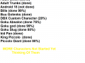
The game could not be released as it was so much time consuming so i decided to release the characters which are done.Download link in comment section,the description and in the article

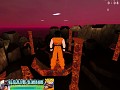
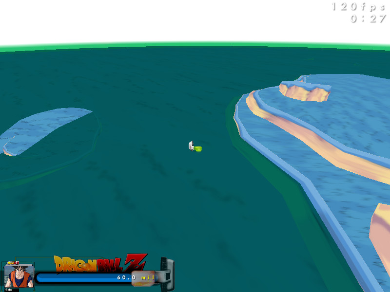
New Hud!!!
(view original)

Post a comment
Description
Guys How About this hud it's simple and nothing changed just little logo and scoutter added
That hud is so much better than the crappy one
thanks
There's still the scouter that is jiding the bar..
If you want to keep it, you should make the glass of the scouter do all the hud (without hiding the bar, so, a little transparent) and try to place a photoshoped icon in. In this case, icons from this kind of pic would perfectly fit: Fc03.deviantart.net
Remember that the icons shouldn't have too much contrast/differences compared to the overall hud colors.
I hope it can help.
ok
thanks i will use icons equally
Btw, by icon, i didn't meant all the picture, just the head for exemple. An hud doesn't need effects or good looking things. The first objective is an interface where you can read everything instantly, without something that hinder the view.
ok now i got you