Tiberian Apocalypse is a Partial Conversion for Command and Conquer 3: Tiberium Wars with the goal to create a true Tiberian Sun sequel. GDI, Nod and the Scrin are getting a complete overhaul.

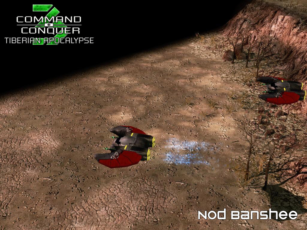
Nod Banshee
(view original)

Post a comment
More TS-Like cockpit anybody?
Looks too blocky, personally I liked the more glassed canopy design.
i have to reserve my kudgement at this time. could we posibly see it a a headon angle so we could properly judge thecanopy? i can't really see it that clearly from this angle. from what i can see it does appear to be a little blocky and sticking out at the top but other than that a very nice represtation of TS Banshees.
So how much more updates for the Banshee will come out? =P
I prefer the canopy on the last picture to be honest but they are both great, the mods really coming along well, keep up the amazing work!
also, correct me if im wrong, but is the Nod logo on the Banshee backwards or is it just me? overal though i like the design of the banshee.
Texture is mirrored, you've probably seen it before, for example if you've played C&C3.
I prefer this one best:
Media.moddb.com
Perhaps have variants, even? Like how Dark Templar in StarCraft 2 look different.
I have no preference, it's STILL perfect.
I would personally go with the previous version. That was perfect in my opinion.
The previous version is a bit better, but from this point of view the engine looks blocky
This looks great. ;) The previous one was too shiny.
The great Banshee debate rages on! :)
It looks like somebody gave it shades. :P
I like the previous Banshee's cockpit better.
death from above:D
I like this cockpit better, but on both models the wings are a bit too thick for my liking. Also, the team colour might work better on the front of the wings with the back being metallic.
Comments based on: