Development is suspended. Разработка приостоновлена. English Description: StarKiller it's multi-genre game project (RTS, Arcade, RPG, Racing) with many parody elements for console and PC games (StarCraft, Mortal Kombat, Pacmen and etc.) and movies (Final Fantasy 7, Matrix and etc.). Русскоязычное описание: СтарКиллер (ЗергКиллер) это мульти-жанровый проект (РПГ, Аркада, РПГ, Гонки) с множеством пародийных элементов на различные консольные и компьютерные игры (СтарКрафт, Мортал Комбат, Пакмен и тд), а так же на фильмы (Последняя Фантазия 7, Матрица и тд). PS: Ну, естественно, в основу всего этого лег преимущественно Старик, но об этом тсссс =) Game version required to play...


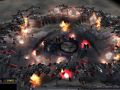
In Gateway (after capture) you can build Zealot,
Dragoon or Archon... if you have Pylons.
PLEASE.. REMOVE...THESE...LENS...FLARES
:dead:
everything besides that looks cool
Do you would find it better if the texture is more yellow like the Pylon???
Or say what should I change on the texture or tell me how do you imagine a protoss gateway texture!!!
i think is necessary to redraw stairs.
Okay I will try it.
yeah you guys should work on the gateway skins a little, it doesn't exactly look like i remember it from StarCraft...
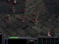
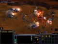
Interesting battle :)
The Gateway lokes great, but its a bit cubic styel.....
It's this the firts version ?
.....
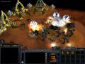
An ideal: The Pylon could have something "glore" light (as the nuke explosion have)
and than will be loke bether...
the Texturas are good on the Pylon
The Gateway need a bit more work
Good work
The Pylons are very good but the gates are too yellow
isn't the design in the square at the very center of the stargate from halo? i seem to remember that circular red on grey design...... i might just be me.... :)
In 1 word CORNEY.. PLEEEASSE Work on the skins, it looks like Action Figure Graphics. Other Than That it's GREEAAT!!
plons look awsome but the gatway could be better try removing the large horns of of stairs
Yes, the Gateways stand out in this image due to their comparative lack of quality. The model may be fine, I think it may be the texture that needs some enhancement to keep it up to par with the units and other structures.
hmmmm, the menu could use some work,
not how i remember it from starcraft
you should try making the protoss menu,
the unit picture a bit stretched, and i am having trouble deciphering WTF the funny car is.
Gateway needs a hell lotta work
maybe you should try playing starcraft before attempting to make a mod
god, you are insulting both starcraft AND generals
this is ********
ok, this is getting gay
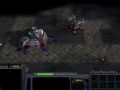
the archons look like a mixture of normal archons and Dark archons
this is just wrong
ok, this is retarded
the archon is the wrong colour on the inside
its supposed to be akind of a bluish shadow