A partial mod conversion of Command & Conquer: Red Alert 3. This mod tries to improve, fix, and add what Red Alert 3 missed, forgot, or unable to do.

Hey guys.
Just to let you know that all comments and reactions about the balance of the last release was taken in consideration. The next version will be a quick patch to apply new balance changes and fix for minor bugs. I can't promise when, but it would soon enough.
The team is busy with their everyday lives and so you know, we can't do updates quicker than you expect it would be. So please bear for the meantime.
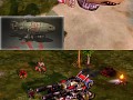
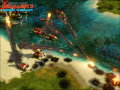
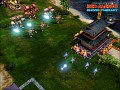
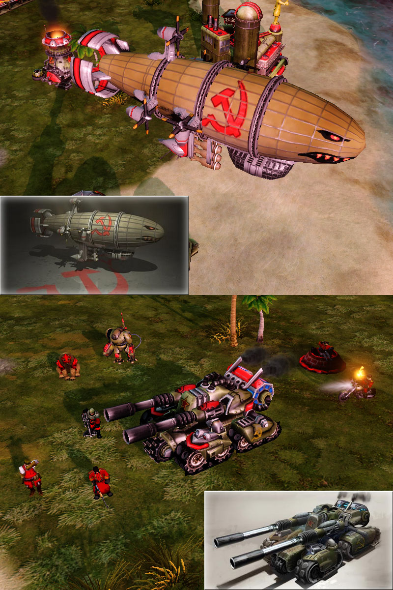
As a little update, I decided to reskin some models either matching the concept renders or lessening the bloom on the house colors (see the conscripts, and the apoc wouldn't be more dark enough unless you want it brownish black)
Don't mind the red bear. Just wrong alpha masks.
EDIT: The skin lightness also depends on the map, the new image is a test on another map with less bloom and time of day at sunset. Fixed the outraged bear and biker duo.
The Apocalypse is pure sex.
The Kirov looks very nice as well.
(buried)
yeah, looking very good but why bear is red?
*facepalm
Nobody reads the descriptions today...
Outraged bear is outraged.
Iron Curtained bears :')
One day TheWorms, you and your team will completely fix RA3. I salute you. Lessening the bloom is a good way to do so.
Thanks for volunteering to re-write the postfx_bloom.fx shader!
Finally a RA2 like Kirov! I always hated the old face! Thank you!
Also great Apoc (and red bear =P )
ARGH WANT.
I don't see any change on the apoc. Barrels perhaps.
they've turned down the amount of housecolour
i can realy see great improvment but if you can make the outlines on the kirove house color soviet symbol darker please,i belive that will greatly improve the kirove overall look :]
UHHHHHHHHHHHHHHH! I just came. Moar awesomeness for RA3!!
great details you added
The Apocalypse Tank's Barrels should be a a Tad bit longer?
That's on modelling, not my good forte.
I've always wondered why the apoc didn't look like the concept picture.
Now it looks just as it should look.
On second thought, I think darkening the barrels as much as you did on the Apoc threw off the distrubution of colour balance; it gives too much wieght to te front of the vehicle. I would lighten the guns just a bit to get it more balanced again.
The darkness on the gun's gives them a dirty look, as if they have been fired many times before.
And they should be a little longer, or thinner to compensate.
Yea, it would look great if the guns were longer and thinner.
Yea the Apoc's barrels should be longer to stay in line with the Concept art.
Awesome work.
This time, I left out the metallic bits unshaded with black.
i believe that the original concept of the guns was better... now it seems really strange! IMO they look a bit fake, if u compare them with the rest of the tank!
apoc need longer gunz,but this not reskinning but remodleing,