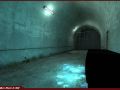
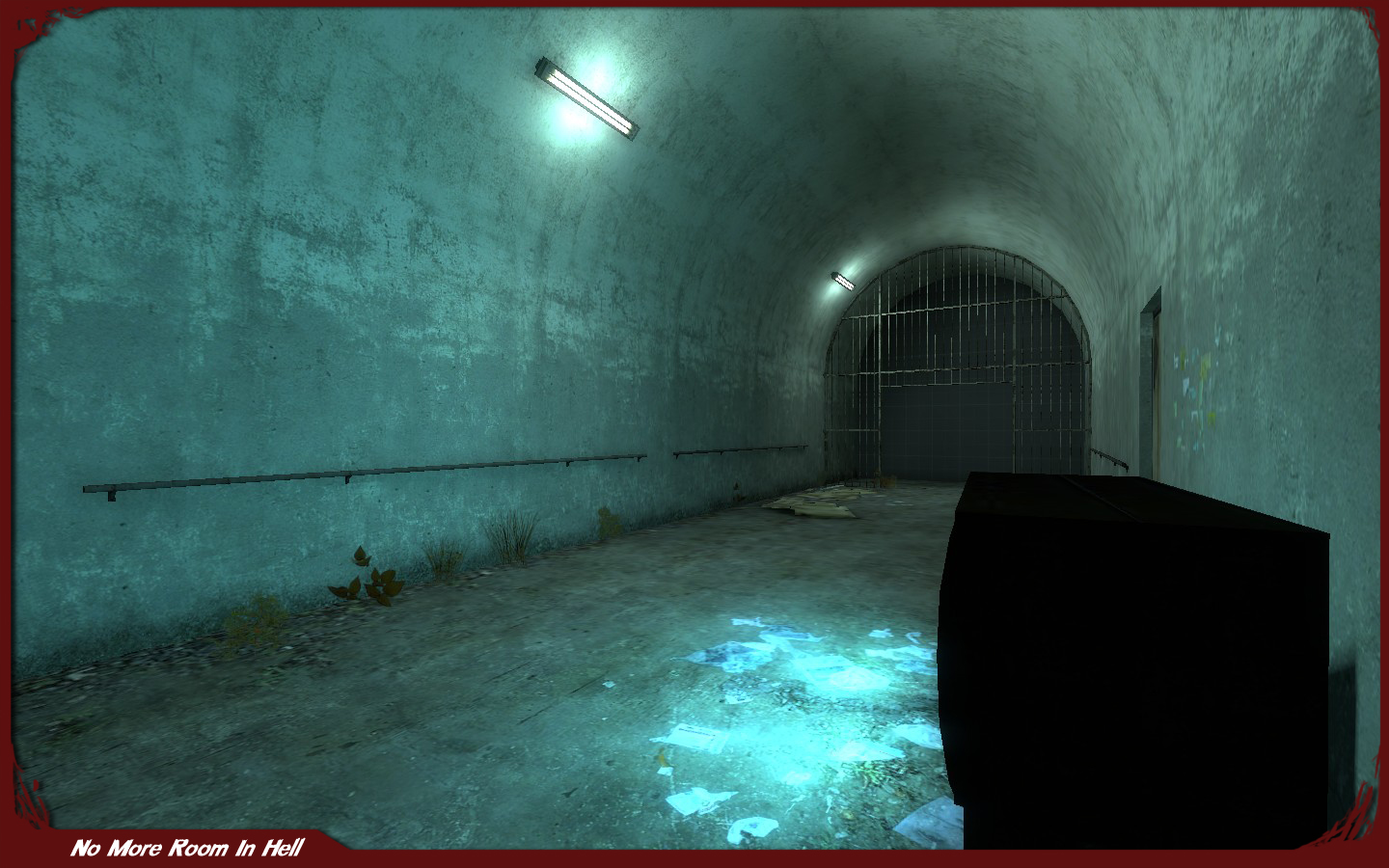
Again it feels to bright for the lights that are in it, except of course for that black shadowed object, which I'm wondering if it has no dynamic light or such for it.
Yeah, but I hate maps where you can't see at all. People say it's scary, it's not scary for me, it just ****** me of I'm running into a wall or something.
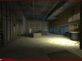
Here let me show you guys here: Img132.imageshack.us
I actually think this looks pretty good, a tad empty for post apocalyptic settings, but still it looks good...

Again it feels to bright for the lights that are in it, except of course for that black shadowed object, which I'm wondering if it has no dynamic light or such for it.
Dude, you always talk about the maps being too bright.
If the maps are too dark its going to be depressive to look at.
Thereby killing all the fun.
Most zombie Scenes are meant to be dark and depressing.
Yeah, but I hate maps where you can't see at all. People say it's scary, it's not scary for me, it just ****** me of I'm running into a wall or something.
why is it blue tinted? is this on purpose?
Here let me show you guys here: Img132.imageshack.us
I actually think this looks pretty good, a tad empty for post apocalyptic settings, but still it looks good...
Nothing that couldn't have been explained in your comment.