A compilation mod for the STALKER enthusiast, delivering top-quality visuals, mind-blowing audio, useful innovation, more fulfilling gunplay, and enhanced gameplay. What's M.I.N.E. Is Yours.
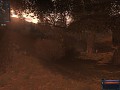
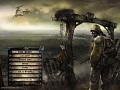
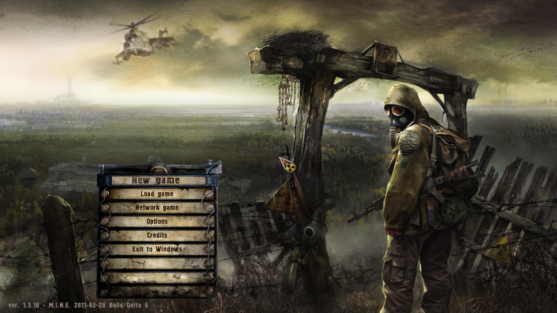
M.I.N.E. - Potential New Menu Screen
(view original)

Post a comment
Description
Like?
Dislike?
Tell us what you think!
Community output will determine if this stays or not.
LIKE
LIKE
LIKE
DEFINATLY SUPER AWESOME MEGA LIKE ! :D
So far, feedback seems good. :D
Thanks to everyone so far for the feedback.
Shouldn't i do the mm? ^^
Don't think about it, just use it.
Seriously.
It has potential. :D
Yeah this is a nice piece of art, I like seeing it wherever it pops up.
I saw four others just as good, and I was going for a whole menu re-skin; but alas, CS has some animated blocks which show up (i.e., the paper blowing in the wind on the options screen), even if you cover the whole screen with an image.
Quite sad.
i know how to remove them ^^
My opinion is that image is overused in quite a few STALKER mods - It doesn't seem very unique.
But I like the image still. I just think it needs a little something to help it stand out - I could start up Clear Sky and say "Alright, I'm playing M.I.N.E!" Instead of "Which mod was this again...?"
That's just my two cents. You don't necessarily have to change the image - Just make it a bit more unique in it's own right. :]
These actually came from a wallpaper background site, so that doesn't surprise me. What may surprise you, though, is that I had five different candidates.
Moddb.com
You will see the five I was considering there.
Does anyone care to take a look and voice your opinion for the best?
Bear in mind that a menu overlay will have to sit on top of it. :)
Thanks.
I have so many different images like this its not funny. More stuff you want to have a look at some point Separation?
Also, the menu section bar itself could do with a big of a redesign. Loner, I think that's your area.
I need to find a few good images for a new main menu for my CS and CoP TC's...
Well, Loner is definitely doing our menus. However, if you have a suggestion, let's take a look. I'm sure you've got some awesome stuff just dying to get some attention. :)
I'm partial to Number 2 or Number 3, myself. Also, something else that may interest you, if you can obtain permission...
Mirf.ru
I always wanted to see this image for a menu screen in a STALKER mod. A little busy, but I like it. I especially enjoy the bolt in the skeleton hand under the water - a nice touch. :]
Damn! That's a good picture.
That is pretty amazing.
Horrid that it's vertically stacked, though; you would easily lose 50% of the detail having to stretch it 4:3, and even worse going 16:9.
Still a really good background - thanks for sharing. :)
It's my opinion that it's the gas mask that makes so much of the STALKER art seem " sooo done ". Yes, it's iconic, but the power of human facial expression is eliminated by it and your left relying on environmentals and color palates for impact and impression.
The Zone is all about base human emotions of survival within a terrifying and lethal place - the art should reflect that by putting a face to the game if you get my meaning. Just my take on it.
That's a pretty brilliant assessment, actually. I concur.
I suppose that is why the one GlassPirate provided is a little more engrossing.
You could go more minimalistic and atmospheric - This was made to represent a typical STALKER environment.
Fc08.deviantart.net
Maybe a little less cliche than the gas mask/AK humans but still impacting? I use that particular image as my phone wallpaper right now. :P
I really like that... I might have to see if I can get that to fit in a menu screen...
Ultimately, however, LONER1 is doing our menus - these are concepts we are tinkering with.
LIKE