wellcome commanders at the vortex of war which is a mod for generals aiming to combine all factions from ra2,ra3,c&c3;,c&c4; and about 3 tottaly new factions and adding new units for the original factions for the sake of ultimate war.

asking for a brutal version of the logo
(view original)

Post a comment
Description
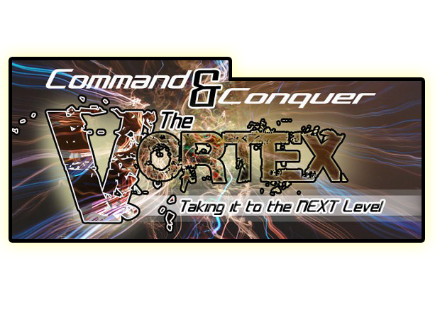
i think this one is brutal enough ;)
made by my RL friend texturiser :)
nice :D
Look great
BEST!
Awesome
Gotta love photoshop :)
Wow) This is much better I think)
Well... better
looks like your mod is having a disease, i prefer the other one, what there should be brutal about this i can't understand. it would fit for C&C the resident evil conflict. but hey its only me so choose witch you like most flash i will love the mod anyway.
this one is more of a poster than a logo.used for head lines only.the other one is kept
hi orange131326 ... the mod s name is THE VORTEX ... n a vortex is something like a power field or force field that pull thing towards it ...so its definitely gotta b something strong n brutal as u can see in the background
As for the (disease) thing ... here s what I thought-> that it would b cool that the words seem like they are breaking and getting pulled by the power of the storm :D
Anyways; Thx 4 ur opinion ... n I ll make sure its better next time :D
Orange does have a point. Try making it blue as the dominant color, and also try making the broken bits as shreds or rips instead of bits flying off.
The colors do make it look like something from Resident Evil.
...and maybe the background should have a spiral too, sort of swirling.
I'm just brainstorming a bit... so many ideas.
I really like the digital theme going...
Ultimate coolance!