Well, what the name doesn't say, the pictures should. I aim to make Homeworld 2 a visual feast. At this point I plan no gameplay changes. Credit to CNLPEPPER for his v2 shaders. Also feel free to tell me what you like and not, I can't guarantee everybody's happiness but I'll try my best to listen.
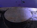
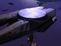


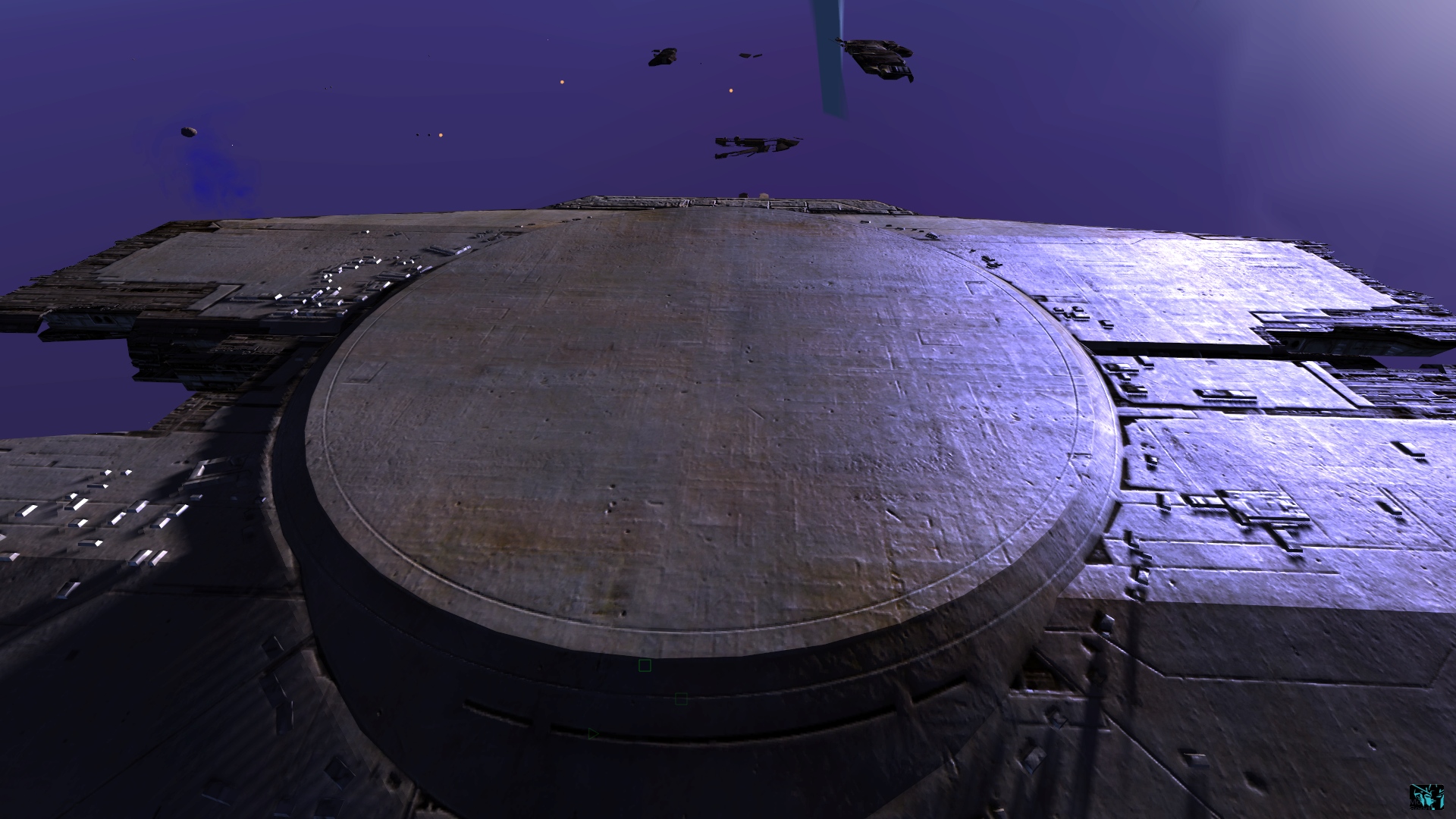
progenitor debris
(view original)

Post a comment
Description
This is the look I'm going for with the progenitor debris... so far, I might edit reflective qualities. I wanted to go for a more made of stone look, like they were carved from the universe or something... but my adjudicator didn't like that very much haha
Looks pretty good. I agree with reducing the specular intensity, though I've been saying that's needed for all ships.
Sorry but specular is not going down... I adjust it according to what seems natural for the background and the lights therein. the tanis background has a bright star with a blueish hue... hence the bright blue specular. My adjudicator agrees and likes it my way this time. as a matter of fact I just changed it a bit and the result makes me want to do away with the gritty effect completely.. I'll have to see how it works on other ships though...
I just can't come to terms with shiny armor and paint on ships designed for war... or in this case a derelict ship abused by the cosmos for ten millennia.
When it comes to visual effects in video games, I believe less is more.
I think that the textures need repairs first. At least make the excessive-specular-effect component optional, please... on a related canon note, the Progenitor engineering bay was made of metal that had been self-irradiated (quantum wave irregularities), and even if it WASN'T toasty, it should not reflect light in this way, as it has collected dust and gases during its long drift through space. Frankly, all of the ships and debris in HW2 are not made of silver.
I agree, all Homeworld designs have a signature matte finish and this is completely unfitting. Lowering glossiness and reducing the specular intensity is a must, otherwise stuff looks like cheap metal trinkets instead of chiseled, sci-fi heavy materials.
Use high specular intensity smartly, for edge wear, for example, don't leave it with diffuse map derivatives or flat values that are seemingly used now, good specular maps are made differently.
Not to mention that you don't seem to have image-based lighting implemented anyway, with only simple and coarse sunlight reflection showing up on the surfaces, so nothing of value is lost anyway. Good example of justified high specular is EVE Online where environments are reflected on the ships, but here, there is nothing to really reflect and whole effect just looks very cheap.