A Halo mod for the critically acclaimed Sins of a Solar Empire, that aims to capture the fast paced intensity of the Halo series.
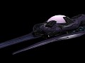
Main Menu Version 242357
(view original)

Post a comment
Description
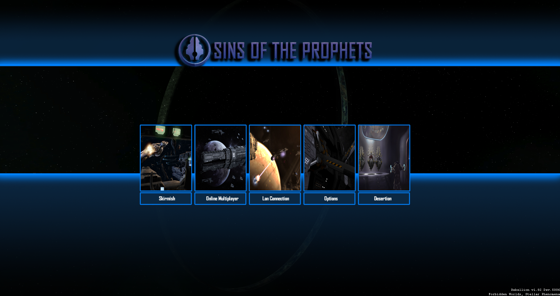
Looking for feedback, do you like this style?
Dude.....THIS IS ******* AWESOME!
Lord_Set is a pretty talented duderino.
Desertion optional one could also be heretic... But I like it alot it looks great.
I don't want to be rude or anything, but this is not good enough, you guys have made one of the best mods I have ever played/seen but this menu look like something someone with minimal photoshop skills could come up with, you guys can do better than this. This is just my humble opinion. (I will regret posting this because of all the hate I might get, but I feel I have to say it, because obviously your fans will tell you its really amazing, when it really isn't)
Well, instead of just saying it's bad, do you have suggestions on how to improve it?
You may or may not know this, but SoaSE is fairly limited in how and what we can mod, so keep that in mind.
I totally agree with you, I should have not said that, without providing any suggestions. I will try to come up with something, and again I meant no offense, the point I was trying to get across though, is that your mod is so unbelievably awesome that this menu just does not make it justice, its just too plain.
I think it's amazing and not just because I'm a "fan" of the mod.. It's minimalistic.. You can't say "you need minimal photoshopping skills for this so it's bad".. It's not bad because of that but because you see something you don't like, which is nothing to be ashamed off.. you said it in a polite manner but your last sentence made it sound too general, being:
"... will tell you its really amazing, when it really isn't"
I know you meant it from your opinion but this one might rub people the wrong way.. As I said, I like this menu but there would be 1 thing I'd change, being the Mods Title, I have to admit that for me, it does look a little cliché and 1990's with the background shadow on it.. Maybe try an outline or something? But that's just my 2 cents so..
It's a menu dude. We should be happy they even care to alter the UI and menus, most mods for games don't. I like it.
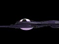
i like it though it would be better if you put the options in the middle and the ring a bit to the right i guess
wait never mind leave the ring in the middle it would look sexy
I was typing up a whole sorta critique of my opinion on it, but so much is just subjective or not really a huge issue. I decided to shorten it to just the size of some things, especially the Title and buttons.
I understand it needs to be compatible with a whole range of computer screens and resolutions, but it seems like there's a lot of wasted space.
Personally I think the title should be bigger or more pronounced. I don't know how to do this, but I think the purple with the blue in the background(even with those sick shadows) combined with the text just doesn't have enough visual flair.
The other major thing I would love to see if its possible is making the pictures themselves the button(maybe its already like this) where you would just click the picture and not have to click the actual Word button underneath it. So the word and picture would be sorta combined as 1 button. That would be what I would hope for, just because that would be my immediate instinct when clicking on stuff. that's a UI thing more than an Art thing.
Like I said I have no idea how it actually works. That's just a concern I would have.
Aside from that..... Well, the slight distortion of the pictures(it looks like that to others right?) is a little distracting. don't know why, that's just bugging me. its very minor though. I assume it was just done to fit it in the aspect ratio of those pictures better.
I love the mod and all the work your doing. its incredible.
Opinions don't deserve downvotes. Come on now people.
Agreed. Fans are a little too rabid.
Theres a difference between having an opinion and just being plain rude. If you have an opinion ok fine cool what ever but if youre a prick about it then thats totally different that over rules your opinion due to hostility. I dont mean you of course lol but rather on pheonixs behalf who did infact correct himself. Just saying its bad without offering any critique actually is just bull **** and will get your childrens noses tickled. But like i said he fixed himself which is good.
On a personal note i think its top notch lord.
Not really. People make passing opinions all the time. It's hardly a rude thing to do. To be honest, I was a never a fan of the DoV style menu. Simply covers up too much for me and I've always preferred the screen not to cover up by a bunch of bars and have the game in the background.
He didn't sound rude in any way to me, he started his sentence with "I don't want to be rude", which should sometimes indicate (I say sometimes) that the person really does not mean any offense, he explained himself in a polite and decent, although a bit general tone.
If a person can't take any criticism it is not really the fault of the critic as it is the fault of the receiving party (not pointing fingers at anyone here, seriously), but since he didn't offer a solution it sounds like a "hater venting hate"..
It's fine to not have a suggestion ready for something you don't like, the difference is when he would have been demanding it to be changed..
Actually, he just voiced his opinion a bit awkward at the ending so it looked like he was speaking ill of everyone else, which is something you watch out for but also something that happens to us beings called humans..
He got far too much negative karma for something as innocent as that..
Ill give you both that, And you're right he did say not to be rude. But I did say he corrected his self in the next statement, but theres also a difference between saying something is just bad without saying why as opposed to a critique with reasons and what could be different. If a person cant state why something is bad then there should be well a different approach, but he did state it in a decent respectable tone, apologies if I seemed hostile myself, im one of the friendliest people on here lol, but I also wanted to support sets work a bit too because he is infact a hard worker at this stuff, just claiming something is bad can be a bit...degrading to say the least, but we are all gentlemen here for the most part.But I agree it wasn't a hate vent after what you stated, to summarize a better approach should have a bit more opinion on what should and shouldn't change rather than a hey this sucks approach. But I humbly apologize for my seemingly hostile comment pheonix.
Even though my intention was not to be rude or offensive, now that I read back my posts, I see that I actually did sound like a ****, so don't worry kyle_katarn67, all the hate that I got was well deserved. I agree with EveningStar, I should have not said that anyone with minimal photoshop skill can do this, because I have no idea how hard, or time consuming it might actually be, and thus I would like to apologize to everyone.
You don't see many apologies on the interwebs, you have a +1 from me for that ;)
It looks good. Alot better than Vanilla, an probably 1000 times better than something you could come up with.
I like it. I'm a fan of the minimalist style though. The only thing I would nitpick are the pictures used seem to be scrunched in there. Perhaps some new pictures that look like they were made for the main menu would help this out.
i like it alot actually, i like how its your own images you guys posted earlier on, i wouldn't change anything! its great so far
love it!!
This is niiiiiiice!
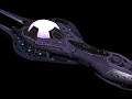
My first impression is that the style is extremely clean. The background is appropriate but unlike most sins stuff, it doesn't distract me from the menu.
The second impression is of menu options being cards on a table. The images are more complex, and won't do well on a low res monitor. I doubt however most users would have that low of a res. I agree with IceBlade that the pictures seem scrunched because of that complexity. They could also be more specialized. For example taking "Skirmish" -> "AI Skirmish" with pic of a Halo AI. Other connotations would work for the images.
Third. The image is very dark; high contrast and some messing with gamma are going to effect how it looks a lot. The title and options could use some bringing out.
Best Main menu style I ever saw,please make it so :)
Well, in all honesty it was inspired by other work, but we're pretty happy with it.
Awesome Main Menu
Best version so far.
Personally, If there were a way to choose between the title screen of your preference, That would be the best option. Some like this one, but the Halo 3 one was my favorite
The only thing I'm picky about is what has already been said - the title just looks tacked on there with no thought going in to how to have it match the style. Perhaps coloring it white and giving it a faint glow? Also the pictures in the cards do look poorly cropped and slapped in there.I would find another way to implement the images where they don't look so low-res and compressed.
(づO‿O)づ
To avoid any whatsoever confusion tho, can the desertion button please just be a quit or exit button?
The rest of it looks amazing tho. High five Lord_set.
No.
Dawwwwhhh pweeassse. [insert puppy eyes here]
Quit and exit are mainstream, they no do mainstream yo!
Personally I'm more of a fan of the Halo 3 style over this one. As previously mentioned by others, it does feel... A bit lackluster compared to the rest of the mod.
Keeping in mind that SoSE is limited, I'm not sure what's going beyond what it can do, but perhaps some moving images taken from in game showing either various ships or battles. I feel it may be more than can be done, but perhaps something EaW alike with a battle happening in the background or just ships flying by.
As for the image at hand. I feel the borders are perhaps too big, especially the lower one, which may be one thing I feel makes it unappealing to myself. The images as well do seem a bit off with the overall style to me. I don't know if its the images themselves or not, but perhaps some kind of a filter over them to help blend them better? I think the biggest issue with it in my eyes is, the images stick out like a sore thumb.
I hope the suggestions helped, and I hope it helps others with ideas or opinions.
when someone goes to quit bring up the exit screen from the halo 1 demo
Can i have the infinity now, please
I like the idea of the menu but I think that it would look better if the title was a little bigger up top, and have the menu buttons down towards the bottom of the screen with a smaller blue letterboxing so that we can better see that glorious halo ring.
No. I liked the idea with the Halo 3 esque menu. Maybe have some CAS carriers burning a planet in the background flanked by CCSs?