Our representation of Halo's iconic space combat in the Homeworld 2 engine, which puts the player in command of some of the most powerful weapons fielded by the UNSC and Covenant and to provide a balanced and competitive experience.


Team Colors Update
(view original)

Post a comment
Description
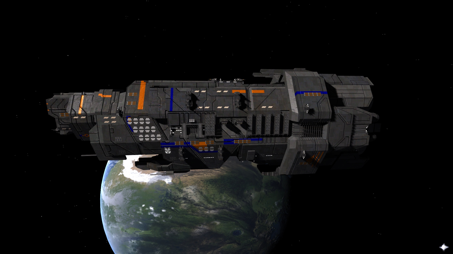
This is an updated concept for team and stripe. Team is blue, stripe is orange. What do you guys think?
Updated Talos:
Majhost.com
Updated Halcyon:
Majhost.com
change the orange to a yellow and slap an IKEA logo on it and we have a deal
Depends if it will fall apart as easily as something from IKEA :P
I have a question, weren't the orange stripes originally red on cruisers?
Or this is part of team color customization?
I think you could just make the original stripes to change color, trust me it make more sense.
Blue stripes collocation isnt really good if someone want to turn them to the original color...
Stripes are based on this concept here:
Moddb.com
If you want it to look original, just change the team color to white/gray and the stripe color to red/crimson.
Yes, what bother me is that, under some of the blue stripes there are fusion points of the plates which the ship is made of.
Even if i set them to the same gray of the ship, they will cover some details.
I literly love the bit of changing the stripes, I also love orange, the best color ever... of all time.
I personally dont have nothing to debate about colors unless they can't be set to original without making them look as grey stripes whcih covers the ship plates details..
Well technically you'll never get the same base gray since it's not a flat color. I can't say it will please everyone.
That's the reason why i would advise you to remove team color and leave stripe color...
You will still recognize your ships and they will look as awesome as they were originally.
Is it possible/Do you considered to do that?
Both team and stripe color will be implemented. Like I said, if you want it to look UNSC, you will just have to make the team color gray and the stripe color crimson.
A picture of the Talos with updated stripe/team colors can be found here:
Majhost.com
So Talos' side hangars are the real one?
The side hangars are auxiliary. A Longsword can't fit in them, but Pelicans and shuttles can. It's purely cosmetic, the fighter/bomber hangar is on the bottom like the rest of the cruisers.
I had this doubt, because they are pretty close to the design of the under side hangars.
Talos' role is to fill the power hole between Thanatos and Marathon right?
Yes. Against a cruiser like the Halcyon or Marathon, it won't stand much of a chance. However, against frigates and destroyers, it will still dominate, but not as bad.
It will still be a rush for the Cruisers, but it's gated and less of a nuisance.
What about showing one with team colors white and stripes red?
Here you go:
Majhost.com
Ok, it look good, i think i will keep them like that, thanks.
Do you have ideas of how to apply that to frigates?
Oh and i noticed you added more stripes than there was before, also it seems you have colored MACs.
Moddb.com
The light blue stripes. I'm not coloring the hull. Team colors will be the stripes while stripe colors will be the light blue areas on the hull, or possibly some other areas. We'll see.
Also the MACs aren't colored, those are the bezels around the MACs.
I think that, frigates wont need an extra color except from team one, or they will be so coloured you cant even see the hull.
The hull won't be colored, I just said that.
Yes, i got that but the light blue stripes spreads so much on ship that they actually are going to occupy half of the hull...
No there is the blue base and then the light blue stripes. I think you're talking about the blue base that covers the majority of the hull. I'm talking about the lighter blue stripes.
No, i have understand what you mean for light blue stripes Zero.
Updated Halcyon:
Majhost.com
It actually looks more agressive than Marathon.
Not bad after all...
Maybe too much white.
I will say you have added too many white stripes on it, it is too different from Marathon style which i prefer.
Why do you always pick the ugliest colour combinations when you try to show these off?
Because I need to make myself look prettier in comparison.
V3LO, the combination of white and red is the most UNSC-like combination the ship can have after this coluor customization change. (which i personally cant understand, as they are meant to fight against covenant that are already a lot different than them).
F3D3, i am aware the white and red is the correct colour combination, however i was referring to the blue and orange of the original picture, along with the blue spots of the last one.
The other reason is that Zero keeps uploading them with 100% saturation, which makes it look like it's drawn on with crayons. He has since adjusted the saturation to blend in more.
perhaps Blue/Yellow =Insurrectionists. I play the game right now as unsc vs unsc. I picture the enemy in my mind as the insurrectionists using stolen ships n such. tada, hes just showing us a pirate ship xD
I like these team colour setups, it's difficult to pick spots for ships that were never designed to have them, and I think you've got a good compromise there :)
b-e-a-utiful. =D
Pretty sweet.
Does this mod has UNSC's most advanced Infinity ?