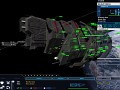
Our representation of Halo's iconic space combat in the Homeworld 2 engine, which puts the player in command of some of the most powerful weapons fielded by the UNSC and Covenant and to provide a balanced and competitive experience.


For whoever said "I don't get why mods don't make custom UIs," I blame you for this. Honestly, it has been a long time coming, but seriously. Go die for making me stay up so late finishing this. All in one day's work.
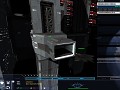
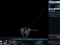
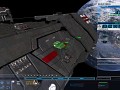
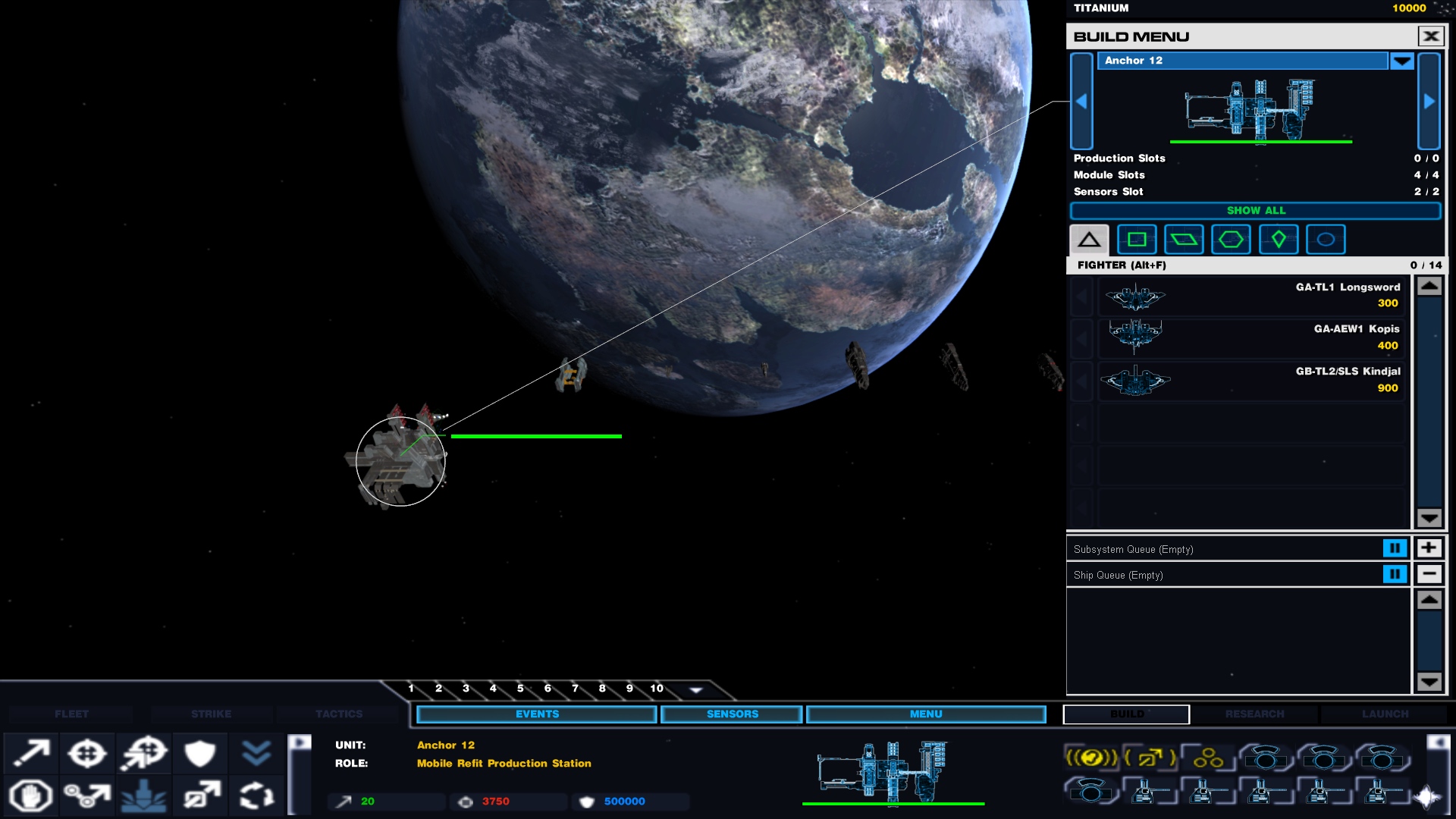
The idea behind our UI has always been a holographic look. I personally went with a lighter background so you can see through the UI easier. I don't know about everyone else, but I like seeing everything, and sometimes the old UI was just cumbersome. Now it's a window of informational goodness.
Some of the stuff, like the taskbar buttons and some of the build/research/launch stuff is either hard coded, or I haven't found it yet. It's pretty much finished, but I would still consider this a WIP.
That's awesome
Different to the old concept you had but still very nice can't wait to play the next version
Had to change some things up since a lot of it is hard coded such as the buttons in the center there. So I made compromise.
Hot.
Love it.
Quite elegant if you ask me.
like it a lot
Nice ! The vanilla UI had way too much contrast. I like this one :)
Ah! i finally dont have to close my build window to see what im doing, Thank you Zero! -bows-
Looks like things are coming along nicely.
ERMAHGERD DEEZ EEZ SO FEKKEN GUUUD
Seriously. Epic work. Amazing.