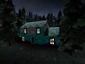
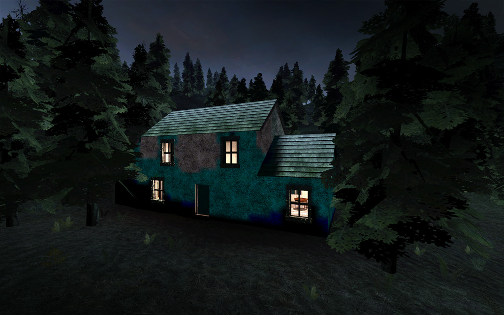
The colors on that house remind me of lighting errors. I usually see something like this (blotching of lighting) is very low-lighting areas. Scatter some small spotlights around the building to try and hide that blotching. Also, check for leaks.
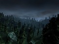
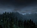
Yeah, the house looks awful, everyone's said it. It doesnt look like this in-game. I had to use photoshop to brighten all these images up for people with bad monitor brightness so they wouldnt complain all the screenshots looked too dark. In-game you the game is not too dark and looks quite awesome but is hard to show that in a screenshot. This house is a WIP. Infact this map is a WIP. It might not make it into the final game since we've been testing a lot recently and its layout isnt ideal at all. Anyway, thanks for the feedback and crits, rest assured it wont look this bad in the final game :).


The colours don't suit the house imo otherwise its good
Lack of details, needs more work.
The colors on that house remind me of lighting errors. I usually see something like this (blotching of lighting) is very low-lighting areas. Scatter some small spotlights around the building to try and hide that blotching. Also, check for leaks.
or maiby that's just how he textured the house :P
Yeah, the house looks awful, everyone's said it. It doesnt look like this in-game. I had to use photoshop to brighten all these images up for people with bad monitor brightness so they wouldnt complain all the screenshots looked too dark. In-game you the game is not too dark and looks quite awesome but is hard to show that in a screenshot. This house is a WIP. Infact this map is a WIP. It might not make it into the final game since we've been testing a lot recently and its layout isnt ideal at all. Anyway, thanks for the feedback and crits, rest assured it wont look this bad in the final game :).