Mod has been indefinitely postponed for the time being, check us out on Facebook for new developments.
Planet Icons MKII
(view original)

Post a comment
Description
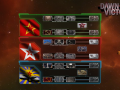
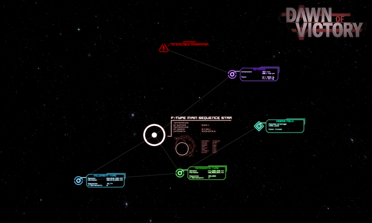
Lord Nelson once said that “no planet icon survives contact with an alpha test”. Indeed one of the most heard comments in our private alpha was that our in game icons, particularly the Planet Icons became cluttered when dealing with larger or multiple star systems.
After a number of redesigns and playtests we settled on these new planet icons that not only reflect our in-game interface, but are easier to recognize on the fly.
i love what you guys have done with this mod can't wait to play it :)
(buried)
you aren't even trying anymore are you, i mean really these are terrible
dude they're still showing off new features and such plus these are pretty nice keep going guys
I'm pretty sure this is sarcasm for the lulz. Why else would someone on the mod team toss out something like this? Professional? Hardly, but cute in a sense.
ehh who knows
Its Dukka being Dukka..
if anything here is cute, it's you
am i cute uguu
u do realize modding takes hard work and skill these may be nothing compared to the rest of what theve done here but i apreciate the little things good work and i love how the planets are coded:)
dukka ur just dum these are awesome this is the best total conversion mod ive seen so far
....I came
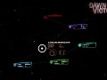
Will the population count actually grow over time? Or is that just part of the texture?
Probably just a graphic, it'd be very complicated to make it change over time
They won't change but the actual icons you're seeing pop out on mouse-over from a slimmer version with planet type and resource info - the basic Sins buttons are static but ours respond to the cursor. We decided to show them off in their large versions to illustrate as many as possible, and because the slimmer versions aren't as flashy.
This is freaking great <3