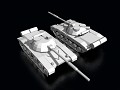
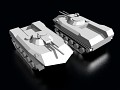
One-man mod. Planed to have over 40 playable factions. Going for realism with units ragin' from as early as late world war 2 to near future units. Mod will be release in the near future, as i plan to release early betas instead of holding on to something that never get released anyway.

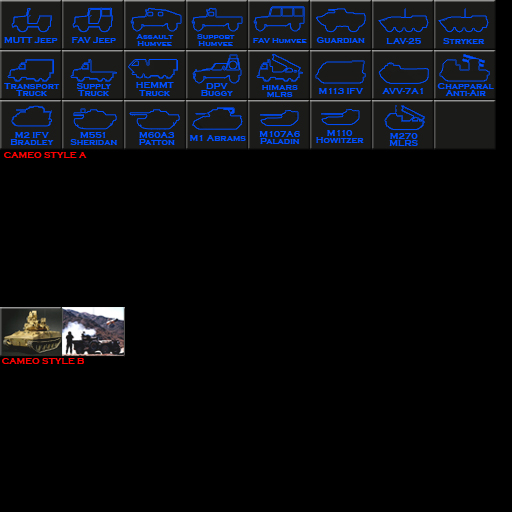
Simple enough. Which cameos would you prefer.
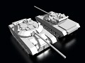
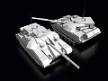
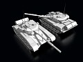
Cameo style A (Top one) or.
Cameo style B (bottom one)
Do note that i want you to vote on style, not how they look, that means do you want icons with text for units (even if cameo style A looks like crap for you, but you like this style better).
Or do you want oldschool Command & Conquer with icons (may add text to the bottom like in Red Alert 1 Series), The choice is yours.
I'll upload the votes here and update them as i go.
Cameo Style A : 21 votes
Cameo Style B : 14 Votes
style A - and make it look a bit more tech and add some glow to them
Yeah, as i said, the A Camoes are just placeholders, i made them fast today.. just to get a feel of how they will look like.
i think the A camoe are better, although is harder to distinguish when you got LAV-25 and Stryker.Easier to find the units you need and looks cooler. Pictures, i recommended in game unit pics instead of real-time or models.
I suggest style B - is more C&C
Style A..it looks better ;)
A is much more original and muck more like military target identification manuals (going by unit profiles)
i will say to things
1- i prefer real pictures so yeah i like B
2 - there is a mistake in A
u have whrote it M107A6 Instead of M109A6
Nice one, diden't notice that. ^^
I like B better to.
I like A
Style A looks cool :D
A
STYLE B ,
A- similiar style is in CWC mod.
I say go with A, and you're right they do look like CWC's icons
A
'cuz them ar allready made let's go with A...and it will be nice if the cameos will have the house collor!:):-))
I think you should have renders of the 3d units as cameos. Would look so much nicer than outlines imo...
I'd say style A but to me it might be hard to distinguish units from one another at a glance with style A
Style A
Style A
I prefer style A. It's simpler and would probably be easier to use.
I also like the idea of using designations: HEMT-T instead of heavy truck, M1A2 TUSK instead of Abrams.
boys in cnc cold war crisis the style a has presented Many complaints in the forums the cause : more time to select the units On not having differed well.
My opinion : I prefer style B for many reasons : 1) is more real and rapid to buy units
The only trouble I had with CWC was deciphering between say the T-60, T-72, and T-80. Although 1) they look alike, and 2) they seemed to perform similarly in-game. (keep in mind, the examples here are not final)
i vote A
A for president ;)
B
A
in A abrams model is more like bradley APC than abrams
no is not the bradl;ey is much smaller :)) and if u know the shape of the abrams u canot confuse one with the other:))
A but it need a little polish still
2011 : technology
The style A is from the 1991 jajaj graphics SEGA GENESIS 16 BITS JAJA
guys , use the 3d no the old graphics xD
A) Shows the person exactly what they are getting, which is especially good for somebody who may not know what something is or know by the basic shape/outline of a unit. Its simple and is basic, the only problem would be for something like the T-64/70/80 tanks which would have the same outline with very different purposes/abilities in combat.
B) Has far more detail and would definitely separate one unit from a similar one. However, it could crowd the UI which could complicate the selection process. All in all, B would be more 'fun' with pictures that really demonstrate what the unit is and how it looks in either real life or combat.
Both are viable options and there is no real wrong choice here. However, if you were to use option A cameos then it would almost certainly require text beneath the picture. Why? Well simply look at the LAV-25 and the Stryker...same picture different unit and different names...
Which is why I for support option B as the cameo. (With maybe A as an alternate download)
I planed to make both, the second one being an alternative download, yes.
And about the crowding of style B, i will use the command button ini file to fix the command bar really nice. take the helipad for instance. The top 6 buttons (first row) are attack helicopters, from left to right, cheapest to most expensive. The second 6 buttons (lower row) are transport helicopters, cheapest to most expensive.. so as long as you figure out the concept of the button layout it's pretty much straight forward.
I like where you're going with this! Why can't more mod teams think like you do?
i prefer a
simple yet , it's easy to distinguish
B !
A
B !
B , more real
i prefer B
In rapids actions to buy it's easy to distinguish.
B
A is too confusing, I prefer spotting the thing I need at a glance rather than having to read the tiny text.
B
B , pretty and cool
OutcastOne can you add in options to select A or B cameos??
exelent
A, the color would be different depending on the nation.
B is overused in my opinion.
style A feels better.
b