I seen that zombie panic source has a black and white short comic posted on their site and I thought to myself, sure be nice if it was in color. I've been aching to do some photoshop work for a while, so what the hell, I started coloring them in.
This is what I got so far, I'm just going have one page finished for now since each panel takes me at least 4 hours to complete. What do you guy's think?

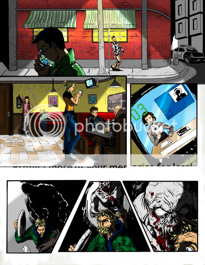
Colored versions looks much better in my opinion.
Awesome, the colored version really pays for itself!
thanks guys, im totally new at coloring and shading so I was kinda afraid of you guys to point those out to me, glad I was wrong. :3
Love the textures used on the walls! I like the colours too, but I have quite a few problems with the shading and lighting.
There is no definition of anything, and it makes a lot of it appear flat where it isn't. Try not to rely on the the lines to know where things should be shaded, and instead take it upon yourself to add those small details in.
Things like the faces, the corner of the street rolling away from us, The zombies face, or the edges of any rounded objects in general. For facial definition there is cheekbones, the sunkenness of the eyes, the hair shadow, and many other small things that can make it look that much better.
Try not using such soft brushes for the shadows (At least not all of them). Shadows get more blurred as they get further away from the light source, but all your shadows have the same soft brush used on them. Don't be afraid to use some hard edges for the shadows.
Next thing I'll rant about is lighting. Some of the characters are lit in weird ways considering the lighting around them (The guy on the phone, the people standing in the cafe, and the hobo). Also, the cafe lights are weirdly lighting up things in the background that do not have lights on them, like the back wall and the picture on the wall.
The only other thing I will say is that the colouring definitely adds a lot to the original artwork. What was before a messy jumble of lines (<-- dislikes uncoloured comic books) now looks a lot more like an old comic book. All that gets me is the uncoloured sidewalk, pole and buildings in the background on the first panel. It feels unfinished to me.
Be interesting to see what you come up with on the next pages if you are doing them.
IDK but I really like this colouring done here:
I6.photobucket.com
Even thought it is obviously unfinished, and very shiny, it has an interesting tone to it. Thought you might be able to take some inspiration from it.
Yeah, I know the shadows were done bad, they were all straight edged before I went crazy with the blur tool. I think I will go ahead and delete the shadow layer and start afresh since the lighting is all wrong. Hate this damn mouse of mine, it makes shading very difficult!
The first panel does look unfinished, have any suggestions to make it look like it's finished by any chance? I only colored them gray because that what they generally would look like... I also like to know how I can make the lights look more brighter, like a glare. Don't quite know how to do that either..
You need a tablet ;D You will never touch your mouse on photoshop again!
Well nothing is wrong with grey sidewalks. Or if you wanted to be different you could use the more gravel based sidewalks. You could make the building in the background almost any colour, like a dark green or anything, and have it fade to black as it gets higher up. Even pretend there is an unseen street light around the corner and use it for the lighting there.
There are a lot of ways to do glare, but IDK what is the best way to do it. It's only useful to do on reflections or lights that the camera can directly see into. Are you thinking of using it on the cafe lights?
Good luck!
Yes, that and have the cellphone glare up. Guess I have to experiment.
You are saying I should texture the street light pole and sidewalk like I did with the red brick wall just to make it seem like I didn't leave them out. Ill try it out.