EvilGoodGuy
joined
I am a Senior developer for the "Guard Duty" and "Operation: Black Mesa" mod teams. I joined Guard Duty in June of 2010 and OBM in July of 2011. My main focus and skill set lies with Level Design, though I also create world textures and 3D props as well. I have been Source mapping since 2006 and have been creating textures for nearly just as long. My skillset with 3D modeling has been gaining ground since May 2011. Level Design, and video games in general, are truly a great passion of mine. I am always striving to learn more and become the best artist I can be, so that one day I can achieve a career doing what I love.
My Blogs
This is my latest Operation Black Mesa/Guard Duty Dev Blog, which can also be viewed on the official forums here: Tripminestudios.com
--------------------------------------------------
Hey everyone,
today I'm bringing you a blog that, by the end, will hopefully give you a decent understanding of why my role is titled "Senior Level Designer". You'll also have a decent understanding of what the level design team endures under my harsh iron fist 
Also, full disclosure - I'm not a real professor. I know, I know... it's quite shocking. Nevertheless, I hope you find this blog intellectually stimulating!
Summary of Contents:
-Display and explanation of common techniques I use for feedback, critiques, and teaching opportunities.
-Display and explanation of my use of dev maps.
-Examples of hands-on revamping that I often need to provide
Introduction:
I'll try to keep the personal stuff brief since I've been over it a few times before and I've never been one to talk much about myself. My name is Brandon "EvilGoodGuy" Smith and I've been a part of the team since 2010. So I'm one of the few OG members. My skill set started out as mere level design. Then because of necessity and intrigue it quickly expanded into texture art, then eventually into prop art, then basic animation; and recently has leaked over into a tiddly little bit of weapon art. Strangely enough I've never been into coding much, although humorously enough when I tell people I do video game design, 99 out of 100 times their response is "oh ya? How long have you been into coding?". 
My main focus, however, has constantly remained level design regardless of my ever growing skills in other areas.
I'd like to preface this by pointing out that the vast majority of us are amateurs, or at least started out as amateurs, and are constantly improving through the course of our work and from sharing each others knowledge and feedback.
My feedback workflow, and by result - this blog, contains in depth critiques of other level designers work at various points in time. Many critiques I provide often times end up resulting in me personally reworking, sometimes from the ground up, other peoples work. I'll be showing you examples of before and after images. The point of this is not to bash anyone's work, but to simply provide insight into what it's like for me. So please be respectful, guys 
Important side note: Essentially every map/image shown here is not final, regardless if it's an "after" image.
Dev Maps
Let's start with discussing dev maps.
What I refer to as "dev maps" are essentially display/sample maps that I've taken upon myself to create in order to provide the level design team with functioning base examples of differing environments, available prop sets, available texture sets, technical examples of lighting and optimization techniques, etc, etc.
I wish I could say this is an original idea, but I honestly have been aware of the concept for quite some time. When Tomb Raider: Anniversary was first released in 2007, you were able to unlock and play a dev map that the development team had put together in order to help their artists define the major themes and style of each major environment.
I use my dev maps for largely the same reason - consistency throughout the game, realistic style, and as learning material for other artists.
I like to litter my dev maps with game_text entities that I leave design tips in for level designers to read while in Hammer, as well as point_worldtext tips/instructions that level designers can read easily while in-game.
Another blog you might be interested in where I mention my use of a dev map can be seen here: EGGs Prop Party
Below you can see a collage of some of my more popular dev maps.
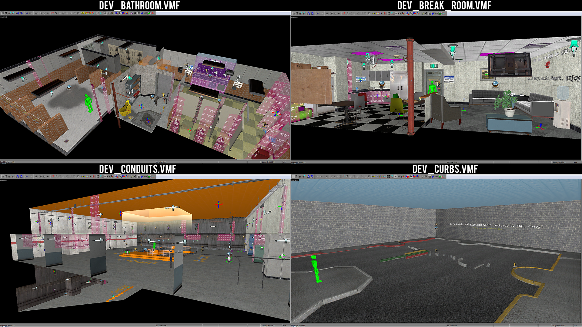
Dev_lighting is one that I put together somewhat recently because some level designers still struggle with advanced lighting techniques. From what I've noticed, lighting in general is something that the majority of the Source mapping community struggles with.
Mr. T was kind enough to help me design the map 
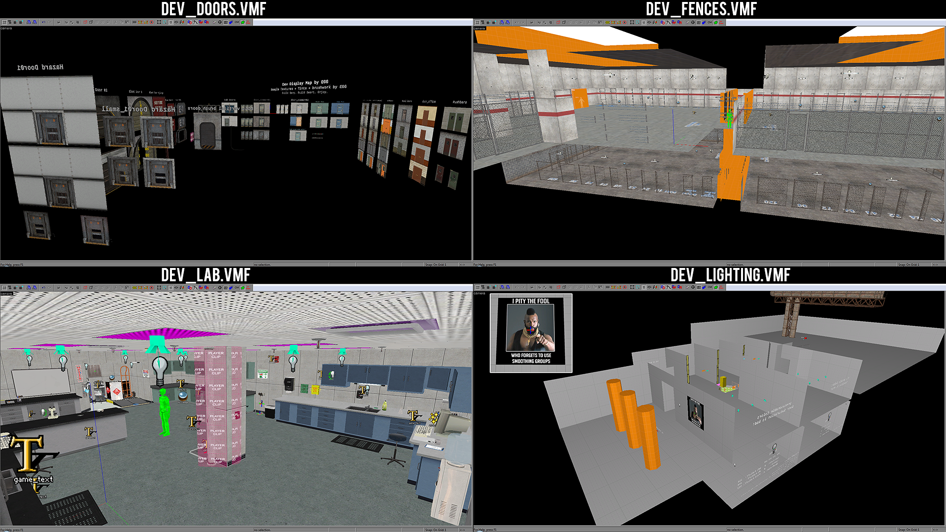
In case you are curious, the tag line that I display in all my dev maps is "Build Sexy. Build Smart. Enjoy" 
Map/Reference Analysis
An extremely important procedure is to properly analyze your reference material, whether it be concept art, real life photographs, or artwork from another game, and identify the style, theme, and structural design. In our case it is dominantly the environments from the original game.
A handy tool that some of us use, which I urge everyone on the team to use, is Crafty by NemsTools. It's a handy program that allows you to preview the original maps outside of their game engine and position your camera wherever you want in order to get a good look at the environment. Often times I have it open on a 2nd monitor while I work on my Level Design.
I personally don't always do the following method, mostly because I've been staring at the original games for so many years that I have them basically imprinted into the back of my eyes, and because I've just always had a natural eye for this sort of thing.
The handy technique in question is to take a screenshot of the original game, then mark it in photoshop (or another image editing software equivalent) in order to help yourself visually identify and catalogue the environments important design elements.
Below will be one example where I've demonstrated this method to a fellow level designer who was considering a particular area to be in the final/near-final stage of development, when in my professional opinion it was quite far from it.
The area in question can be seen below:
The room was quite lacking in any distinct style or architecture, especially when regarding it's appearance in relation to the original game.
The following image is the demonstration I created for him as an example for how to easily identify key design elements:

This is one of the scenarios where I went ahead and recreated the area from scratch in order to accompany the Analysis Demonstration.
As said in the intro to this blog, the area I recreated is not final. Both because I try to avoid spending too much time on other peoples maps and because I don't want to rob the level designer of the opportunity to at least improve upon and finalize the area. Hands-on experience is important for improving. But so is my own time, which I could be spending working on my own maps, rather than reworking another developers map multiple times. So it's a difficult balance sometimes of knowing how much to rework.
Below is my recreation, using the analysis image as a reference:
Bonus points if you know what area this is 
Hands-On Revamping
As mentioned and shown above, my feedback often times leads me to revamping another developers map depending on the amount of feedback I have and the level of attention required.
It can range from me committing small changes to very extreme changes. Sometimes if I'm unsure of a design direction I'll simply play around with the design until I reach something I feel good about, then converse with the level designer about whether to simply hand off the new version or have them use it as mere inspiration for changes.
Shown below is a original area that the level designer created, which I felt could be improved upon. In this case, since it's not present in the original game, and no particular real-world photos or concepts were used, the analysis image technique doesn't necessarily apply. So this is when I can choose to analyze his work and provide a "critique screenshot", which I'll demonstrate later in the blog, or just have a go at revamping it myself.
In this case, I had some ideas straight away, but went ahead and got my hands on it directly to experiment.
note: The walls have been made non-visible to make it easy to see the changes within the building.
Before Revamp:

After Revamp:

Since I chose to just experiment until I found something that suited it nicely, in my opinion of course, I then am tasked with writing up a lengthy changelog/explanation of what I changed and why.
I won't detail that entire changelog/explanation here, but I'll provide below some basics:
-metal racking in an inaccessible location / elevated section unnecessary and unrealistic
-fence is unnecessary/not appropriate for this indoor use
-I-beams were unusually rusty for this environment
-foundational elevation was okay, but not necessary
-ceiling lights could be better attached directly to ceiling, rather than hanging
-purpose of room is not fully defined
------------------------------------------------------
-Converted room to a small mechanic shop
-added rollup door
-changed wall and support beam textures to better reflect environment
-changed shelving to better reflect environment
Extreme Revamps
Illustrated below is an example of an extreme revamp, which I engage in every now and again when the level designer is struggling with multiple design aspects, or if I'm very unsatisfied with the results and are forced to put my foot down for the sake of quality consistency.
Before Revamp:

After Revamp:
note: again, this in particular is very early and very outdated work
If you're a Blue Shift fan, then you probably recognize this area from the chapter "Captive Freight".
In the original game, the building the screenshot is focusing on contains offices and a stairwell that connects the basement (with level transition) to the different stories of the offices.
In the previous level designers version, he had completely removed the stairwell, as well as moved the offices to the complete opposite side of the map, while heavily changing the architecture of the building and area as a whole. This was partly because of what happens when you try too hard to make your map look unique and end up failing to keep the design formula that defined the original. Essentially robbing the map of any nostalgia. At that time there was also a lack of proper team feedback to help guide the level designer, resulting in perhaps a bit too much extreme experimentation.
Critique-Screenshots
As mentioned previously, this is my primary form of feedback that I supply to level designers. This is of course in addition to writing up more detailed explanations.
Essentially, this method involves me taking a screenshot of their work, then making visual marks on it, with critiques and suggestions written directly on the screenshot. I find that this helps quite a bit since it's very visual and is unfortunately necessary because we do not have the luxury of working together in person. Some of us are separated by hundred of miles and even oceans. I say unfortunately, because it does indeed take a lot of time to prepare this method of feedback, especially when I do it for an entire chapter. Sometimes it can take more than a day to prepare the first pass of feedback if I'm critiquing an entire chapter, depending on how much I think it needs improved.
Sometimes I'll combine this method with the hands-on revamping if there are reasons that call for it.
Combining the 2 methods can be seen below:
Top/Red = Before image with visual listing of critiques and suggestions
Bottom/Green = After my changes with visual listing of major differences

The area demonstrated above can be seen below, both before and after my revamp.
Before Revamp:
After Revamp:
Giving feedback and making changes to other level designers work actually takes a large chunk of my time these days. Literally hundreds of hours have been spent working on other developers maps. Which honestly is one of the reasons I'm making this blog - so that I get at least some credit for the large amount of work I dedicate to it.
One thing that's not shown in this blog is the private videos I've created and supplied for the team, which essentially serve as training videos. Which I'll probably release publicly once the project is complete.
Just for fun I made a little joke wallpaper image that has a large collage of some of the critique-screenshot feedback that I've given out somewhat recently. I blurred the images slightly to reduce the chance of spoilers, but if you look closely you can see just how much feedback I put into the screenshots and how many there are.
Enjoy zooming in and trying to decipher where these outdated screenshots were taken

It's all in the Details
As mentioned previously, sometimes the critiques, and thankfully the revamp work, is relatively minor.
Below is an image of a before and after revamp that didn't really deserve a critique-screenshot, but rather just a simple text description of necessary improvements and changes I made.
-indent area aligned with edges of wall texture
-wall support portion of texture continued across the top for structural support
-indent texture rescaled and brushes added for more actual depth
-flat cables brush replaced with 3d models of electrical conduit
-wall texture replaced with striped variant for more contrast to help define the edges of the room
Not to steal Chris' thunder, but below is an area that I assisted in revamping for him, which is shown in the recent summer update. It's important to note that with each revamp and large wave of critiques that I throw at him, he improves noticeably and accepts my intense critiques with grace and professionalism 
Before Revamp:
After Revamp:
major changes:
-pipes recessed into the ceiling with accompanying supports
-valve wheel added to pipes
-lighting reworked to remove some intense shadows
-detail props added to ceiling
-frame built around servers
-many texture re-alignments
-floor repetition broken up with trim brushes
-smoothing group changes/fixes
The above area is shown to help demonstrate how sometimes all it takes to make an area look just that much better is a little bit more planning and careful sculpting of the environment. So my advice to anyone interested is to slow down a bit when you near the final stages, and take the extra time and effort to carefully craft the environment you are working on.
Conclusion
Well, that's it for this blog guys! It's been a pretty lengthy one and still only shows a fraction of the work I've done critiquing the level design departments work, not to mention the numerous revamps I've done to my own maps hahaha.
Hopefully you maybe learned a little something too. If you enjoyed this type of blog, let me know and I'll consider doing another of this type in the future.
Also, if you haven't already, check out my of2a1 Revamp Blog that I collaborated with Frag to make.
Have a good one, guys!
This is update #14 from my running dev blog that can be viewed on the official public forums here: Tripminestudios.com
------------------------------------
Hey everyone!
With the recent Summer Update I figured I'd add a little bit more for you guys to gander at.
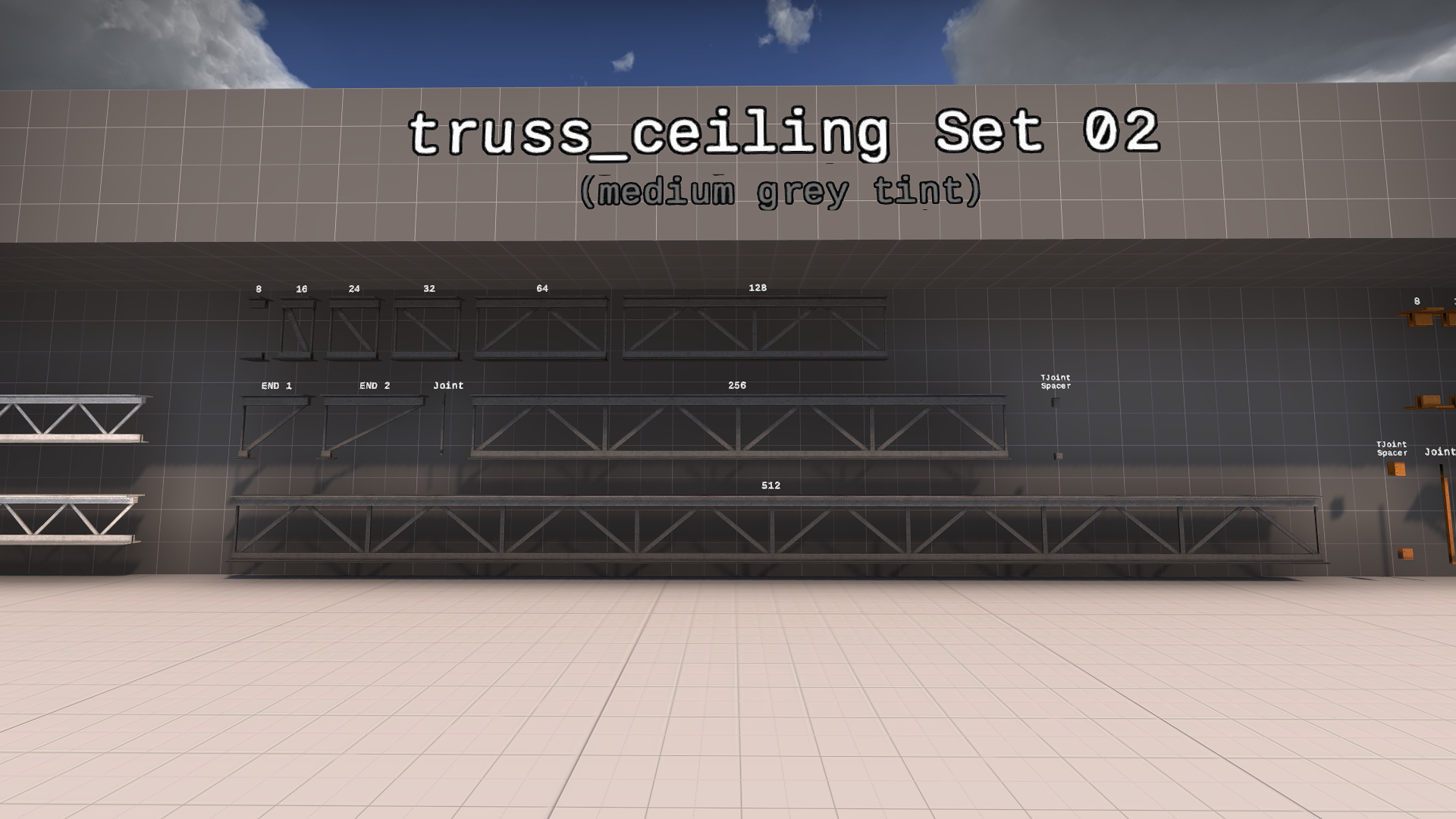
First up is my most recent prop work, which is a fully modular set of trusses, intended mostly for use on ceilings. You might have noticed a render of these in the summer update.
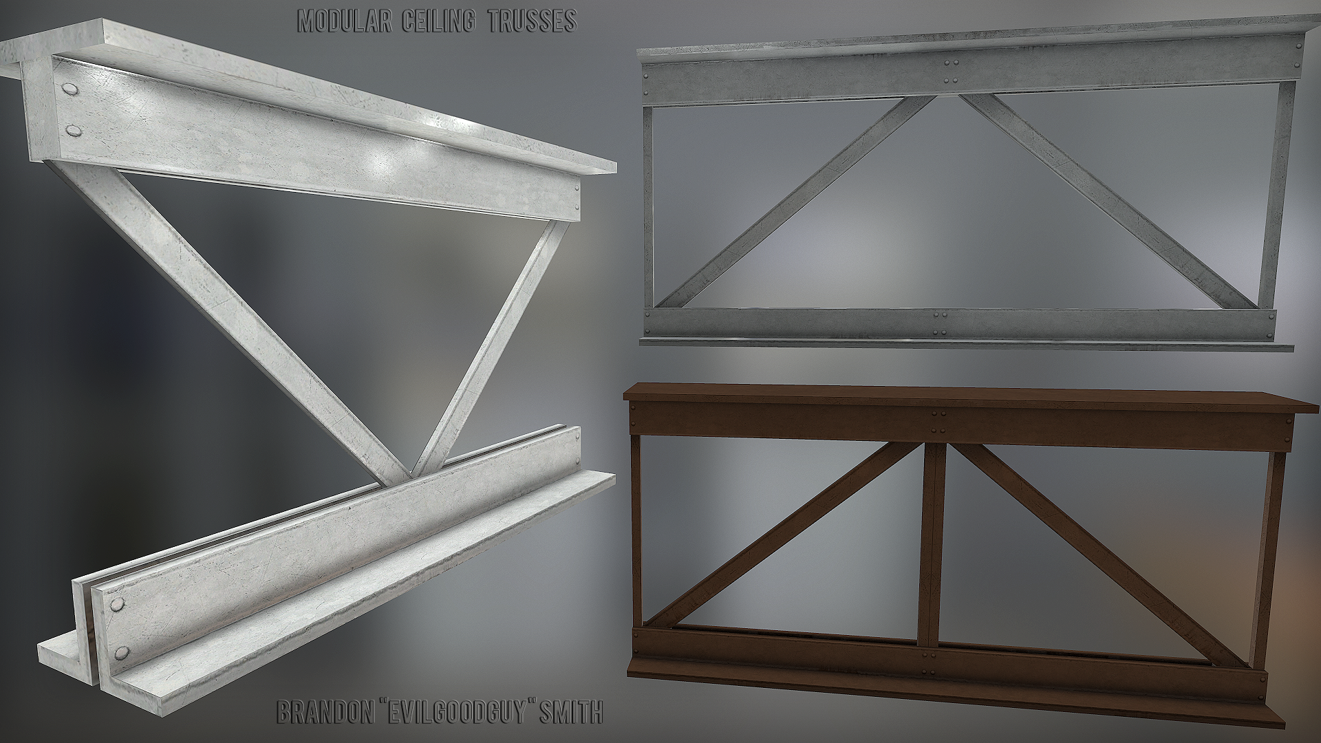
I have created 3 separate fully modular sets, to be used in various locations.
Set 1: Small sized design with no vertical center joints. Set contains a total of 10 different models, offering various lengths and the option of a sloped or straight end piece.
Set 2: Medium sized design with vertical center joints. Set contains a total of 12 different models, offering various lengths and the option of a sloped or straight end piece. As well as 7 miscellaneous lengths.
Set 3: Large sized design with vertical center joints. Set contains a total of 11 different models, offering various lengths and the option of a sloped or straight end piece. As well as 4 miscellaneous lengths.
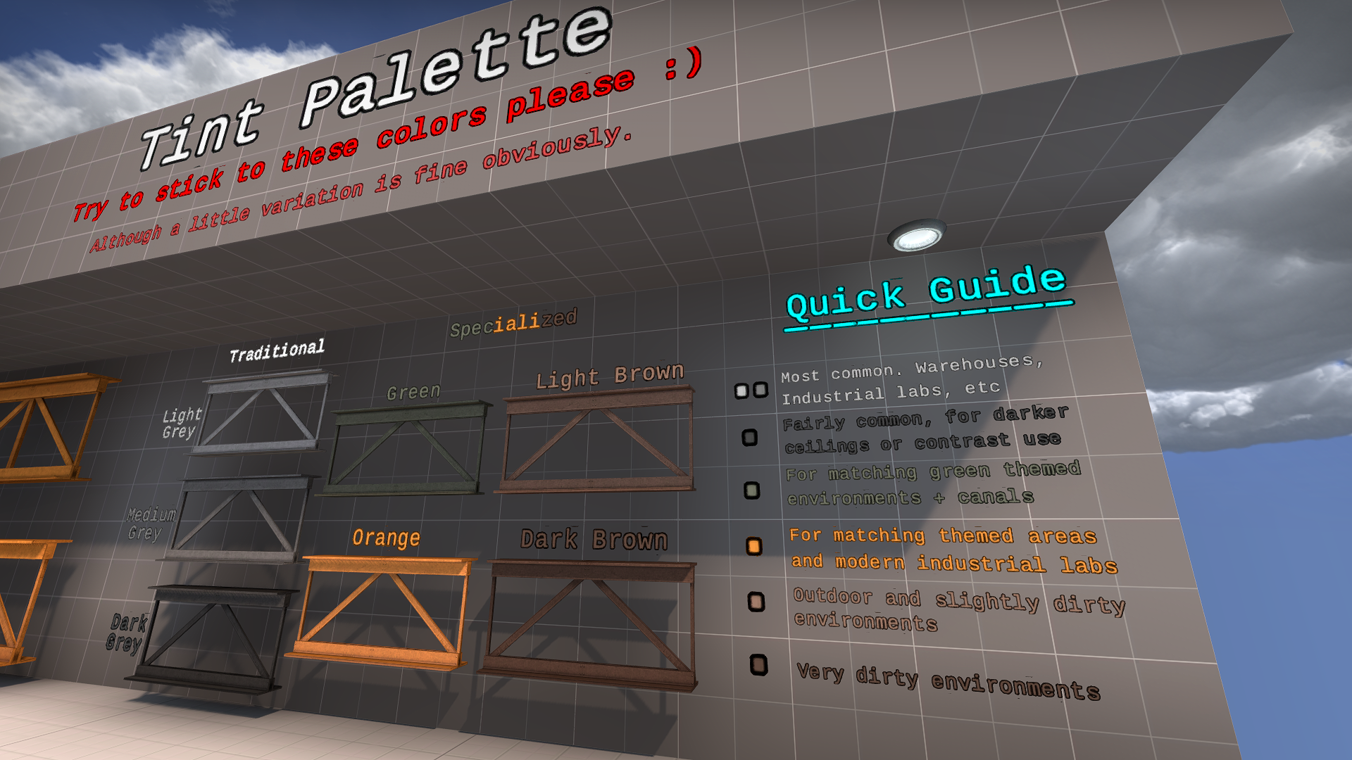
The models were designed with the tint-feature in mind from the very beginning, heavily relying on it in fact.
The base texture color is a bright grey, allowing for tints to be applied evenly to the model.
As I do with most models that I create, I made a dev map for my fellow level designers, which displays the proper usage of the models, as well as suggested tint values. I try to design my dev maps in a way that will also help potential community mappers after the projects release.
Screenshots of the dev map can be seen below:
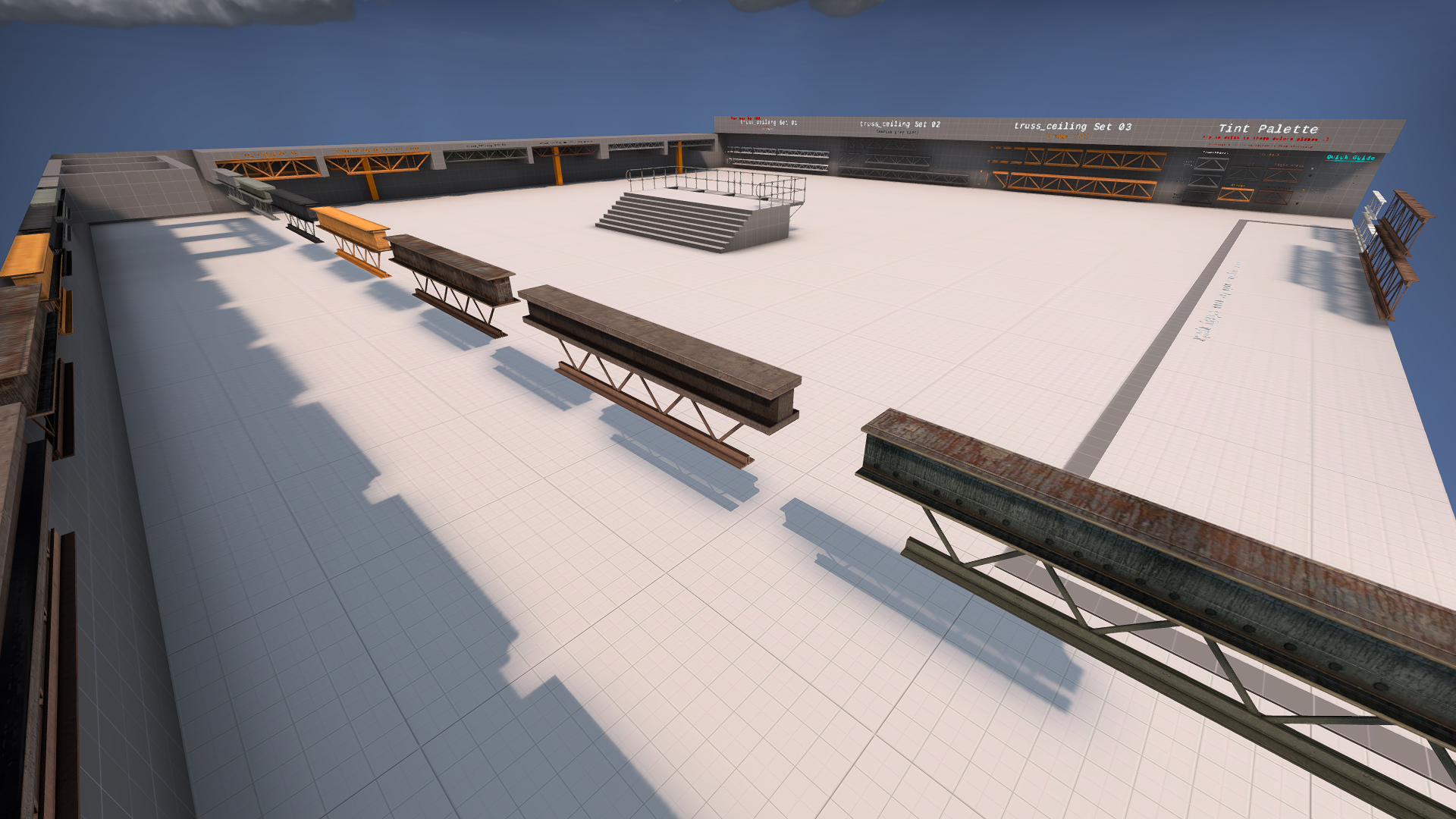
The tint feature is also great for highlighting certain models that level designers need to pay attention to using properly, as seen below.

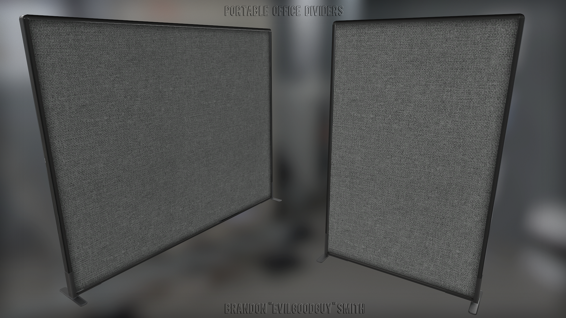
The next couple of props are portable office dividers.
These are somewhat modular, because they don't connect together directly, but can be placed side by side to create a wall.
There are 2 versions:
-A 90 unit wider variant
-And a 46 unit wide variant
They are both fully gibbable by explosive or energy based weapons only (controlled via a damage filter entity assigned by the level designer). So I'm sure players will have a lot of fun lobbing grenades around the offices and seeing these things break into lots of pieces.
The next few props.... aren't actually props. But are indeed weapons!
Now it's important to note that I did not make these weapons, but rather made some large changes. It's also important to note that I don't consider myself a weapon artist, but I am quite useful in the sense that I know my way around the modeling process.
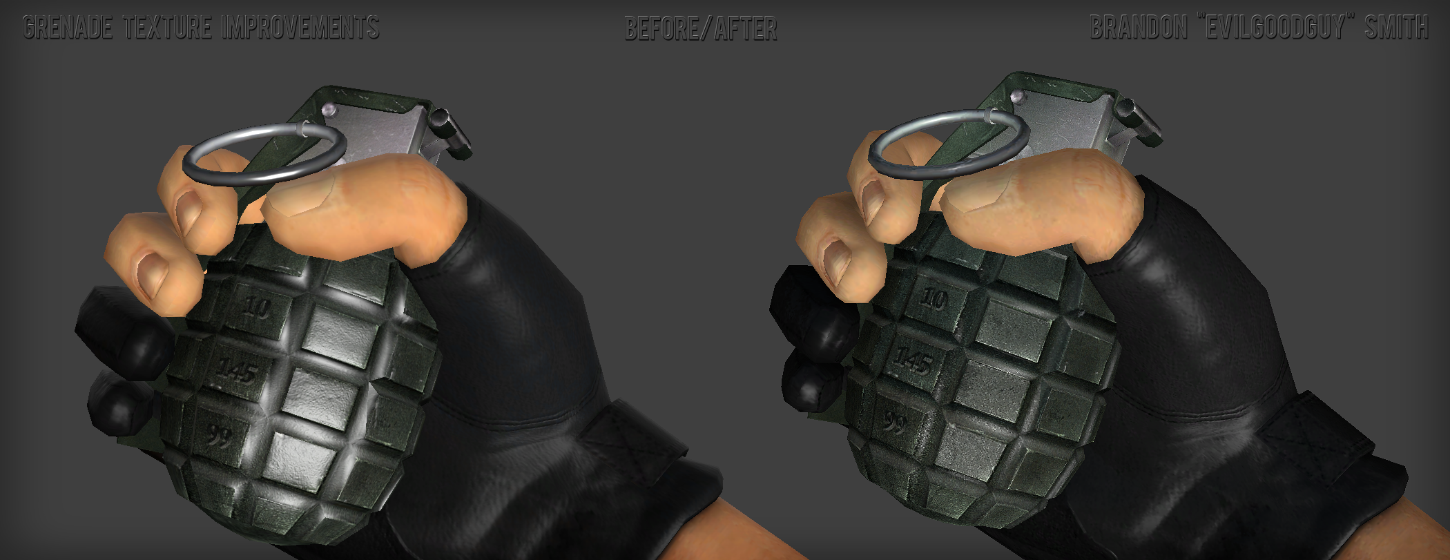
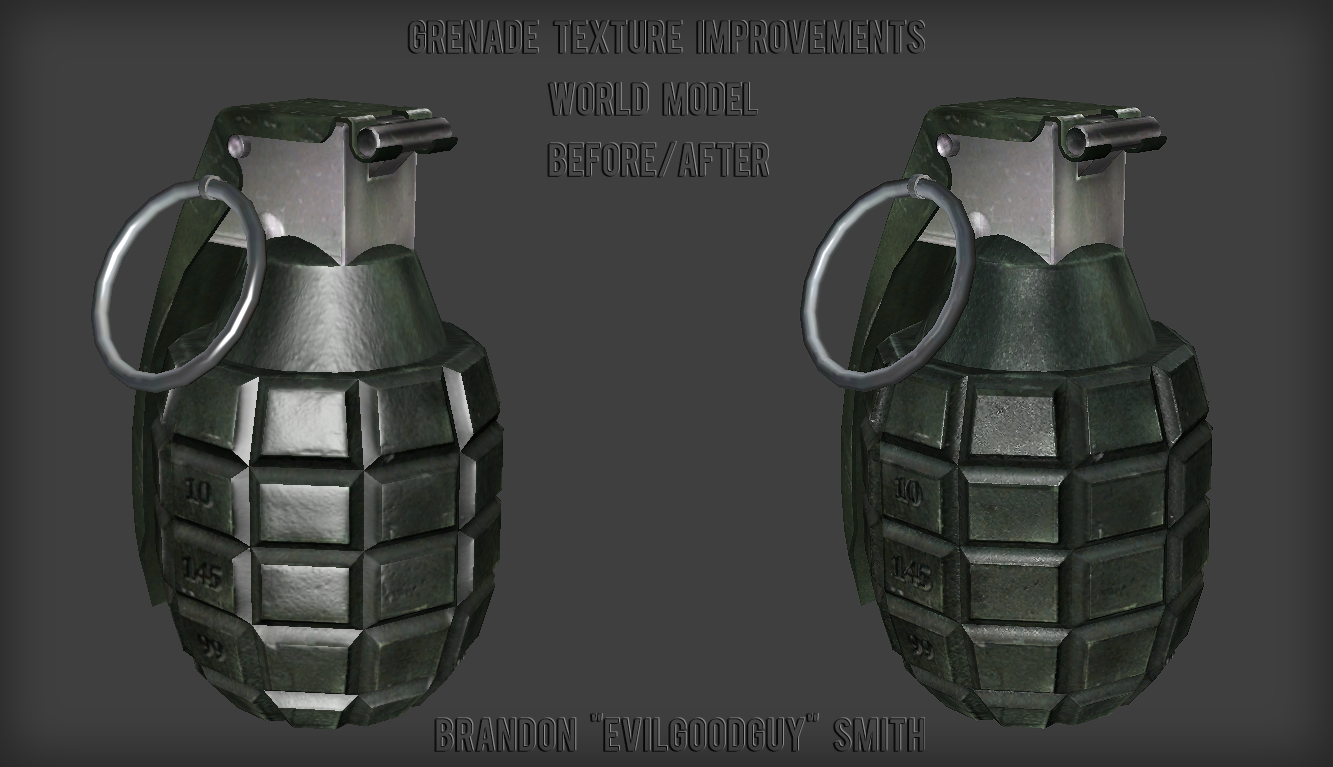
First up is the frag grenade.
This models bump map was quite blurry and undefined and it was also lacking a specularity map entirely. It's phong highlights were also quite out of control, resulting in a plastic toy appearance.
So I completely remade the bump map from scratch, as well as a specularity map, then proceeded to tweak it's material settings until I achieved a fairly (in my opinion) realistic look.
Check out the before and afters and don't forget to click on the images and view them in full screen mode:
note: The players hands were not part of this improvement, although they may look slightly different because I was experimenting with saturation levels temporarily.
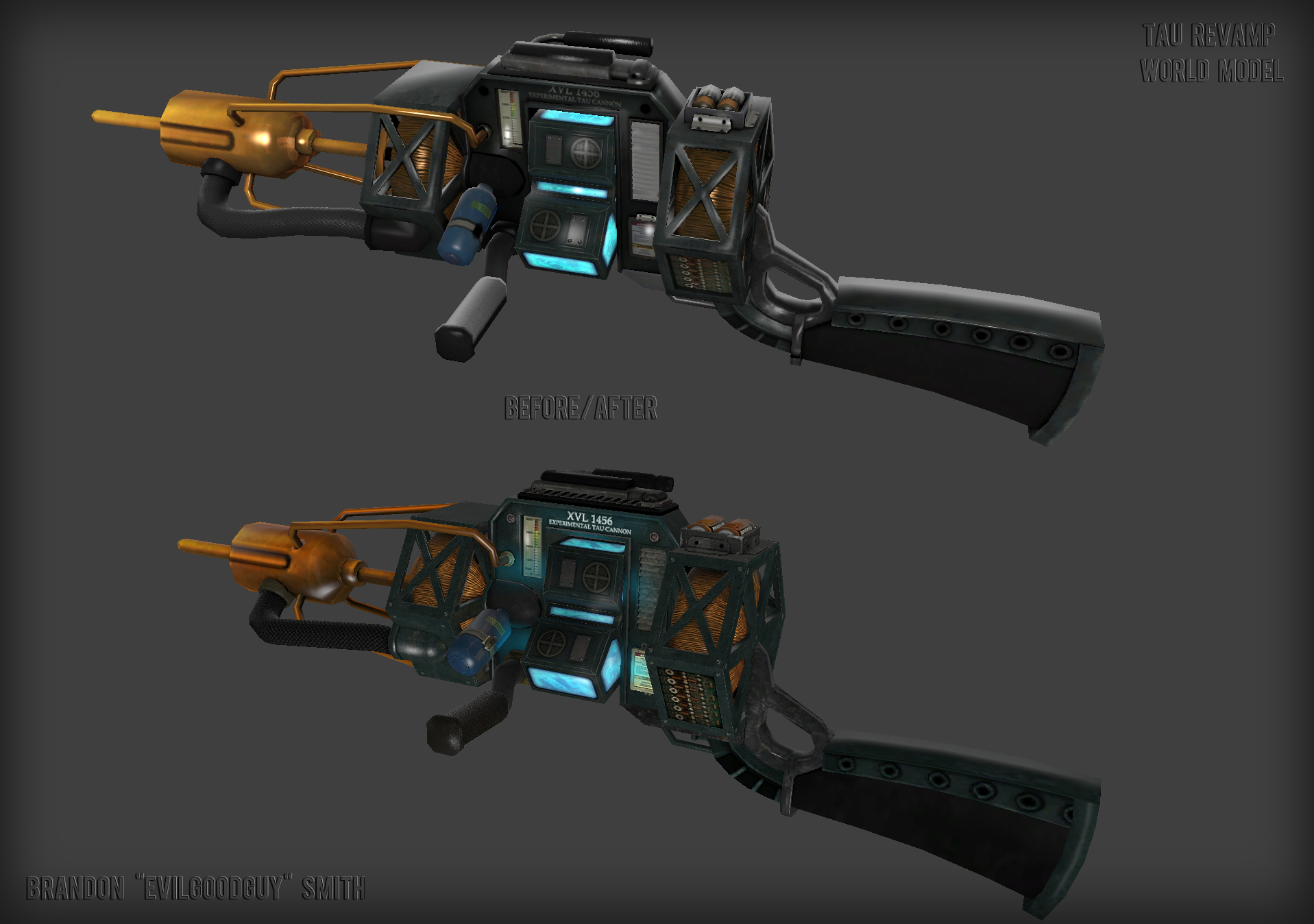
The first weapon that I remember making improvements upon is the TAU cannon.
The Tau Cannon is one of our older weapons, so portions of it are not quite on par with some of our newer weapons, but all in all it holds up pretty decently. We can't afford to remake it completely at this point in time, although it may happen after our initial release. So until then, I made the following improvements:
-I completely remade it's bump map to be vastly more detailed: Before and After image
-I overhauled it's specularity map and phong reflections
-Added self-illuminating cyan colored light to appropriate parts (shines in the dark)
-Fixed a lot of UV errors
-properly mirrored the UVs on to both sides of the weapon
-Fixed various mesh problems
-colored the carrying handle and top rail black
-made the batteries orange instead of yellow, so they don't stand out as much
-touched up the texture for the small blue canister
-added metal bolts to texture
-touched up the metal edge wear
-retextured side vents
-remade warning labels
-various brightness/contrast adjustments
Check out the before and after screenshots below:
note: For anyone curious, these screenshots were taken a long time ago (years) for dev purposes, in a random dev map I was using for testing things.
Viewmodel Before:
Viewmodel After:
World Model Comparison:
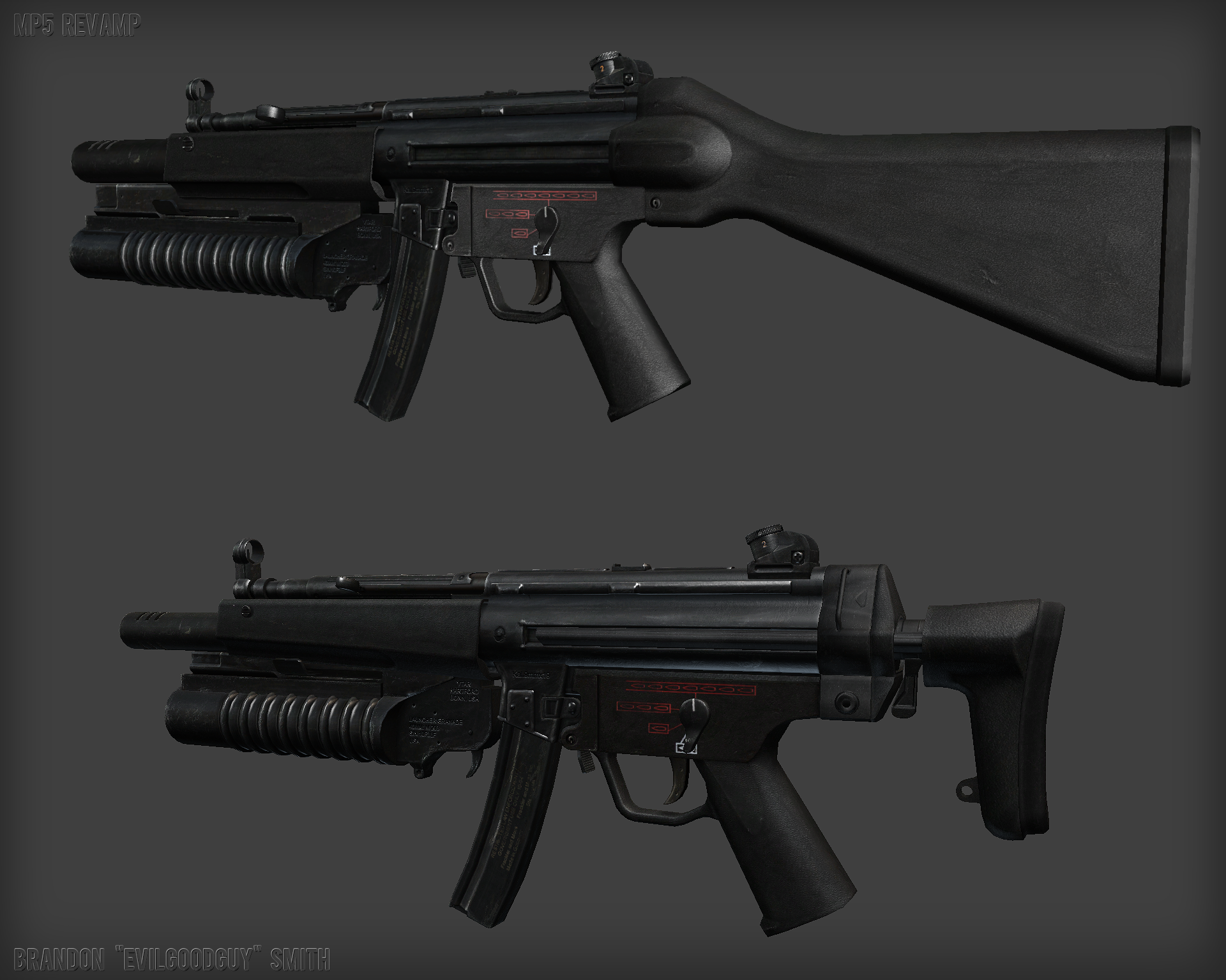
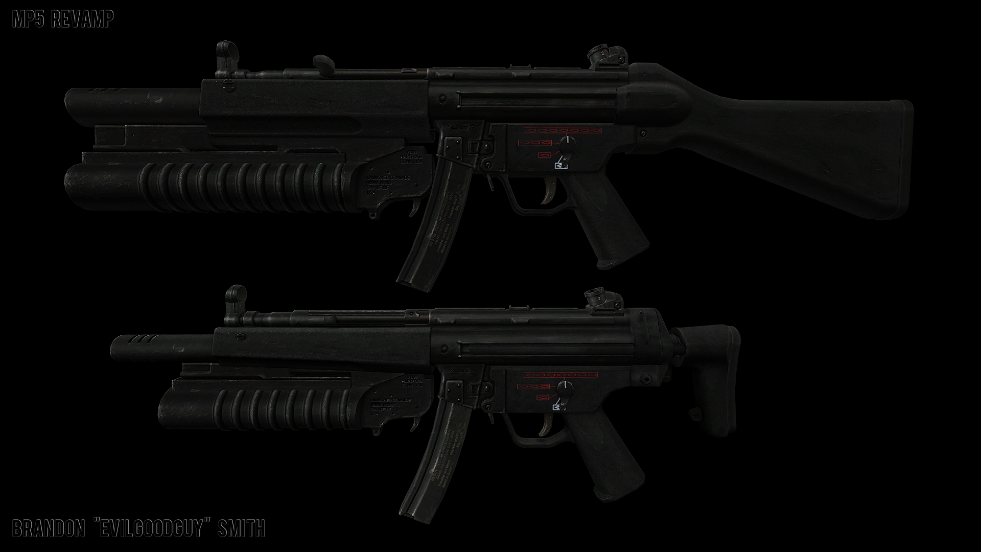
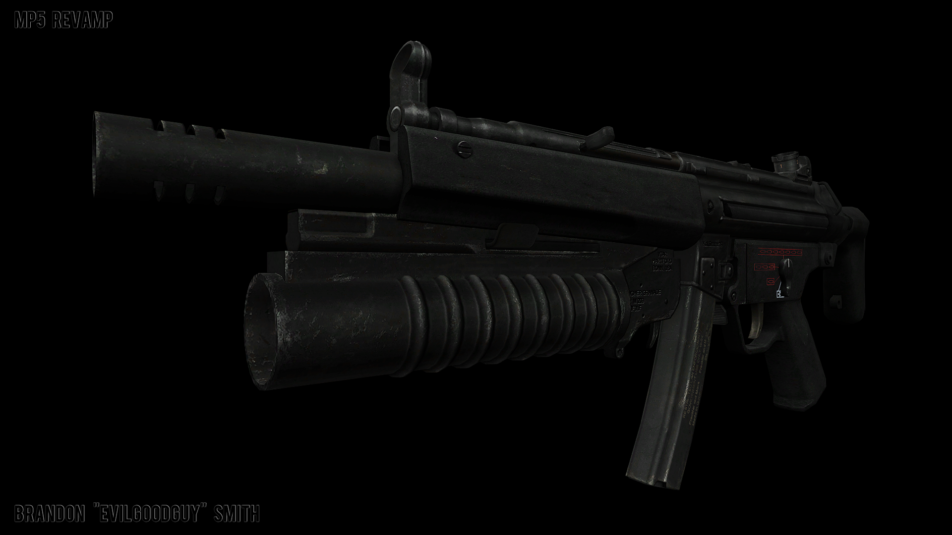
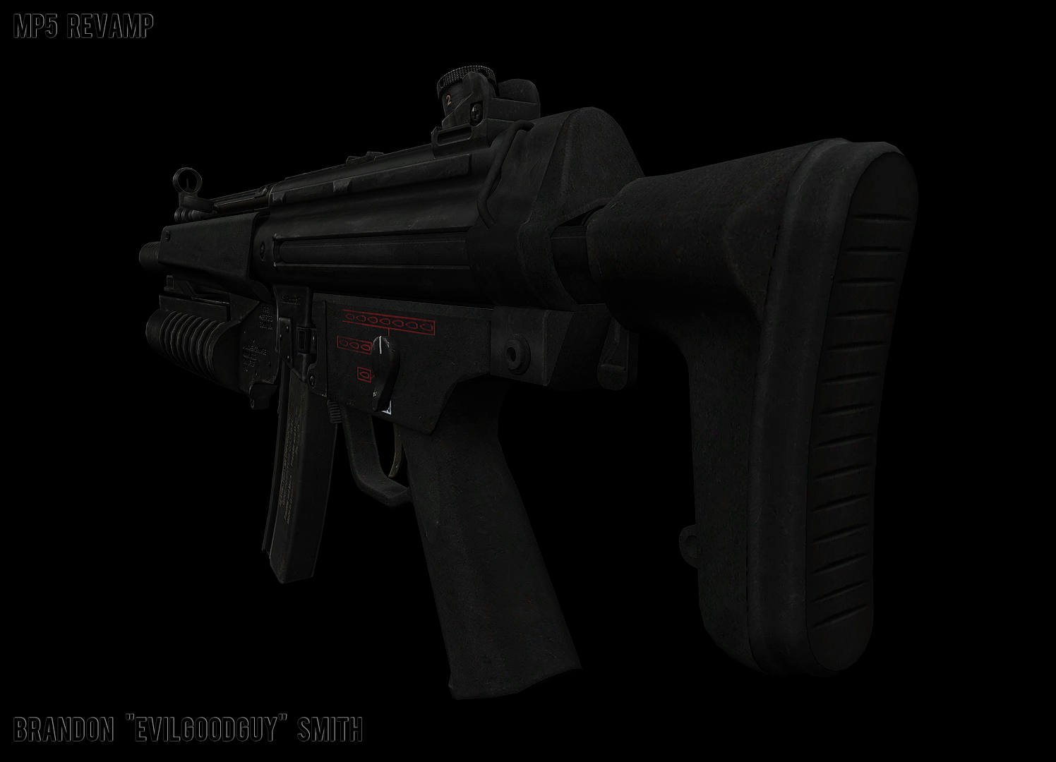
Next up is the MP5.
This has always been a rather strange weapon, particularly because the original games model was very undefined and unrealistic.
Based on my personal preferences, the teams decisions, and feedback, I made the following changes in order to achieve a bit more of a realistic look, which is also a bit more reminiscent of the original game:
-Completely remade the buttstock (new mesh, new UV maps, new textures, etc)
-Fixed a ton of bad smoothing groups
-Fixed a ton of bad UVs on various portions of the model
-Reduced the size of the grenade launcher, because it was vastly oversized and half as large as the weapon itself. This meant heavily modifying its mesh as well as its UVs and texture maps.
-Added a few more polys to various rounded portions of the model
-Removed unnecessary edge loops
-Fixed floating geometry/portions of the mesh that did not connect properly
-Sloped front hand guard, and tightened it up to get rid of a weird gap allowing you to see through parts of the gun
-Added symmetry to the "Flash Hider" portion of the barrel
-Various material tweaks
-Resized charging handle a little bit
-symmetrized mesh details that were previously only on the left portion of the gun
The current version can be seen in the in-game weapons demo video seen in the summer update.
Below are also some renders in Marmoset, as well as a screenshot comparison from modelviewer, which better represents what it actually looks like in-game.
I'm still pretty amateur when it comes to getting fancy looking renders in Marmoset, but they get the idea across 
Modelviewer before and After:
Marmoset renders:
And of course we can't forget about the world model used by the Black Ops soldiers!
Theirs comes with a silencer instead of a grenade launcher.

That's gonna be it for this dev blog update, guys.
I hope you enjoyed the extra little bit of weapons content.
See you next time!
OF2A1 Revamp Blog
By Brandon "EvilGoodGuy" Smith
By Brandon "EvilGoodGuy" Smith
Playing the role of "Senior" Level Designer offers and demands that I have a deep knowledge of level design and the tools that our team works with, that I am available to assist and teach other level designers in a constructive way whenever possible, and that I can lead by example with my designs; while still being realistic as to what degree of fidelity can be achieved in a reasonable time frame.
In most scenarios where I provide feedback to the other level designers on the team I will generally, in addition to regular old textual input, go through their maps and take screenshots which I will then overlay with graphic illustrations and text for possible ways to improve upon the maps design.
One of the other ways that I give feedback is to go through another level designers map and make actual changes myself, which the original author can then continue to work off of to finish the map, then I write a lengthy post detailing what changes I made and most importantly why I made them. Sometimes the changes are very minor, but sometimes they are extremely extensive.
For lack of a better term, I've just come to call this feedback technique "Revamping". This is generally done at the request of a level designer who is either struggling with a map, has "mappers-block", or who is near the end of development for a map. Although sometimes I will insist I revamp parts of the map because I feel the quality is not high enough for the overall standard we are trying to achieve.
In this blog I will be illustrating my most recent revamp, which is for the OBM map "of2a1" at the request of my friend (and level designer in charge of the map) – Oliver "FRAG" Curtis.
Other than myself, FRAG is one of the more senior members of the team. Seeing as he has been on the team for quite some time, he has fairly extensive knowledge of Source mapping (he even demos his mapping on his youtube channel sometimes) and has a fairly good design sense. So in comparison to some of the revamps I have done in the past for some other level designers, his map was quite a pleasure to work on. Not to say that any of the other level designers are terrible... love you guys 
I will show you what I believe are some of the most attractive before and after screenshots and explain briefly for each what the major changes were and why I made them. Hopefully by the end of this you will have a better understanding of how our maps evolve and the amount of work that we put into them; as well as some tasty screenshots 
For the sake of keeping this somewhat brief I'm not going to detail all the optimization changes I made, such as resizing brushwork, relocating brushwork to be more aligned with a grid size of 8units, adding hint brushes, area portals, etc.
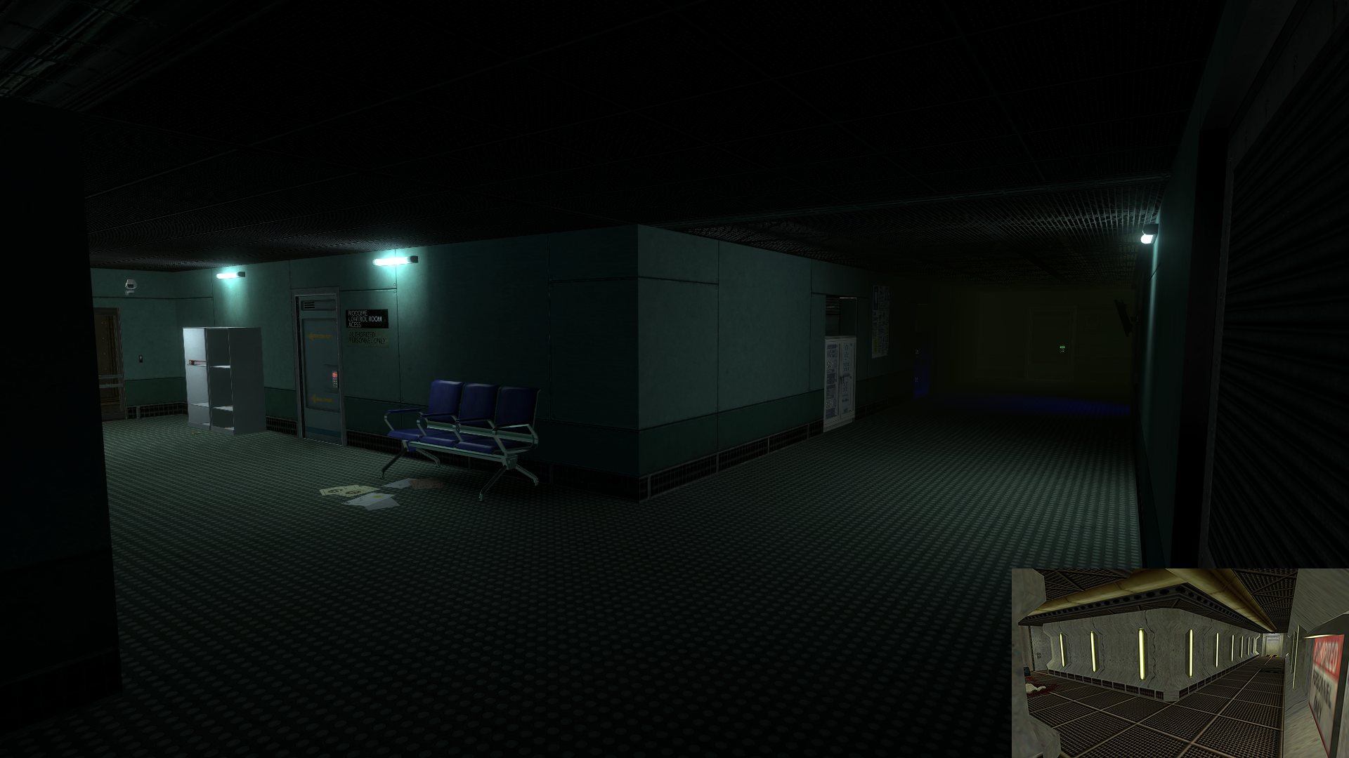
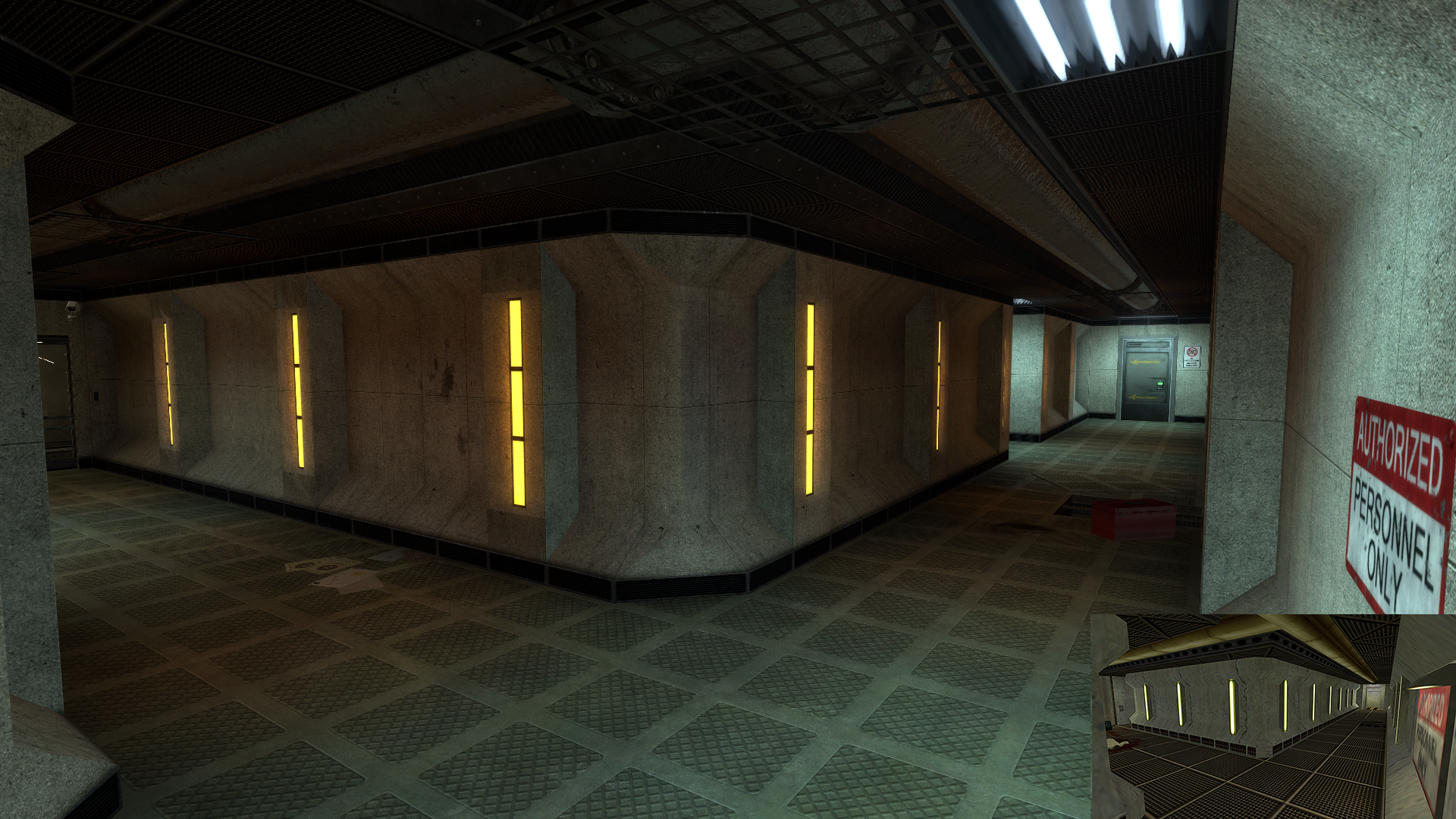
Area 1
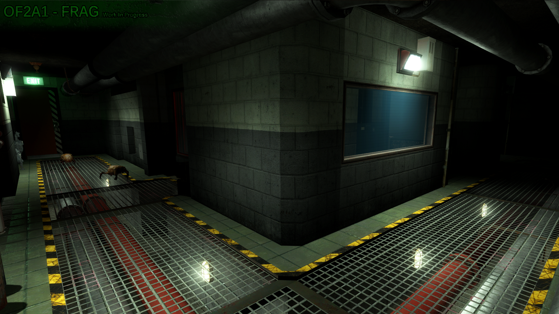

Things that I was immediately fond of about this area is the major brushwork and the large grating used for the majority of the floor. So my first course of action was merely to improve upon those.
I first started by reducing the length of the hallway to keep it short and sweet and to immediately provide the player with a visual of where he needs to travel to after dropping out of the vent. Then I smoothed the corners of the walls, re-arranged some minor geometry to give the room behind the windows a better sense of purpose, changed the texture scheme to use higher fidelity textures and styles that I feel represent a maintenance/industrial corridor more effectively.
Then it was all about re-working the lighting and making the most out of those floor grates by converting them to models and using textureshadows to cast high definition shadows onto the walls and ceilings. Generally when working with industrial type areas I like to use a mostly orange-ish lighting setup with cool white accent lighting.
Area 2
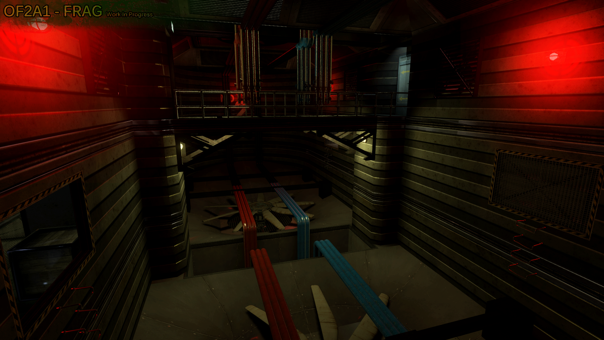
This is that weird giant fan ventilation room in the original that the player has to traverse without falling into the fans and getting chopped into bits.
Redesigning this room to have it make sense from a somewhat realistic stand point was quite the challenge. Frag had put in a lot of work (more than I probably would haha) into trying to figure out how to make it seem plausible without straying too far from the original.
The initial frame work, the center catwalk, and use of pipes for traversing the room, were all things I really liked about his design. So working off of those I decided to simply increase the depth of the room to add more verticality and a extra sense of danger for the player when traversing over the large deadly fans.
In addition to many custom grates I ended up creating more complex brushwork for the fan housings which I then converted to models to save on performance and also for the fact that Source does not handle complex sloped and curved geometry well at all.
The next step was dealing with the entrances/exits to the area. From my perspective it does not make sense to have these openings in the walls that personnel would simply climb through that basically just lead right into the large fans haha. So I removed the "fake" openings, replaced the exit with a vent that the player breaks into, and converted the entrance into a more legit and plausible opening. To make it more plausible I increased the size of the opening a bit and added a catwalk that leads to a ladder to gain access to the center catwalk.
Then I re-worked the piping system to be less-intrusive, appear to not obstruct the airflow as much, which also increases the feeling of empty space around the player.
The final step was to re-work the lighting. I decided to go with a mostly cool white coverage because it accents the already grey-ish texture scheme and aids in the appearance of a smooth and mostly clean ventilation system. Some red lighting was kept to help define the shape of the room and also for nostalgic reasons.
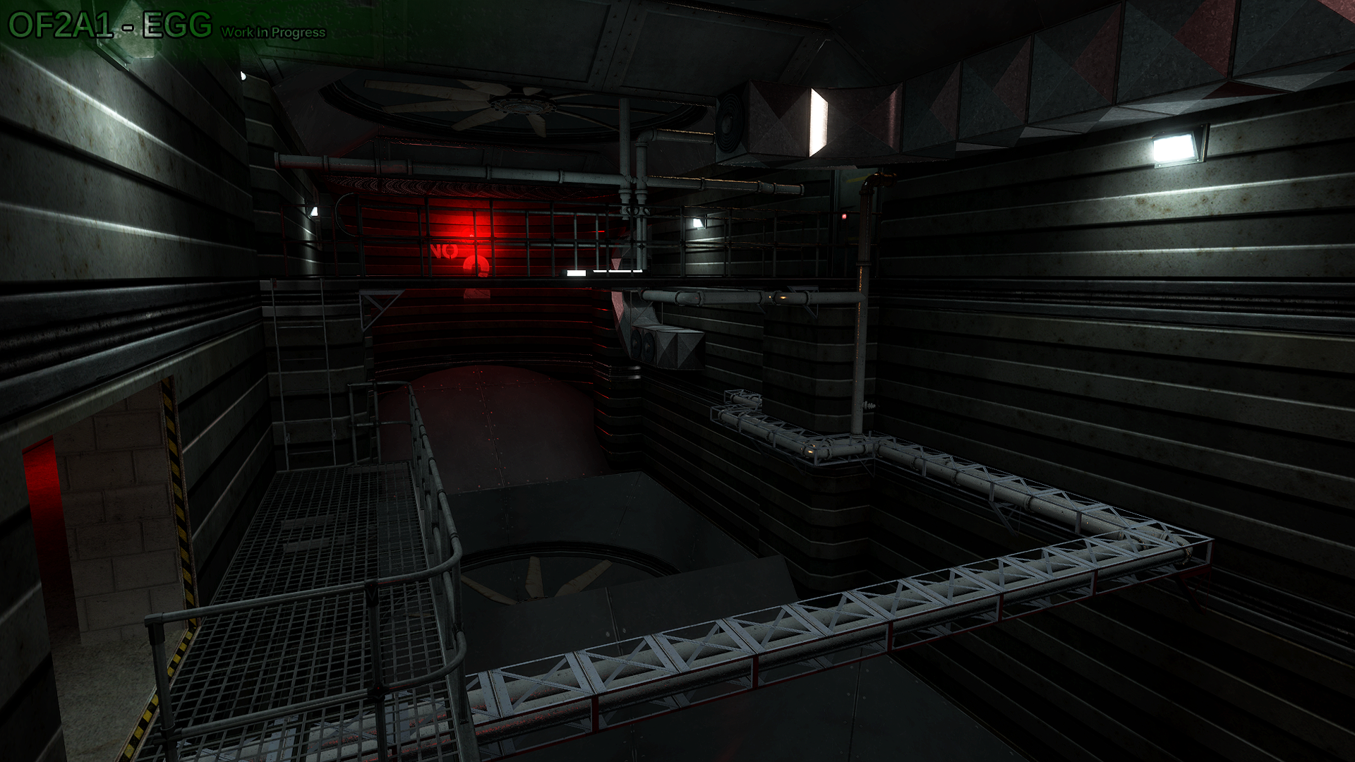
Area 3
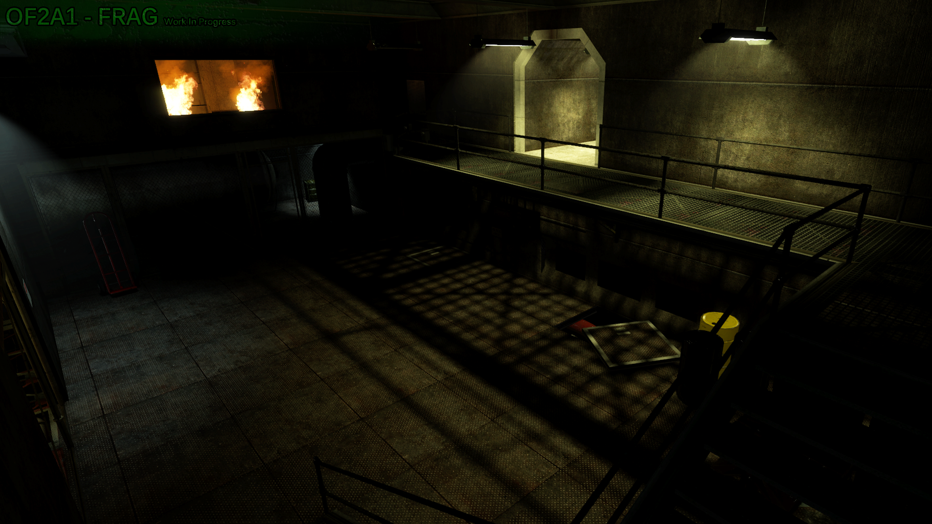

Trying guessing which area this is. I bet you can't
No but seriously, I know you can't, because it's a new area created to ease the transition from one room to another that was very abrupt in the original game.
Not being familiar yet with modeling, Frag went total beast mode with the blocklight dev texture brushes to create that grated shadow. Although it looked good and I'm sure took a while, I had to replace it with a model to properly cast textureshadows, which are more accurate and detailed than what can be achieved by using blocklight brushes.
Other than improving the shadows from the grates, the railings, and the chainlink fence, I also completely re-worked the lighting in this room to match the lighting in the previous sections of the map. Just a fyi, the room that's on fire is extremely early WIP still, so pay no mind to it 
I decided to shorten the overall length of the room as well. It seemed a bit large for having no real reason to be as large as it was. I also connected the grated catwalk to the room that is on fire, to give the appearance of it being an official entrance/exit.
I liked the texture scheme he had going on, so I only resized and re-aligned most of it. To show off the textures better I increased overall visibility in the room by increasing the light coverage to get rid of any pitch-black shadow spots.
To give some perspective on the revamp, it took me about a solid month to finish. This was mostly due to being busy with other personal things and also because I had been playing a lot of Ghost Recon Wildlands hahaha. So normally it wouldn't take quite that long.
The areas shown in this blog are just 3 out of 27, not including the map overview screenshots showing pathway and room layout changes. So I'm sure that after the mod is released I will post a follow up blog to detail more of the changes. I'm sure if he feels like it Frag will also chime in with his thoughts in designing parts of the map.
So that's it for the blog, guys! I hope it gives you a bit of insight into one of the design processes that we, myself in particular, go through to improve and aid in finalizing a maps design.
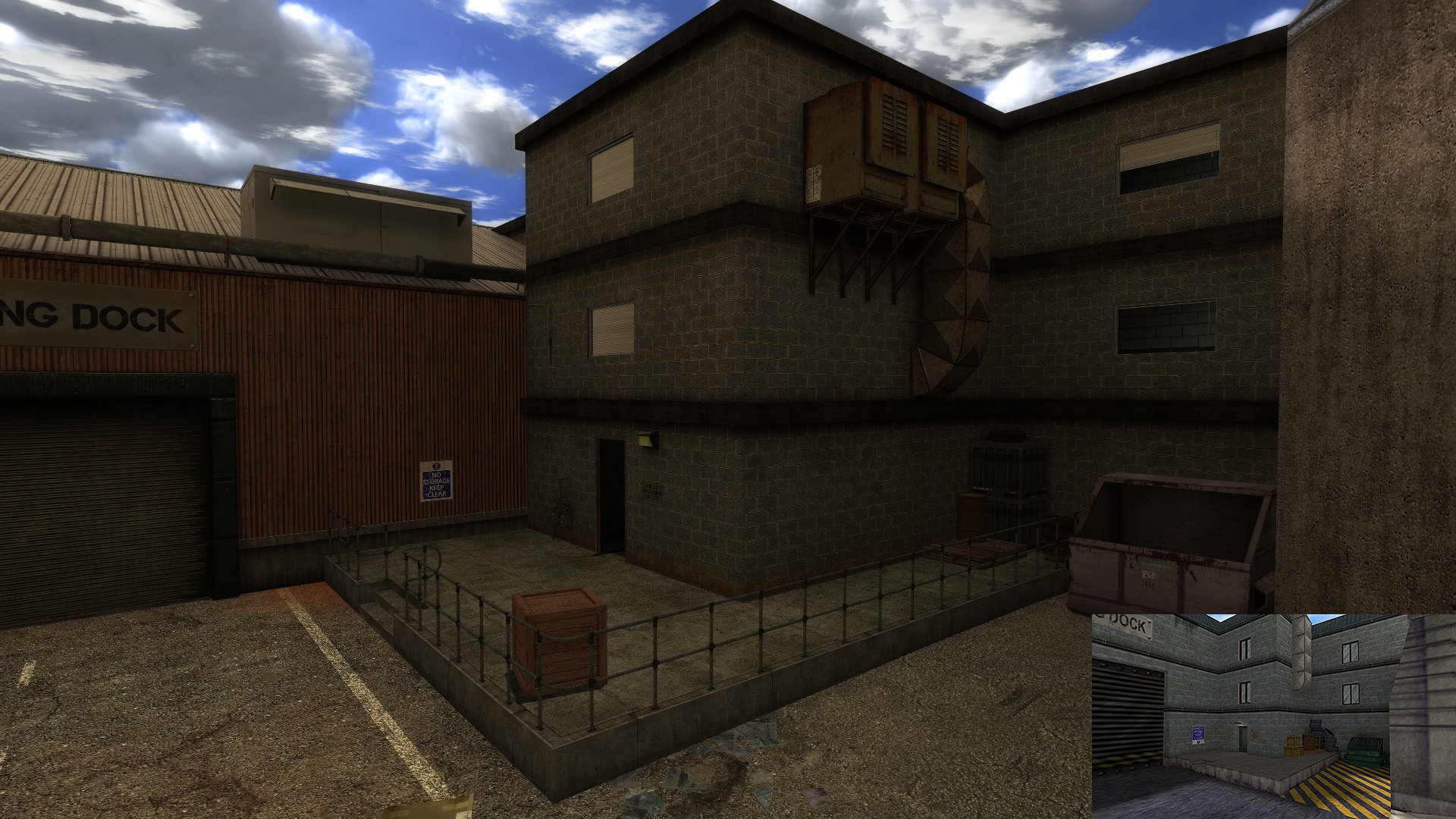
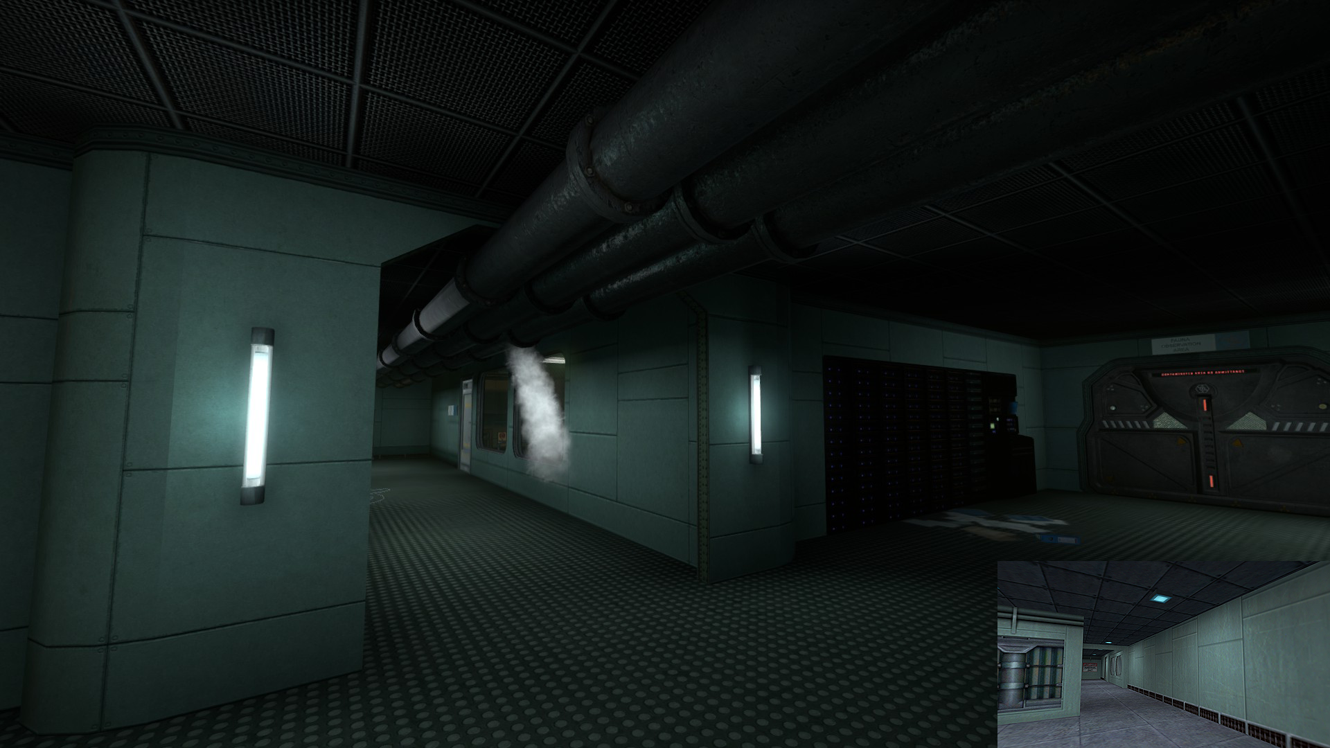
Hey everyone, I'm EvilGoodGuy, a relatively new level designer on the
Guard Duty team. When I was brought onto the team I had a desire (as I
still do) to bring a more logical and artistic style of mapping to the
team.
I am assigned to re-creating maps in the Chapter "Duty Calls",
which had already been mapped by a previous level designer. The
purpose of this DevBlog is to show the comparisons between the previous
level designers version and my iteration; and the process I go through
when designing a map.
Before I even begin mapping I ask myself the questions: "what
is the purpose of this area?", "what is the theme/style of this area?",
"what is the main attraction of this area?", and "what could I do to
make this area more realistic/appealing?", etc.. I then research any
photos/information I can find that may relate to the area I'm creating
and use it to aid me in my re-creation.
In the beginning areas of Duty Calls, the player finds himself
in sub-level storage/maintenace area. The resonance cascade has
occurred, so lights are flickering, alarms are going off, and a sense
of gloomy chaos fills the area.
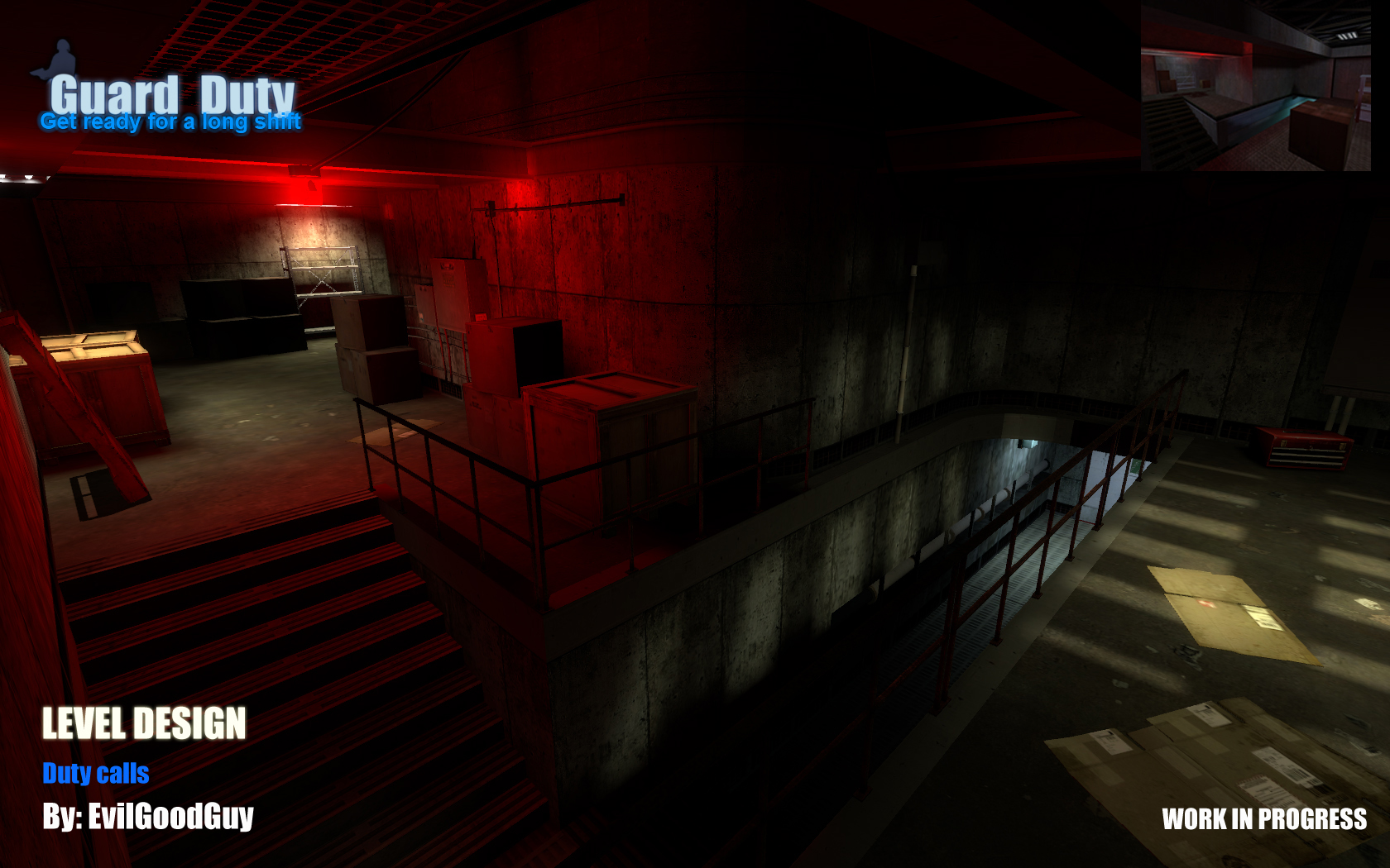
In the previous mappers version of the map (as seen below) the
original areas have been re-created with a similar structure to match
the original, but have some issues:
- The area was enlarged, when I believe it should be kept as small, if not
smaller, than the original, in order to preserve the feeling that you
are in a sub-area for storage and maintenance.
- The entire area was drastically over-lit with bright white light
- There were mis-matched props everywhere and props/detail brushes
scattered everywhere that made little to almost no sense existing in
that area.
(WIP screenshot of previous mappers version)
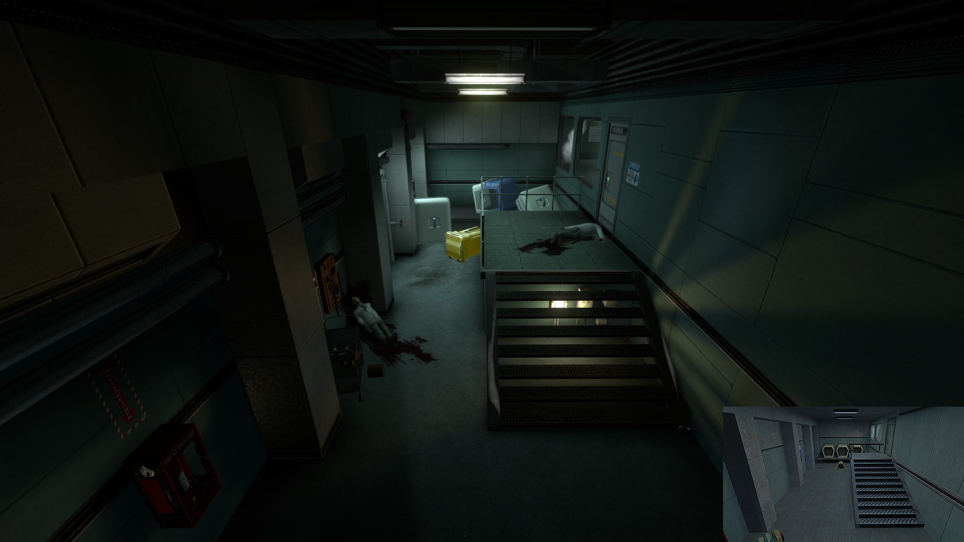
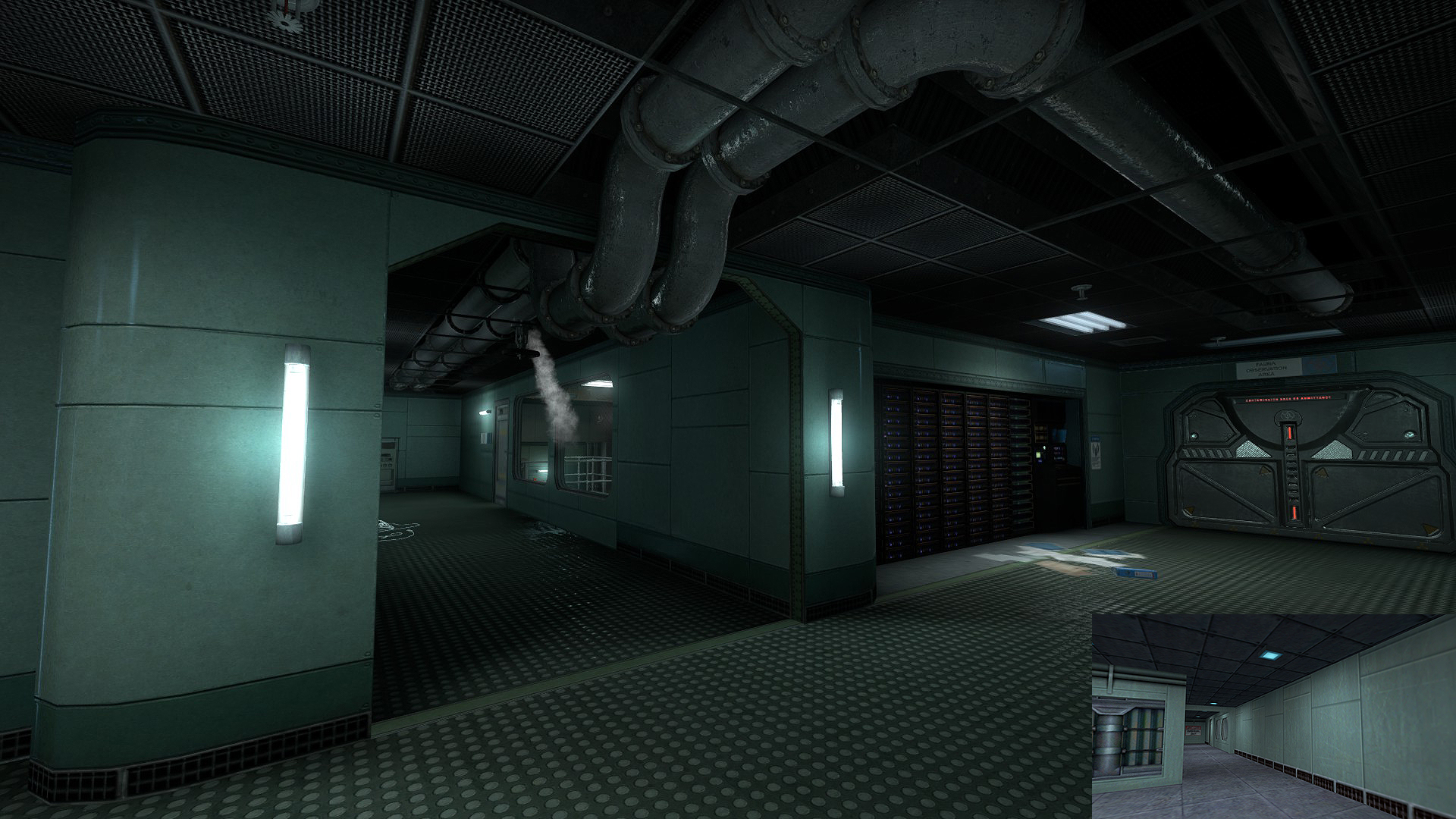
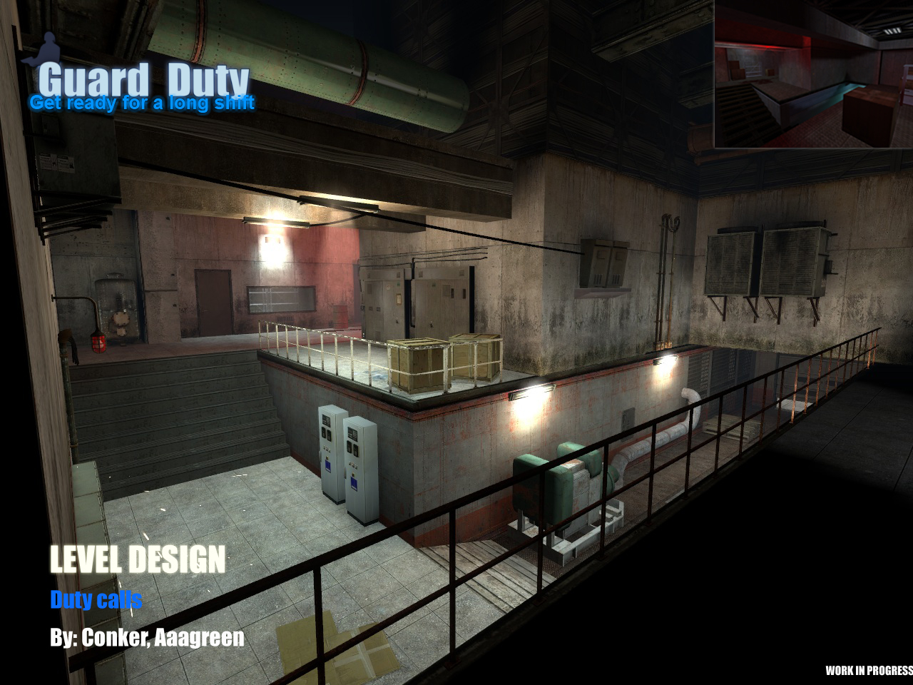
In my iteration (as seen below), I decided to start from
scratch and made a great deal of changes to the area:
- I kept the area very close to the original size, and even shrunk
some areas in order to give the player the proper feel of the room.
- I styled the area with dim lighting, red emergency lights,
broken/flickering lights, etc, in order to convey the feeling of the
disasterous situation and felt that a darker atmosphere would fit this
area better in accordance with its theme.
- I populated the area with props that matched the
storage/maintenance theme and only that theme. It is better to have a
few correct textures/props, than a crap load of wrong ones. Just because
a map is littered with props, doesnt necessarily mean it's "detailed".
(Early WIP screenshot of same area made by me)
It is to be noted that my map (as seen in the screenshot) is
still very much a Work In Progress and does not reflect the final level
of detail and structure that it will have in its final stage. Even at
its early stages of development, I believe my iteration displays a much
more appropriate and styled area.
Well, that concludes my first devblog. Hope you guys learned a
little about my mapping style and stay tuned for future devblogs ![]()
Profile
