
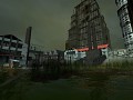
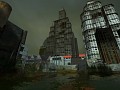
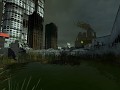
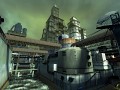
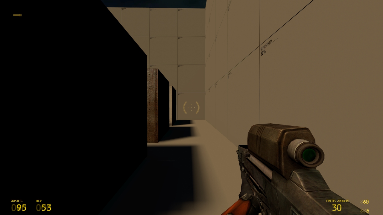
The player's HUD is now pretty much finalized (and as you can see, is relatively modest); some minor details may be added later (ready to hear and discuss your suggestions!). Also, a quick list of pre-answered possible questions:
- Panels' background (faint numbers) restored to resemble the design on early screenshots. The exact position was changed to be make the HUD more convinient.
- Though, the panels' labels aren't texture based like they were in early versions (and as they are in MI), due to the localization aspects (it is possible to make them texture based AND localized, but that's just extra work, I don't think it matters for anyone).
- The ammo panels have '888' background instead of '000' one due to slight problems with implementing the latter one, and even so, the original screenshot (search for it on CO OICW page) shows a '5**' background for an ammo stock counter, for some reason.
- A flashlight icon is moved to the upper right 'cause I like it more this way. (do you?)
- The ammo counter label refers to a type of ammo used by current weapon. Made to make the HUD more convinient as well, as there are more ammo types presented than there're in retail game or the leak.
maybe make the HUD a bit larger? everything else looks great to me!
Personally, I prefer the flashlight icon on the bottom right, though the top is pretty good too. And as Zombine said, maybe the hud could be just a *bit* larger. Overall though, it's looking fantastic!