Hmm, when’s the last time the Art Department had the floor? I believe it was at least two weeks ago. Well, I hope no one’s assuming we’ve been lazy – but the opposite: we’ve been trying hard to bring out the best of what we could get done for the sneak peek. Evidence? Look at the GUI we’ve overhauled. If you want to know more about one of the greatest reasons why we did this, check out Dave’s Design Journal post about the Stats Overhaul.
If you’ve checked out our early screenshots and trailers, you must be familiar with this one. Yeah, We weren’t satisfied with it, either. The health and steam tubes on the middle of the quick bar look very steampunk, but let’s be honest, it’s ugly and it just doesn’t work.
Next came trial # ?!?! (not sure) but this never made the light of day. The major change was the health and steam bar, with which we tried to make the losing and restoring of health/steam more animated. But we let it go almost as soon as we picked it up: the animations were unnecessarily taking up resources. We wanted the player to get the most out of the game and not waste CPU on extras.
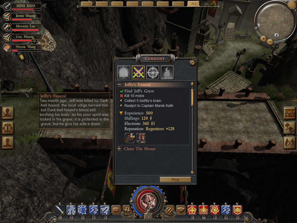
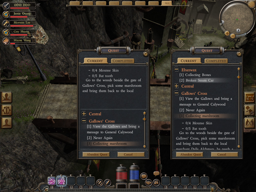
Now let’s take a look at the newest version. We tried a lot of others and we thought it would be best if we had a GUI Editor. So we set off developing one by ourselves and it turned out great.
(More on that in these Dev Journals: Coding 2011-12-20 and Art 2011-12-20, as well as this week’s Design Dev Journal)
We overhauled the whole GUI with the help of the editor: the health/steam bar is moved to the upper left, the ability interface was integrated with the character attributes interface, and short cut icons are put together in a line on the upper middle. The upper right zone is reserved for the mini-map, which we’re still working on and hope to get done for the Sneak Peek. (Forgive the placeholder text… we’re artists not writers!)
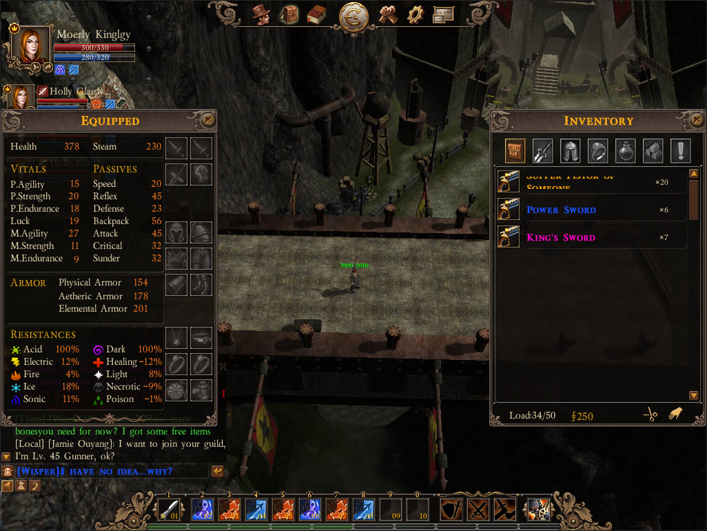
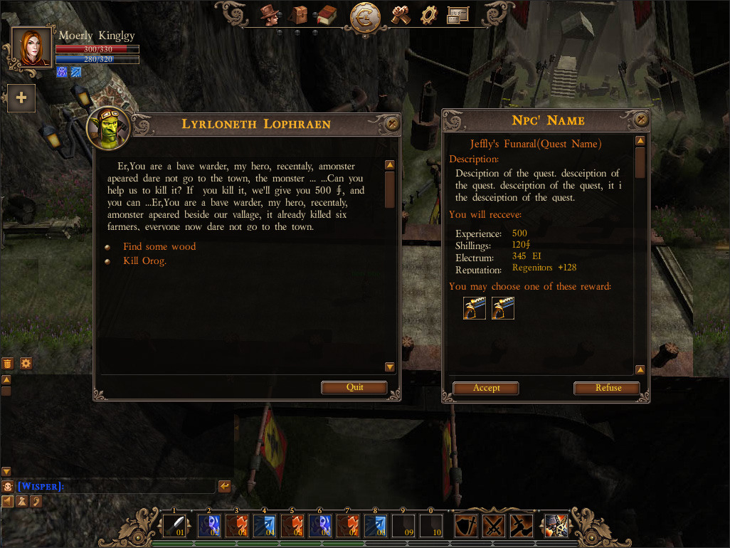
No doubt this isn’t the perfect one, yet. Once we get the Editor optimized and we have a better command of it, we’ll improve it as best as we can but we do really like the streamlined feel to it now. Very clean. Look forward to later, more defined versions! Those who get a chance to get into the Sneak Peek and test it out please tell us what you think, what should be added, what was confusing, we want to hear more!
Head to the developer page to see more. Players who have keys can explore the Sneak Peek already.