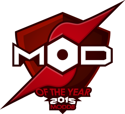
Earlier this year we reached out the community to help design us a new award logo for this years annual events, as always we got a ton of great entries however there can only be one winner. The winning logo was picked based on style, simplicity and brand awareness, along with how it fit the overall theme of the awards and how well it would stand out as a feature piece.
Presenting Lucas, the winner of the logo making competition!
After all his hard work Lucas was kind enough to share some insight with us on the processes involved in the creation of the Award logos for 2015. You can view Lucas portfolio of work here.
Q: How do you start off the design process.
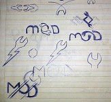
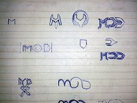
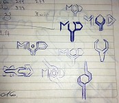
Basically first thing for me when i have to do a logo or brand is to make a little research, investigate what´s been done before, so looking back at the older entries i decided to take some elements and put my style with it.
Q: Your logos really stand out, what did you do to make them unique.
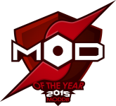
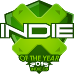
I liked the idea of the shield, so i decided to use it on all the three logos as a common base between them to associate them and make it recognizable as part of the same family. I enjoyed playing with a metal nut serving as an O letter, but i realised it only could be done for ModDb, so for the others i had to play with another elements like the cell phone and the iconic arrow directional from a gamepad.

Q: Once you have an idea of what your going to make, whats the next step?
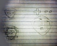
Once i get the first look on my mind i try to transfer it to the paper making as any sketches as i can and when there are one or more i like, it´s time to go to illustrator and draw it on the computer, then of course design or use some typography according to it, and the last thing is to choose or create a colour palette and test it on the logos.
Q: Any other tips for budding graphic designers?
It is wise to design always in black and white first, so you can play better with colour later once you know the brand looks and works good with only one colour.

Nice to have a glimpse of the creator's background work of creating this year's MOTY logo. Which, I may add, is really, really good and blended in nicely with ModDB/IndieDB/SlideDB's general design.
Congrats to Lucas and good luck to all participants in this year's MOTY awards!
Congratulations, it is really a nice logo I think :) Well done! :D
Thanks Lucas for making such an awesome logo. The feedback has been unanimous and everyone seems to like it!