The game you are trying to view has ceased development and consequently been archived. If you are a member of this game, can demonstrate that it is being actively developed and will be able to keep this profile up to date with the latest news, images, videos and downloads, please contact us with all details and we will consider its re-activation.
We regret to inform you that Lucasfilm has denied our request, we want to thank you though for your support but this wont be the last your hear of us. We won't be deleting our content that we have created but we will store it for the time being, and if we don't see Knights of the Old Republic 3 in the next ten years, Then we will present our case again to them. But on a personal note, perhaps this may encourage EA to pick this up, as there is great potential for this. We will keep doing our best and pleading with EA and Disney to let us make this game.


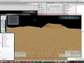
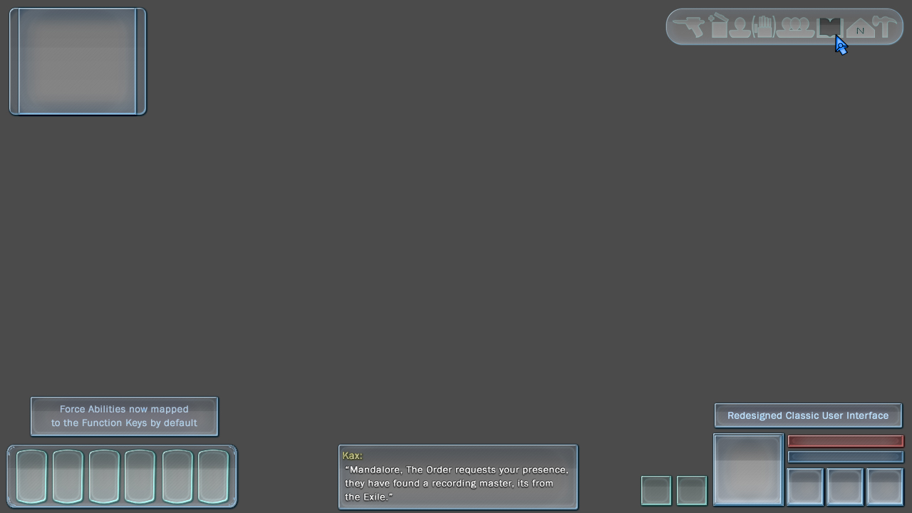
Each user element will hold near full transparency, we've given things another revamp, what's your comments on this version?
I still think the map should be swapped with the character portraits.
Also why are force powered mapped to function keys (which I take are F keys) instead of numbers? Is something else mapped to the number keys?
For the style of a game that this is trying to be I would recommend "borrowing" UI elements from Dragon Age Origins. I'd really recommend using the large abilities section that Dragon Age Origins has.
Things I like though are the location of the tools/characters/options/etc in the top right corner like in KotOR. I also like the modern look of everything being transparent to a degree. I'm on the fence about the dialog location I like it yet I also feel like it should be above the abilities bar that should in my opinion be large enough for all our abilities to fit on it :D
Also whats with the 2 boxes near the selected character? Does that mean we could have pets/droids not count as actual companions?
Lastly I like the colour scheme. Sure it's not that fitting but it looks great! Maybe the toolbar at the top right could use some colour as plain grey looks a tad dull.
Anyways can't wait until July 31st. It will be an amazing feast of either in game footage or a bunch of trolls :P
We shall see. 50 % chance this is legit.
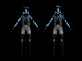
Looks good, can't wait to see that running in game.