
Ok, A few people have indicated some interest in how I create Klingon textures. Alot of it is just by feel, but there are some basics I could share with those that are interested. Note that I do the textures almost entirely by hand. There are other methods, some possibly superior to my own...I just like doing it this way, though I am open to suggestions of course. Just wanted to give you a heads up.
A few more notes: This assumes you have a basic working knowledge of Paint Shop Pro. If you do not understand any step I can elaborate in more detail. Also note that methods in Photoshop may be different, and tools may have different names. I will not be able to help with Photoshop, as I am not familiar with the program.
Getting the base
Ok, first you have to decide which hue you are going to use. I generally work with three basic hues and go from there. Use a standard saturation.
1) BOP hue - R:84 G:153 B:109
This is an electric green hue used as a base. From here you have some lighter more washed out greens as well as a bluer green, but from my perspective this is a good hue to start from.
2) TMP hue - R:96 G:113 B:99
This is generally a washed out green, to the point of almost grey. You will notice that if you increase saturation on this hue it becomes a green. This is the color I would set for most TMP klingons.
3) TNG hue - R:99 G:114 B:101
This is the general base for all TNG and later klingons. It is a good light base to start from, and gives the ship an overall modern feel compared to older klingon vessels.
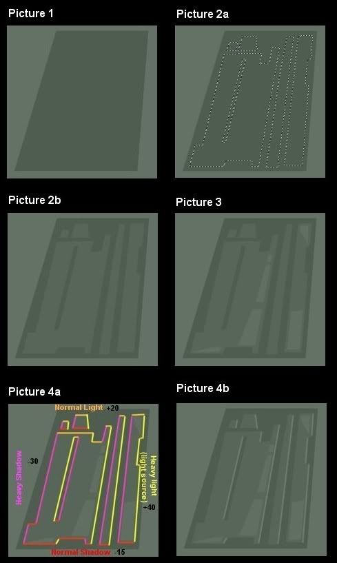
Getting to know your lower base
Ok, this is where a few tools come in. You want to set the lowest base color that will sit in the trenches, around the panels and such. It will be a dark color, but not so dark as to not allow detailing to be added. You will want to choose the area you want to create your panels in using the freehand tool. I find going point to point is best.
Once you have the area you want selected you are going to drop the lightness down a few notches, in the picture I dropped it down by 20 points using the brightness/contrast feature (Picture 1).
Get your Michelangelo on
Heres where you get a bit creative. You are going to form some panels now. Panels are higher than the surrounding hull, so they will appear lighter, giving the illusion of depth.
You will want to come up with a pattern you want and apply it using the lasso tool again (Picture 2a). I usually choose a large block using the plus side of the tool, then cut out parts using the negative side of it. Use the ctrl key to add area, the shift key to remove it. Be creative, look at ship pictures, experiment.
Now you should change the brightness/contrast again to a lighter color...this is the first panel depth so you should start with 10 points plus (Picture 2b). You have your initial panel pattern.
Needs more paneling...and more cowbell
You will want to add more graduated panels now. Just some accents on the original panel blocks. Use the same method as above, and again add 10 points to the brightness. You will be at the lightest panel color now, matching the background (Picture 3). You now have your base panel setup. Now on to adding some shadowing.
Shadows are not shiny...
There are tools you can use to create shadows, or you can do it by hand. Generally I do my shadowing manually. This may be a bit of a long part to this tutorial, but once you get the hang of it it will come easy to you.
What you have to decide is which way the light is coming from. You establish the source of the master light when you are making the model (just pretend the sun is located somewhere around the model) and create shadows based on that depending one where the panel is going to be located.
Here we are going to assume the light is at the fore end of the ship, and this is a side panel..left is back and right is front. Using tools to create shadow en-mass is tricky. I usually do shadowing by hand, so that is what I will cover.
a) You have to determine 4 colors basically...heavy and normal light and shadow. You will determine brightness colors for each (I usually go with 30 to 40 points for the heavies and 5 to 20 for the lights. Keep in mind that, in general, Normal highlights are half the strength of Heavy ones.
- Heavy Light: +30
- Normal Light +15
- Heavy Shadow -20
- Normal Shadow -10
b) Use the base color on the panel to create shadows for the first level of panels, and the first level panel color to create shadows for the next highest level...and so on. Here is a step by step on the Heavy Light as an example...30 points above base.
- select the dropper tool
- right and left click on an area in the picture that is your lowest level...your darkest color.
- click on each box on the right and adjust the color up in lightness 30 points.
- Select the draw tool (single line, antialias, create as vector as tool options)
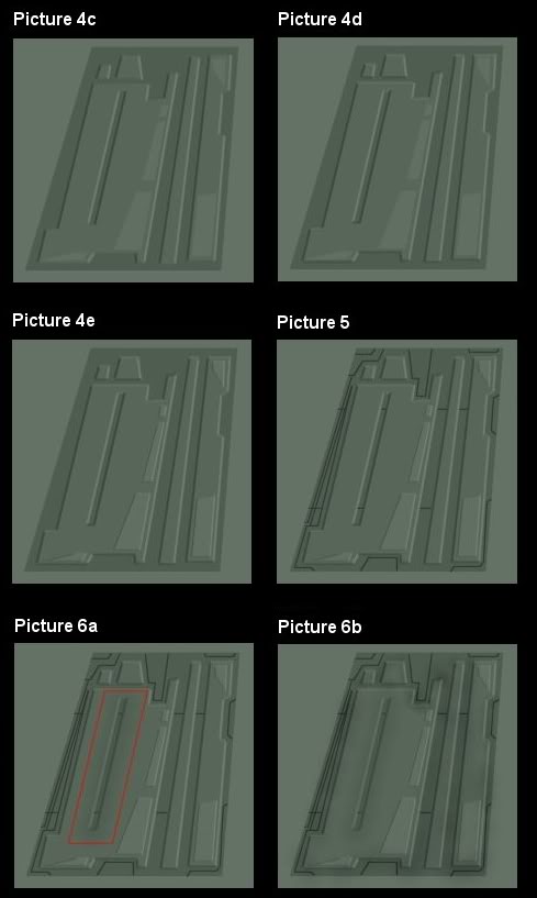
Ok, here you have to decide the height of your panels. Generally speaking, the bigger your shadow line the higher the panel. Im going to go with an average shallow panel, so my lines will be a width of 2. Some people will argue that the higher the panel is the darker or lighter the lines have to be, but essentially I have found that is less important than line width.
Now, before we apply the first shadow lines (Picture 4a).
- any edge to the right of the light source will be normal light.
- any edge to the left of the light source will be normal dark.
- any edge behind the light source will be heavy dark, in front will be heavy light.
Note that I only highlighted the first level..we will need to change the shade of the shadow/light for the second set of panels to make them work right. Also note that applying this rule will sometimes put a highlight where it doesnt belong, and your eye will point that out...feel free to change to shadow or light where needed.
Ok, we are applying Heavy Light first, so I added 30 points to the base color and applied the lines (Picture 4b).
Then we apply the Heavy Shadow, I subtracted 20 points from the base color and applied the lines (Picture 4c). Finally I did the Normal Light lines (+15) and the Normal Shadow lines (-10). This last step is optional, but is better for the effect (Picture 4d).
Now we just repeat the steps for the next higher set of panels, using the panel color they sit on as the base. Just repeat the steps above. Note that the top panels are not as high as the lower ones, so I dropped the line width down to 1 (Picture 4e).
Hopefully not as long as step 5... Base greebling
Ok, now you get into the nitty gritty. Making the panel more realistic looking. This is a two step process. First, the pre-weathering greeble. This is just a network of dark lines, darker than the shadows you created. I cant tell you how to do this, other than to say that the color should be at least -40 lightness from base and thin lines. It is up to you to determine what pattern you want to use...you can see what I chose here (Picture 5). You now have your raw panel ready for weathering and post-weathering greebles.
This is too much work...Weathering and post-weathering greebles
To weather I use the Retouch tool, lightness down, round, size of 36 or so, hardness of 0, opacity of 40, step of 9 and density of 100. This gets a bit tricky, and it is really something you have to practice. Generally you want to dirty up any edge that exists. Channels get extra attention. You want to use the tool ONCE in an area, then move over or down a bit so that the next application only overlaps the former a little bit...and so on down the edge or trench.
I did this in the channel on the big panel...the difference is slight to the eye but makes a big difference when you are done as you will see (picture 6a). Remember that less is more, and dont be afraid to adjust the size of the tool to make sure that you overlap the panels by a bit, but not too much. The end result should look something like this at this stage (picture 6b).
Next you will add chipping. This is pretty easy..you choose a few edges here and there and apply a light block of color or two to look like paint chips (Picture 6c). Again, less is more.
Now you will do a greeble darken second pass...this time only darken some of the greeble areas as shown...your choice where. Dont overdo it. Then you want to add lightening on the panels in a few spots. Again, your choice, generally make it one or two applications and keep it centered in the panel as much as possible. Use the same tool you used to apply darkening, just use lightness up instead of down. I went with about a 46 size here (Picture 6d). You see what is happening?
Now the second greeble pass. This is comprised of two types of greebles...lines and patches.
The general rule is base greeble lines and patches are light, panel greeble lines and patches are dark. You will want to pick the lightest base area you can find and add 5 points to the lightness for the base, darkest area and subtract NOTHING for the panels. Then get to work. It is important to note that your lines will sometimes wash out, sometimes really stand out. THIS IS INTENDED. Just draw them as if you can see them...the eye picks up on them even if you dont in general. First the base greebles...(Picture 6e)
...and then the panel greebles (Picture 6f)
And then a bit of desaturation here and there to represent fading. Use the desaturation tool just like the lightness up tool, keep it on the small side, dont go overboard. You can also sharpen it up a bit if you like (Picture 6g).
A few closing thoughts, and things to remember...
- Be conservative. Large differences in hue stand out too much, and look too cartoony. It is better to have your details fade in the distance then to have them stand out as if the hull was painted with magic marker.
- Be patient. Little details matter. Remember that in real life something like a space-faring alien vessel, controlled by fierce warrriors with trigger fingers and a lack of personal hygene, never mind a concern for asthetics would have a ship that is dirty, banged up and generally full of lots of detail. Your details may fade in the distance, but up close they will look very realistic if you take some time to do them right.
- Rome wasnt built in a day.....and neither are Klingon ships. That means over time materials may fade as others are used and attached. Feel free to change the hues here and there slightly, try not to apply the same hue to the entire ship. It really does make a difference in how realistic it looks.
- Dont allow yourself to get impatient. One can tend to get in a rush when the job is almost done, and sacrifice quality. It is better to remain consistent throughout the texturing set.
- Create your own style. You have always had an idea in your head as to how Klingon ships look to you......dont be afraid to share it with all of us.
And there you have it. Feel free to experiment and perfect your technique, but this should give you the basics.


Locking good :)
Thanks for sharing this.
My pleasure. I realize that some of the items I listed can be done with automated tools, but nothing existed for someone using simple paint programs or a desire, like I have, to just do it by hand.
Nice textures!
Thanks. There is just something about doing it by hand instead of using tools. More "love" I suppose.