The Anatomy of an Icon
Hi guys. Once again, it’s Stuart Livermore from the Shadow Heroes art team. One of the many jobs I’ve had so far in the design process of this game, is the creation of a great many icons for the equipment system. I’ve done around 40 so far, and will probably have done hundreds by the time we have finished with the game, and I thought I’d share with you what I’ve learned about the process so far.
The first problem I was faced with was the size of an icon. For someone with a background in digital painting, icons are small, like really, really small. For those of you familiar with Photoshop, my art work is usually on the scale of 7000x9000 pixels, which is admittedly quite big, but allows me to really get a lot of detail into an image. Conversely, the icons for Shadow Heroes were decided to be 55x55 pixels, a size that proved to be a challenge to work with.
Immediately, a problem emerged.

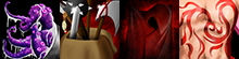
The above icon will not be in the game, because I think we can all agree, that the item it represents (called “The Bloodblade”) appears in this icon to be viewed from a second story window, which taught me a very important lesson. Unlike in regular art pieces, where you show what’s important, and try to limit what isn’t, with icon, you only show the most important part of what’s important. You have to pick very carefully what you show and what you don’t. Basically, you’re trying to show only what you need, to convince the viewer that this icon is what it says it is. Here’s some examples of some good, zoomed in icons.

The second problem I had was one that many artists run into; a lack of pop. Take a look at these icons.

They are called, respectively, “The Badge of Honour”, “The Berserk Herb” and “The Yellow Sign”, and they are going to be in the game, but look for a second. They are very flat, and lacking in anything really eye catching. They look correct, but they need to be interesting, beyond being just correct. So I started adding some flashy backgrounds, nothing specific, just some splashes of colour to make the overall image eye catching, something people will want to click on and interact with.

Finally, the last thing that I found to be a difficult hurdle to overcome, and it has to do with details. Look at this.
Now, these pictures, for items called “Can of Stuff”, “Extra Pack”, “Stealth Cloak”, and “Magic Tattoo”. Now, I like these, but they have problems. I think the problem is that the amount of detail they have simply doesn’t work at this size. When they are this small, the details in images can disappear, or even appear as something completely different. It’s important to only add detail when you need to, and only do it if it is going to appear correctly at this size. As I realized this, it became much easier to quickly produce icons that were ready to use.
I leave you with what is the best of the best so far for icons in Shadow Heroes: Vengeance in Flames.