Hi guys,
Jeffrey here. It is my first blog post, so I would like to start with a few words on how we actually work together in a tiny team. A long time ago we decided to take time for the concept art first before we throw ideas at the 3D designers, in order to develop a juicy atmosphere and feeling for the look of Proven Lands.
So the creative process for Proven Lands usually starts with Rafael throwing a few buzzwords at me during short briefings, mostly at lunch. It’s like “It will do this, is this tall, and it could be influenced by the creature so and so in this film”. And if it feels great, if we agree on that, I promise to give it a try. This works pretty well, as we already have a common pool of inspiration that fuels our vision of the game, which includes basically all Ghibli and Pixar movies, as well as Japanese mecha anime and retro futuristic sci-fi and enjoy chats about movies like Nausicäa, Enemy Mine, Alien and so on. After swapping several ideas with him I do some research at Pinterest and tumblr to mash up reference pictures, to help me defining texture, anatomy and the like later.
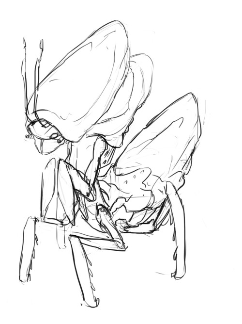
I finally start swinging my stylus, creating some lose silhouettes adding a minimal amount of detail to them. This very beginning is in fact one of the most exciting steps during the process, shortly before things start to take shape and I can still leave space for happy accidents. This is a very fast procedure and allows me to create a big variety in a short amount of time. I chose a selection of the most promising shapes to refine them further, yet storing everything I created thus far in a separate layer. Keeping things proved to be quite comfortable, not just as a backup, but also as a stock for interesting elements that might not enfold their potential in the initial sketch, but by putting them into a new context, especially when stuck with a current sketch. This „dump“ grows over time and serves as a great overview for the direction that the design takes, enabling me a more focused and self-iterating way of creation.
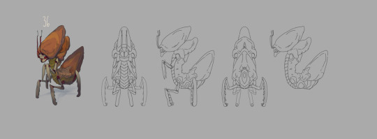
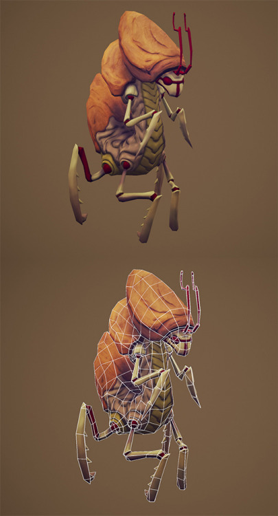
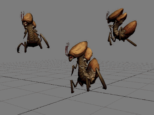
At that point I also start consulting my reference cluster to define details and make the design more plausible. By now Rafael peaked over my shoulder at least once and we eliminate the weaker designs and adjust the overall direction if needed. Following up is a final line drawing that I color and shade in a few variations, usually with regard to the environment we’ve created or have in mind already. The coloring process changed from a very painterly approach in the beginning to a flatter, more accurate and faster one, that leaves textural choices to a great extend to the 3D artists, yet encourages a stylized, cartoonish look for the final models. This is probably the biggest difference to a big studio where you have specialized concept artists working on higher quality concepts for a long time. As soon as we are content with the colors I create orthographic views, commonly the front, back and side, which is a great opportunity to recap former design decisions with regard to volumes, which were not visible from the angle of the initial drawing. When done I hand the design over to Rafael who will use it to instruct the modelers over time.
- Jeffrey


Very informative.