I've got a few things to share today, first up I've been playing around with the new gameplay features, maybe to excess.
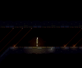
This is basically just visual, but I do enjoy how it looks to have several beams tracking the player. (Orange beams are only triggered by humans, red beams are triggered by anything).
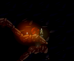
Next up is climbing on boulders. This was already a gameplay feature, but I hadn't tackled the animation yet, I've only roughed it out for now but it definitely gets the vibe across. I've been constantly challenged by this project, I've never really been much of an animator so I've had to grow a lot (which you might be able to see from the rest of the devlog). Anyway, I was worried about this one so I'm glad I have a good start:
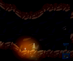
And it's not the most exciting entry but it's a vital component of the game... The player can die!
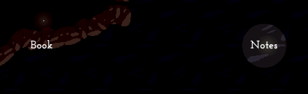
On another note, I decided it was finally time to rewrite the notes menu. We had decided this was going to happen ages ago, it was just a matter of time. The new flow is much nicer, and the code is far more maintainable.
The whole thing wouldn't have been possible without the use (and improvement) of our FlashPunk utilities library. Which is available at Github.com.
So, I'll run you through what I did:
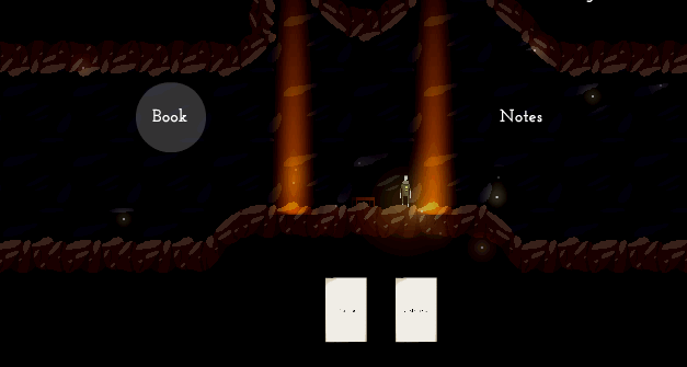
This is the first part of the menu system I worked out, it's got a container around those icons at the top, that allows them all to be repositioned as one. The icon strip is a view to a NoteCollection model, which in turn holds many Note models. When the collection is updated, the view rerenders itself to display the current state.
The large note below is simply a regular entity who's graphic is swapped out depending on the selected note.
This sort of design pattern is much more obvious to me now, having several years more web development experience under my belt compared to the start of this project.
Next up, I made the level above this. This wouldn't be my normal approach, however I had forgotten we had two distinct note menus to worry about. Luckily the modular system I used allowed me to instantiate two of the icon strip views and switch between them as needed.
I also coded up a little cursor object as you can see there. Not sure if we'll keep that style.
Finally I added the ability to drill down a level further and examine the notes once you've selected them from the icon strip. Here's a gif demonstrating the full menu flow from highest to lowest level:
A lot of people definitely underestimate how useful it is to program across multiple fields. Game development is typically far more challenging logically than web development, but the lessons I've learned about reusability, modularity and layout from web development are invaluable. Plus learning more languages is always fun.
That's all for today, as my brain is pretty fried. Time to have a beer and enjoy a sweltering Australian afternoon.

New update, yeah :). The menu is beautiful. The death animation could use some work. The main complaint is that the legs lift up for no reason. Maybe the player falls on his knees then the body falling.
Thank you! There are a couple of animations that are basically keyframes at the moment, including the death one. We'll definitely redo it when we have a chance.