Our first approach to HUD mechanics was very simple - it had to be as much useful system as it can be, showing all available information so the player wouldn’t forget what is what. It soon turned out it didn’t worked exactly as we planned. On one hand, there was too much on the screen - icons covered much space and sometimes hid elements of levels. On the other, player’s couldn’t remember what the icons mean - even bringing an introduction screen with instruction didn’t work out because players just didn’t read it.

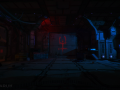
(Old style of HUD in Phantaruk)
This whole situation made us realize how important element GUD is. Up to that point we had treated it negligibly, almost ignoring it and player’s feedback changed our view of good game interface and its significance. In the end, it is something the player has contact with through the entire game.
Second approach wasn’t fruitful, either. To be honest, we just focused on the look, not usability, and changed the layout. Of course, it improved readability (“Rem” was changed by an infection bar and “Heartbeat” - by an animated image) but still it covered too much screen and still didn’t show all necessary information. What’s more, there was much more focus on the HUD due to the animated elements.

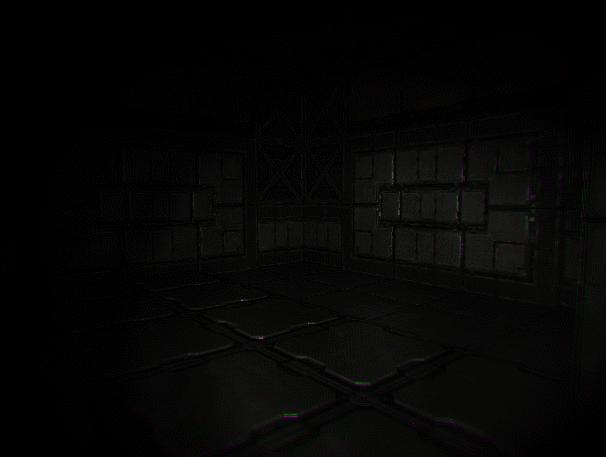
(Next approach to designing a HUD)
Therefore, we decided to change the approach and try making something more compact, somehow similar to what can be seen in ‘Dead Space’ and ‘Amnesia’ series. Having these ideas in mind, we implemented a medpad - a small computer on main character’s hand. It works in two modes: quick-view and inventory. The first one allows to check the heartbeat and intoxication; when right mouse button is pressed, main character raises his hand to show the display with the pulse and the infection level. Second mode is switched by using Tab/I key and turns a hologram on. There, the player has access to items, logs and list of objectives.
At the moment, the medpad works great. Not only it merges brilliantly with the game but is also functional and useful. Although its screen is mocked up, it is not hard to understand how it works.
Is there something left on the screen? Yes, there are two elements that can be seen in the game. The first one is stamina bar which appears when the player sprints (it disappears shortly after). The second is a crosshair - it changes if there is a possibility of interaction with an object (like pickupable object or usable mechanism).
That's all. :)
And don’t forget to like us here: www.facebook.com/phantaruk
www.phantaruk.com