User Interface design is something I enjoy doing when I'm working on apps and websites at my
day job but until now I've been neglecting it in my game as I try to get the primary mechanics refined.
That being said recently I started working on what I'd like the HUD (Heads Up Display) and Pause menu to look like eventually and it's been fun to work on something that comes more naturally for me.
I'm not reinventing the wheel here there are some classic aspects of the HUD that I'm going to be taking advantage of for a solid starting point. For instance, it's pretty common to have your player information at the top of the screen due to classics like Mario and Zelda having so much influence on video game evolution.
Since players already tend to look there I'm not going to try and fight that convention. My real goal is to make it quickly readable but also as unobtrusive to the gaming experience as possible. Currently
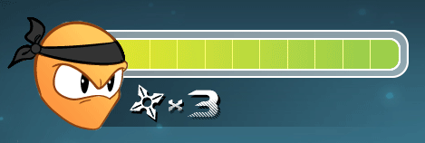
in my game I have the player's health represented by numbers in the upper left of my screen. I'd like to change by adding a health bar graphic that changes color when you are hit. Green = good, Red = Bad, this convention registers quickly so you can scan it faster and get your eyes back on the action.

Something else I've thought about is the Pause menu. How to make it stylized but also again easy to use and understand. Also I didn't want it to feel disjointed from the rest of the game so I wanted to have to go with the overlay menu so you can see some of the action in the background still. Adding a Blur filter will help keep the screen from looking busy despite all the craziness that could be happening at the moment the game is paused. I'm also thinking I'm going to keep the palette black and white so the menu looks good over any part of any level in the game.

Having somewhere in game to reference the controls is a must and I'll have to make one of these for the controller and keyboard/mouse. Again I'm trying my best to make something clear and easy to understand while still feeling like the rest of the menu. These are a good start and I'd really like to have this interface implemented before I release the "official prototype" demo. We'll see what I can make time for.