Call of Duty: Zombies Quake demake "NZ:P" for the PlayStation Portable & VITA, Nintendo Switch & 3DS, Windows, Mac, and Linux.
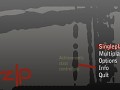
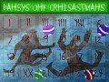
Possible new menu design
(view original)

Post a comment
Description
It's not a big thing (cause it's just a concept), but this is how new menu MIGHT (not sure if it will) look like in the future.
looks cool
looks awesome but i would use a more of a zombie type text front and use broken line studios logo somewhere, instead of info you could use extra's and have a sub menu in there for the extra stuff, other then that its good, i would like to see something like this on the pc version :D
Can I help design it? I am a wiz with the photoshop
Looks more like a professional design than the actual main menu.
I like it. Except for the "NZlP" text.
I think it should just say "NZP" or "NZ:P".
mmmm... heroic :)
cool
jukki if u want a cool font ill give u one via skype
just write to me if u need it
achievement system...
intresting...
thats old news man lol
Oh my god..PLEASE use this in NZ:P!!
what the hell else would they use it for?!?!?
The menu!
Ah derp :P
just dont make it looks cheesy. use pro photoshop skills =D
amazing :D
A zombie on the background would make it look good :DD
make the bg something like from ndu map(dark,fogy)add the ambiance sound(screams, wind sound's, and the damned song with echo) than add some blood splatters and use nazi zombies font
awsome design!!! ;)
looks so prettyyyyyyyyyyyy. can i stroke it!? can i? please?! i will be soft on it! please please!
omg soo cool, great job
I would use this menu, as it lies right now. Keep the font. Easier on the eyes.
Could be better...
awsome you should use it in NZ:P beta 1.2!!!!!!!!!!!pls or make 2 betas one with the old design and one with the new!!!!