With hindsight where I went wrong was labeling the release Beta.3/RC.1 - That RC bit “Release Candidate” was tempting the gaming gods.
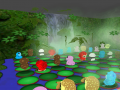
My game is not complex. Essentially it’s a match-3 game, (as an aisde ‘hard-core’ gamers tend more not to have a clue in this genre compared to say... your gran :) ). Its a Match-3 - but even so it does have mechanics. In fact some of the mechanics i'm quite pleased with, and they kind of fuse together to give a really nice mid game. Its got lots of variety and keeps the player coming back.
However, I made a classic mistake of assuming that things are *SO* obvious to the player that they didn't need explanation. And thats really why my RC1, stayed as beta.3 - and really failed.
Failure at this stage is really important though.
Games are really disposable nowadays. After user acquisition, which is incredibly hard - the biggest challenge is user retention. Just as most businesses fail very early in their lifetime, so too, most gamers are going to quit your game very early and never come back.
If you make your game difficult to understand or use you're going to lose more users in those early moments.
In Matchy, I kind of knew some of the elements are not immediately obvious, but I’d hoped that players would *DISCOVER* what things meant by playing and experimenting. However, I made a few really big errors. Luckily, I think i've caught the worst ones by failing now - during beta. Hopefully I now have a chance to fix them before release. Sure some people will still download play once and never come back - but i’m going to try to minimize that..
Three main areas to tackle:
1) Overwhelming - All features are active right from the off. I’d hoped that the player would focus on what I knew was important - but how can they know what is important. TODO - disable features and activate them slowly…
2) Terrible tutorial.
Heres my old tutorial:
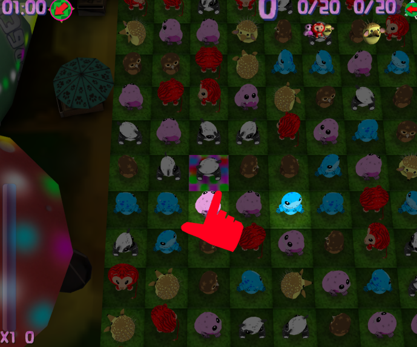
Ok you don't see it moving but thats cool - its literally just that. Its not enough. Its rubbish!
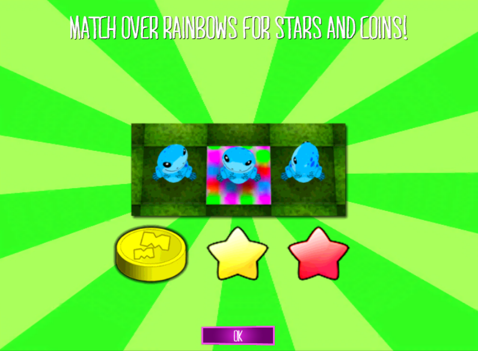
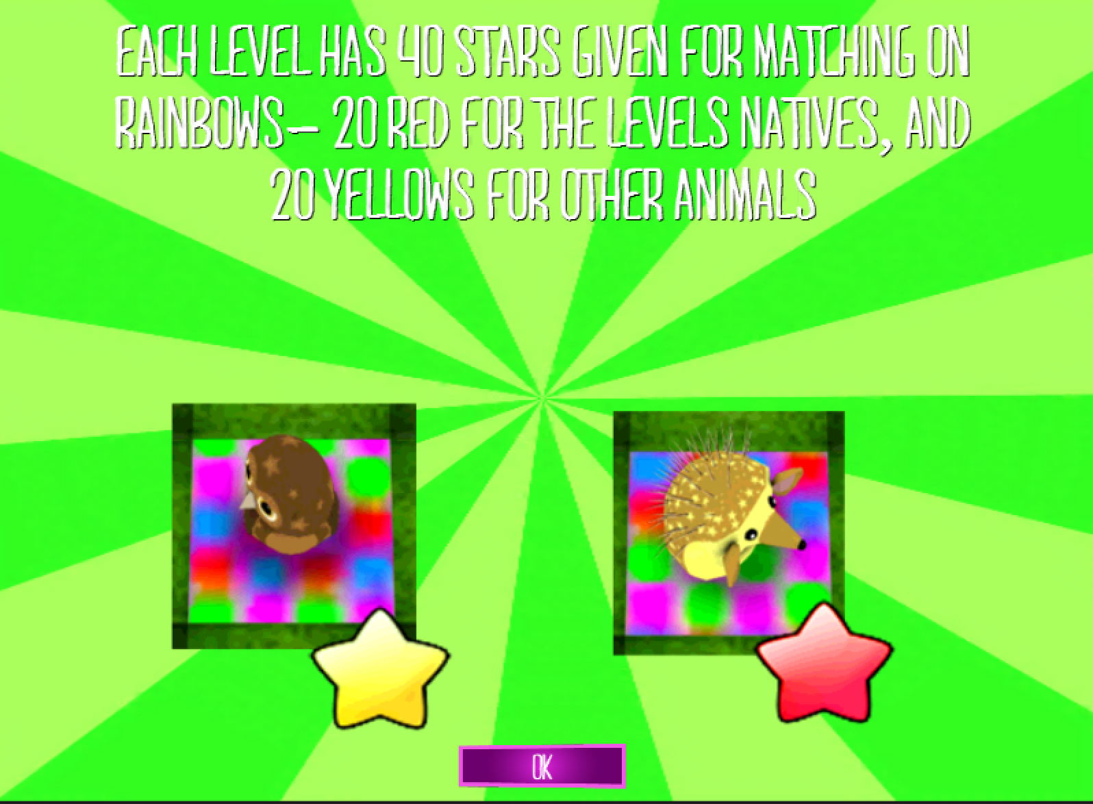
TODO - Unfortunately I don't have the resources to make a expanded tutorial thats truly integrated into the game (like proper games have :) ) - So I had to take a hard look at what I can achieve. In the end I’m going to produce a set of screens which introduce new features. They should be simple and to the point. Heres a couple - as you can see I’m still working on the text - trying to reduce as much as possible while it still makes sense. This is quite hard :)
3) In App Purchase/Game Purchase. I need to revisit this - but I think it deserves a post of its own…! Coming next :)
Any way - RC1 - coming ... soon? :) Check the trailer ...