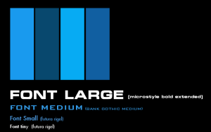
This week we decided to do something a little different than the weekly mechanics article. Typography is the art of arranging the written word and being able to process it. For a strategy game like Lord of Rigel, being able to clearly read text in the interface is crucial to being able to quickly process what is going on in the game and make decisions. Fighting with poorly legible text is the last thing any prospective space emperor wants to do!
We wanted a minimalist user interface in LoR, influenced heavily by the design work in 2001: A Space Odyssey and the appearance of interfaces in Star Trek II: Wrath of Khan. This is reflected in the alternating blue color scheme with subtle gradients, which mimic the rear-film projection used for computer displays in those films. We’ve also chosen to reflect that in our choice of fonts to display text and information in the game.
When doing research on fonts in LoR, Dave Addy’s blog Typesets in the Future was a great source of reference behind some of the decisions made by film makers such as Kubrick and Duncan Jones. Typesetinthefuture.com
For large text in Lord of Rigel we use a variant of Eurostile. This was a geometric sans-serif. Serifs are the little curls and things added to fonts like Times New Roman that arguably make them easier to read in print. Serifs also tend to make text look less minimalist and less futuristic. Sans-seif fonts like Helvetica and Verdana are fonts without serifs. Eurostile was developed in the 1960s and became popular for headings and signs, and was particularly popular in science fiction artwork. Variants of Eurostile are seen used heavily in science fiction movies, specifically HAL-9000’s displays in 2001: A Space Odyssey. We use Eurostile in white for titles and buttons in Lord of Rigel.
For medium sized text we use Bank Gothic. It’s another geometric sans-serif font that was developed in the 1930s. It’s a font used heavily in games and promotional materials. It’s rather prevalent in current science fiction. Despite being angular, futuristic and “cool” it’s also not the most legible font at small sizes, so we use it for section and category headers with a blue coloration.
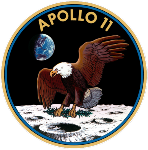
Our final font is in fact a customized one that combines the best of two. Futura is the font used for the commemorative plaque Apollo 11 left on the moon. Its a very legible sans-serif font, but its numeric characters we don’t use in Lord of Rigel. Instead, we use Spartan which was a font developed as a direct competitor to Futura. Spartan is in fact used for the numbers on the Apollo 11 mission patch. The numbers are cleaner and more legible than Futura, but we wanted to use Futura as it’s more prevalent and unconsciously familiar to people. So the best of both worlds is using Spartan for the numbers and Futura for main text in our Futura-Rigel variant font.
So overall we’re using a set of fonts popular for looking “futuristic” and also ones tied to space exploration. All of them are clean and legible at different scales. In the end, this means we have a clean minimalist set of fonts that can display a large amount of information quickly to the player.


