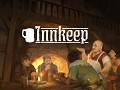
When I first started out on this project I had an idea that down the track I would rely on a real artist to do a lot of the work needed for actually drawing the play space, the interior of the inn. But I also didn't want to look at anything too ugly while building the game, so I decided to try my hand at making something that could serve as a stop-gap for a year or so, and give me some kind of idea about what I was doing. I downloaded GIMP, and proceeded to merrily draw away without the slightest bit of training, or any kind of research about what drawing programs are, or how to use them (basically picture a kid using MS paint).
Actually it kind of turned out pretty neat.

To the trained eye it might not have been much to look at, but I thought I succeeded at least in evoking the idea of an inn, and at the same time proved to myself that an angled "dollhouse" kind of perspective would work. With a bit of shadow, shading, light and smoke, it could even look a bit atmospheric.
It was however a pretty terrible mess. There are a few basic mistakes I made when it came to simple techniques that I never tried, or tools that I didn't think to use that could have saved me a lot of time. But the absolute worst thing I did, and something that is pretty embarrassing really, is that I drew the whole image below as a -single- image. Yes, that's right. Everything is baked in. Not just the walkways and the stairs, but also the columns, and the fireplace, and the shadows. There are no separate layers that allow for easy adjustment down the track, just one grid of pixels... Oh boy.

So, I got around that best I could by copying geometry that I wanted the player to be able to "get behind" and simply placing the copy over the top of the original as a discrete object. This allowed for it to be drawn over the player when the player had a lower value for its Y axis. But if I wanted to move the location of the column? Then I would be out of luck.
I soldiered on with this basic limitation for a while, too focused on the tricky task of implementing stuff like path finding, object selection and guest code. It gradually became obvious though that this was not the way to do things, and I knew that one day I would need to do something about it.

That day was some time last month. I had recently set up my new office space for game dev and had been getting busy with Innkeep! again. I had a lot of fresh ideas about what I would like to do with the play space, but the terrible underlying setup was getting in the way. I would have to scrap everything and start again. Rather than just cutting things up and patching them over though, I thought this would be a good opportunity to put in some effort and improve the art at the same time. Rather than creating some more temporary art, this time I would attempt to make something that would be basically good enough for the final game, even if it might need touching up and improving somewhat later.
Installing GIMP on my new work computer and loading it up for the first time in over a year, I had a lot to remember. But I also quickly started discovering new functions while crafting. Most importantly though, I had a clear idea of what went wrong before. This time the floor, walls, walkways, stairs, and fireplace would all be separate images that would then later be combined together. Then if it turned out that something needed altering down the track it wouldn't be a big job to do so.

The first step was to isolate the floor. I liked the perspective and the size, so I was keeping that.

But I was going to scrap all the original flagstones. A week or two earlier I had done some work on the cobblestoned street outside the inn and learned a thing or two about shadows and highlights. I also learned the value of looking at reference images and analyzing what was actually going on, rather than simply creating an approximation from my imagination.

I added an overlay for the perspective, to be removed later.

Then drew out a flagstone pattern to match. I did try experimenting with a tiled system, which you can create flat. GIMP has a handy tool that allows for applying perspective and squeezing the selected pixels to fit. However I wasn't happy with the loss of image quality. It didn't quite feel right. So, by hand it was then. A massive job. But this time I knew enough to realize that I could simply mirror left and right, with a bit of a buffer in the middle, rather than doing the entire thing manually.

Looking at actual pictures of flagstones helped me work out a rough pattern that would prevent there from being too many lines that went on forever. As I went I simply removed the perspective lines.

Using some of the techniques I learned for the cobblestones, I found the kind of look I was going to use for the rest of the flagstones. A bit of shadow, some highlights on the edges, a little texturing, and some damage here and there. Then it was simply a task of applying that to the rest of the image.

This took a while.

Lots of coffee was consumed.

But eventually it was done. It still needs a professionals touch. Maybe some more detailing. Maybe some slight variation in the colors of the stones to stop them looking too monotone. But compared with what I created previously they were a huge step up.

Next I moved on to the walls. This was going to be an entirely separate image and not just a different layer. I used the new floor here simply for size reference.

I created a base plaster texture that looked a nice dirty white, instead of the sickly yellow I ended up with in the earlier design. Then I created a block of wood that I could cut pieces out from to apply over the top as the structure, going for the same tudor look.

Then I could go over the space and fill it up. The walls sticking out like wings to the left and right would be pulled in to place later using a GIMP tool.

Some edging helped bring out the geometry for the eye, while at the same time preventing the improved textures from detracting too much from the symbolic look I wanted to maintain. Brown = wood. But a textured brown can too easily look like a poor approximation of wood. Like some kind of uncanny valley of the art world. Thick lines seemed to really help prevent this. Notice, too, the shadowing I applied. Again a trick I figured out from the floor work. Everything here I was learning from scratch by myself as I went. Again, starting as your basic MS paint level person.

With the basic woodwork added I could then apply some grime and cracks.

This was looking more like it.

And there we are. Another big job on top of the initial big job, taking a few weeks and leaving me pretty worn out. But a much nicer result.

I even found time to work on a herringbone style tiled floor for the kitchen.


The warmer colors made a nice contrast with the gray stone of the common room.
And that's it. It's been fun to take a break from coding to do something more artistic, and I think I picked up quite a few handy techniques along the way that I can use in the future.
Looking forward to showing you what I've been working on with the re-incorporation of the walkways and stairs soon!