Here's a screenshot of the editor module as is:
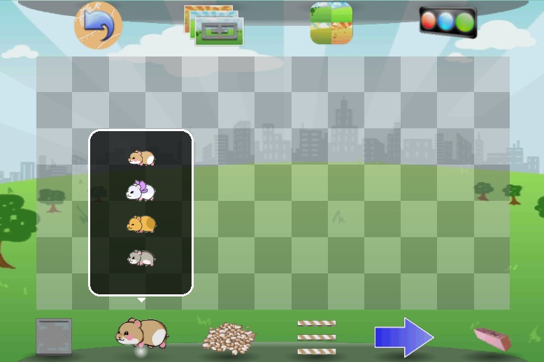
You'll notice some significant differences from the old screenshot. The changes can be summed up in this way: Stop thinking like a PC developer.
- Large icons. Mobile phones are small, and even if you have a tablet, it's just less work to reach for a button.
- No icon text! It helps break international barriers, and your icon should be so intuitive that you don't need text. If it's not intuitive, then tapping on it out of curiosity should not result in drastic undoable playfield-wide changes.
- No black toolbar background! Black may be a neutral color, but it's just "sad" in what it otherwise a cheerfully colored scene. I instead studied the desktop of a typical Mac desktop, and came up with my own discrete background.
- Shadows for the icons to give them depth. They should stand out over the playfield.
- All "operating system" level buttons at the top. Content editing buttons goes on the bottom.
- Popular buttons go in the corners. The back button always goes on the top left. Top right is for testing the simulation. Lower left is "floor," the most common tile. Bottom right is the eraser; because nobody's perfect.
- Change the attributes of what you add to the playfield by tapping on a button twice. That brings up the popover and lets you choose what to add.
I'll do another post once I get to loading and saving. I'll give you a hint: think of your editor app like a photo album.
Check out my homepage and news feeds


And my projects!