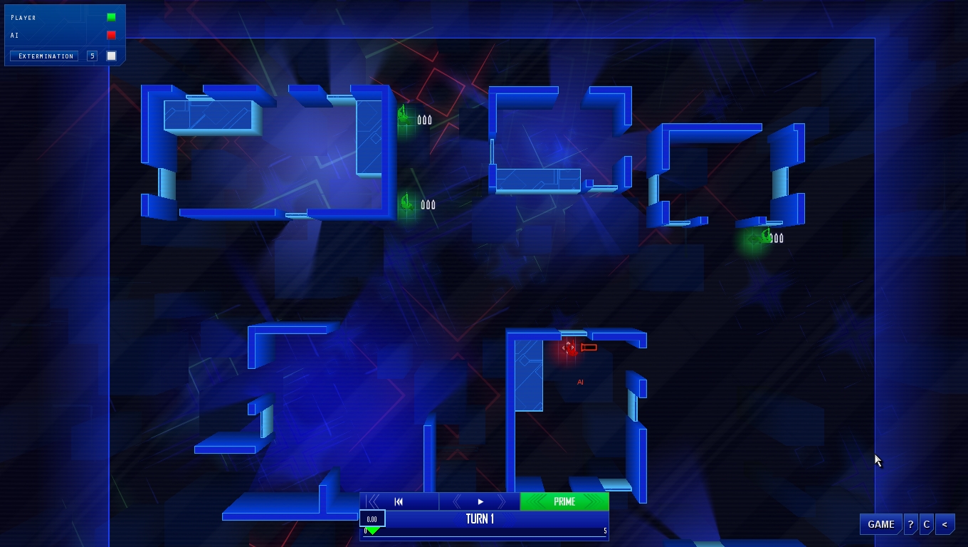
You've patched in to the enemy's security system: get ready to make your plan. Frozen Synapse is the ultimate strategy game: you have full control over your strike team, directing their every movement. At the same time, your opponent is plotting to defeat you. Plan your moves, then hit the "Execute" button: both you and your enemy's turns are executed simultaneously. Bite-size, hardcore strategy with a striking sci-fi aesthetic.
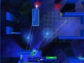
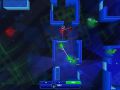
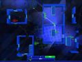
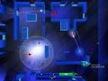
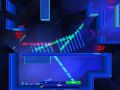
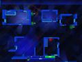
New screenshots!
(view original)

Post a comment
I'm sorry to say it .. But those background effects are so massively distracting that I find them almost gamebreaking =/
You are trying way too hard to make it some kind of artistic background, I really think it's overkill - Try going with the basic perhaps?
This is naturally only my oppinion, but I will most certainly be playing *without* the background effects, if they are this distracting.
You could make an option for players to disable it
i would much rather see some more props, like little blue tables and chairs, than a flash background
Yeah, it looks way too busy.
Wow, that's a very unified reaction - we'll look into changing this if everyone hates it.
I have to say that I don't think it's possible to judge the readability of the game from these screenshots, especially as the brighter background elements fade in and out, so aren't there a lot of the time.
But I hear what people are saying. Is it fair to say that you guys like the sparser, moodier look in general?
I'd like some more info from you guys on this.
The background objects (even the bright ones) don't make the game less readable - I promise - the units and plans are very clear on top. But given that you all think these backgrounds are too busy, I'd like some clarification in what you want to see. Do you want:
1.) Less background objects
2.) Less non-blue background objects
3.) Darker background objects
4.) More transparent background objects
5.) All of the above
Does this come from you guys wanting a more *realistic* look in general, or is it just basically a worry of "I won't be able to read the game state well enough and I'll get distracted by the background"?
I have to say, my immediate reaction to this would be to go in, greatly reduce the frequency of more colourful objects appearing, and increase transparency of all of these BG elements quite a lot.
Just some information for when you're commenting: the BG is currently comprised of...
1.) Boxes
These are just the greyish 3D cuboids you see underneath
2.) Snakes
The lines that chase around on the floor
3.) Slashes
These are the faint slashes that create the "glass floor" effect
4.) Blue spinners
Very faint 2D blue objects that rotate
5.) Other spinners
The brighter stuff that people seem to dislike - these fade in and out
I wanted to add the other spinners to give some dynamism to the background.
Less non-blue please.
This -> "I won't be able to read the game state well enough and I'll get distracted by the background"
It's hard to give the most informed opinion without a video, but I honestly like a minimalist style better.
The background at the moment seems to be without rhyme or reason. The gloss is what bothers me most at the most. If you want a more detailed scene add more props such as items on the desks or something instead of just a crazy background.
With all this in consideration I wouldn't listen very closely to random people on the internet.
Thanks for this - that's actually helpful. I take your point about random people on the internet, but at the same time I think there's useful information to be gained here.
i like it.. good job
Thanks man.