The game you are trying to view has ceased development and consequently been archived. If you are a member of this game, can demonstrate that it is being actively developed and will be able to keep this profile up to date with the latest news, images, videos and downloads, please contact us with all details and we will consider its re-activation.
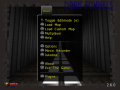
Take control of researcher and assistant, Thomas Flynn, part of a task force to find an alternate energy source. Yet the team's research is being put to another use. Can you find out who is behind the suspicious late-night testings and find out what the real reason is for E.R.I.?


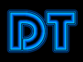
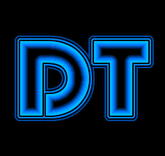
It's been a while since I looked at the logos for DT. I wasn't quite satisfied with them, as they wouldn't show up properly as a 32x32 icon. So I redid it, and wanted your guys' opinion. Any thoughts?
It might be good to remove one of the black "double lines" - they are invisible at medium icon size (32x32)
-or remove both black lines and make the entire center region a different color, orange for example.
I'd move the T a little further away from the D just in case you make more letters, or an entire font. It'll make kerning easier.
Blur the glow along the curves of the D to get rid of the rays present in the glow.
Personally, I'd get rid of the bottom part of the D and mirror the top part to replace it. In 32x32 it's fine, but in 125x125 the P shape is distracting.
Yeah I had my doubts about the P shape as well. Thanks for the feedback!
I'll definitely try it out in orange. Part of the idea was to have a relatively discernible logo and orange would be a good idea.
I can try using a small space between the D and T. Also, I cranked down the amount of lines around it, but I agree it could use more.
Thanks for the feedback!
Seems that there is not much left to comment on..
EXCEPT: Orange? :P
Orange would show up really well, so I think I'll give that a go (once I'm on my true computer :P )