Cogmind now comes equipped with an official tileset!
Originally we were aiming for two tilesets, one symbolic and the other realistic, but despite the promising concepts provided for the symbolic set, the artist unfortunately turned out not quite suitable for the position. With that we are down to a single tileset, though one with which I'm extremely satisfied.
Kacper has done an incredible job on the realistic set, going above and beyond simply following the specifications by coming up with a number of great ideas and suggestions that have improved tile mode's overall visual quality while keeping within our limits. It's been a pleasure working with someone who's as into the game as I am :)
")
Position filled, credits page updated :D
Symbolism vs. Realism
We showed pre-development tileset concepts in a number of different places, and a majority of responses were in support of the more abstract "symbolic" tileset, essentially taking the essence of ASCII and putting it into tileset form.
It's too bad we won't see that tileset come to fruition (at least not for now), though there is some consolation to be found in various other factors for consideration:
- More than one of the prospective artists I consulted with during the hiring process made a valid observation, stating that "some of the symbolic sprites don't clearly represent anything." Ignoring the fact that this is in some ways the very definition of symbolic, it's true that in an unfamiliar fictional world it is sometimes necessary to create unfamiliar new symbols that the player then associates with new objects. In a complex enough world and at small enough sizes, these symbols can begin to seem arbitrary and opaque, making interpreting them somewhat difficult for the same category of player that has trouble with the highly symbolic nature of ASCII in the first place.
- The question as to which tileset concept is superior was directed mostly at audiences already familiar with ASCII and traditional roguelikes. Players at the edge of or outside that circle generally preferred one of the non-symbolic concepts.
- All early feedback was also based on rough concepts created by artists with minimal guidance. Any of the concepts could become much more than their original form, as you'll see below.
- A portion of the players preferring a more efficient symbolic approach to the map can simply use ASCII (as many will). I'm confident that Cogmind is, after all, the most accessible ASCII game ever with a vast array of UI features to aid usability, among them auto-labeling. Objects are also represented using very uncomplicated symbol conventions and a relatively small number of glyphs--common objects use only 9 punctuation marks and 24 letter glyphs (counting upper and lower case as separate glyphs).
Against this background it would seem that the ideal tileset should be as different from ASCII as possible--non-symbolic, detailed, realistic.
For me as the designer, however, this exaggerates a problem I've been dealing with every time I think about Cogmind having a tileset: any pixel art representation runs counter to the intended look and feel of the game. As regular readers know, Cogmind's entire aesthetic and theme embraces the ASCII rather than using it as a makeshift crutch. You are the Cogmind, and that's how you see and experience the world. Many of the map and UI special effects rely heavily on ASCII, and the intro, inter-level animations (still WIP) and ending (WIP) are rendered entirely in ASCII as well.
Sure it's a game, but as part of the design philosophy I've made an effort to avoid anything that overtly gamifies the experience. I didn't even want the game to have a title screen--as it turns out there's still no start menu (nor will there ever be one), but I did finally cave on the title screen part...
I know, the game has both ASCII and tiles mode, so why fret? I'm sure it's a bigger issue to myself than anyone reading this blog, because as players most of you see Cogmind as a game. To me it's art. I have a vision for this piece of art, and feel like I'm sacrificing part of that vision to expand the appeal of the underlying game.
Of course a number of players out there also subscribe to the game-as-art-form mentality, especially in the indie world, and the appreciation of art is always a very personal thing once it's released into the world, anyway. By providing a tileset I suppose I'm simply giving the audience another tool with which to appreciate it, even if it does significantly affect the intended expression.
While in the future this dilemma will always exist whenever I have to decide how to prefer to present Cogmind, I can at least say that after some days playtesting with this new tileset, it's awesome, and certainly doesn't reduce the game component's awesomeness :D
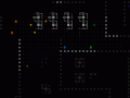
Style
The non-symbolic representation of map objects should have both meaningful detail and a consistent look, and given the limitations this tileset does a wonderful job of both.
")
A sample scene showing the tileset at its smallest (12x12 cells) and largest (24x24 cells).
Kacper has squeezed an amazing amount of detail into a tiny area. Robot compositions highlight their primary features and functionality; item forms reflect their categories and subtypes while remaining distinguishable from one another when necessary. How does he do it?
Before getting into analysis of specific object types further below, the short answer is by focusing on a simple shading scheme. At the small sizes required, softening tiles with excessive shading costs too much space that can otherwise be used to define details (an even more significant limitation without multicolored tiles). By contrast, this tileset uses a mere three shades:

Grayscale ramp from Cogmind's tileset. The detail!
As you'll see with the robots and items, these shades aren't used to create any kind of gradient, instead being assigned as a primary color vs. detail color. The result is extremely sharp sprites that pack a lot information into a small area, and also mesh well with the sharpness of the UI.
One drawback we've discovered to relying on such a simple monochrome color ramp is that while on the perfect hardware the darker two colors are nicely distinct from one another, they appear much closer on lower-quality LCDs, causing sprites to lose some of their internal contrast. Correcting for this on one setup results in less than ideal viewing conditions on another. The current ramp is best displayed on high-contrast monitors with true blacks. Hm, as I write this I've begun imagining some kind of adjustable gamma option that changes the actual ramp itself, allowing the player to set relative brightness of each spritesheet component to whatever looks good on their particular monitor...
Machines
Machines were outside the scope of the original tileset specifications. As mentioned before, I'd be okay with mixing ASCII machines with a minimalist tileset, though Kacper decided to tackle the issue, anyway. The result is quite promising, and does a good job of pixelizing the machines such that they fit well alongside our other map sprites.

A comparison of non-interactive machine ASCII originals vs.
their pixel version created using one-to-one glyph substitution.
The effect works well enough with non-interactive machines (the gray ones, seen above and as described earlier).
However, because interactive machines are often both smaller and use more outward-oriented designs than non-interactive machines (whose designs are larger and inward-oriented), that subcategory doesn't look nearly as good. This is cause for some hesitation in making this change permanent as is. A redesign of the base ASCII glyph arrangement would resolve the issue, but also might result in a less effective ASCII version.
Either way, the spritesheet has already been expanded to allow for an alternate set of ASCII line glyphs specifically for machines (the original set was still needed for UI elements that use the map font). For anyone who would like to use tiles but prefers the basic ASCII machines (not yet sure if that type of hybrid player even exists!), the config file does contain that option.
Terrain
More work went into the terrain than I initially expected. At first I was thinking "okay, we'll just replace the hashes with one of a handful of wall tiles and that's it." It's not quite that simple, though keep in mind we're still not doing linked and oriented walls--they don't really add anything for Cogmind, in which terrain is incredibly simple and the focus is on tactical layout (plus oriented walls can unfairly give you too much information).
The first unplanned change is the removal of ASCII dot/period floors. They are replaced with a faint gray rectangle representing the floor section, and do a good job of reducing visual clutter when the general noise level has already been increased by pixel art.
I hadn't considered the possibility, and even imagined it might be incompatible with the particle effect animations, but Kacper dropped it into the tileset so I figured I may as well try it out. I like it. Tests show that it is not only perfectly compatible the hundreds of existing particle effects, it even enhances some of them.

See the floor tiles highlighted by these UI animations,
the red volley rangefinder and the green launcher AOE scan.
Strewn about on lower levels, and blown off robots and machines to slide across the floor, you'll often see mechanical debris:

A roomful of mechanic debris in the aftermath of my reckless rocket rampage.
Oh look, here comes another to join the scrapheap...
The tileset contains 16 debris tiles in all, one for each of the possible gray background ASCII debris symbols. Both the tiles and ASCII debris punctuation are organized by their pixel density so that areas of debris created by a noise function will look a little more natural.
Tileset debris, with corresponding ASCII for comparison. (A couple of the ASCII
may seem out of density order, because that order is based on a multi-font average.)
The most prominent terrain feature, walls, required the most tweaking of any tile type despite their relative simplicity. Adjusting them also required making the tileset's only deviation from the standard color ramp described earlier.
The issue stems from the tileset coloring system, which draws directly from the colors and levels assigned to the ASCII, all fully saturated colors with a specific brightness level (usually fairly bright).
Wall ASCII universally use the hash ('#') symbol, which naturally has a lower pixel count than any wall tile. Thus using the same color for ASCII and tile walls means the latter will require a lower brightness to avoid overpowering everything else on the map, especially since wall tiles are almost always the most numerous visible object. As explained in the original tileset specifications, this is easily achieved in the spritesheet by using a non-white color. So the original grayscale ramp (which uses pure white as its brightest color) needs to change a bit for that. (For the record, Kacper didn't like the idea of deviating from the ramp, but was a good sport and understood that it had to be done for the greater good =p)
The brightest wall color was therefore lowered from gray 255 to 225, so from 100% brightness to 88.2% brightness. But that doesn't go far enough to produce the best wall effect for the map as a whole (Kacper cringes). Honestly I really like the walls at their original sharpness, but that detail is at the same time distracting when it's repeated across the map. We needed to reduce the contrast on those details to help other objects stand out more. So I progressively raised the brightness of all the darker colors to tighten up the color ramp and make it easier to focus on objects other than walls.
You can see the testing process below, taking the factory walls as an example:
")
Tweaking the grayscale ramp for walls.
If the change seems subtle to you, it's more meaningful when trying to play on a full-sized map with other objects mixed in that you'd prefer to be focusing on. This effect is even more pronounced at larger tile sizes.
As for unique walls, currently there are only six types--wall variety is a good bit less than the number of map types, because some maps simply use recolors (e.g. for the same general area and theme but still different in some way). Not unlike other traditional roguelikes, Cogmind is not about terrain--it's about interacting with the occupants and objects found among that terrain. There are (and will be many more) interesting environments, but they are created primarily from machines. Walls are merely barriers to influence tactical positioning, and tentative ones, at that, since you can always blast your way through them to forge new pathways :D. (Note: Always consider what may be on the other side!)
Compared to walls, doors were left completely unchanged from their original ramp, since we want those to stand out--they even use a bright pure orange to achieve that purpose. So we get to keep their juicy crisp details (Kacper sighs in relief). Same with stairs and branch access points.

Heading through a door to find an exit. You are going to be really happy to see one of these in game,
because finding them is your primary objective, but not always that easy.
Robots
When I first saw Kacper's robot concepts I thought to myself, this could be Cogmind! It wasn't the same feeling I had with the other tileset concepts, which could at best be classified as "okay, this could possibly become Cogmind with some work."
Some viewers might claim the robots are too intricate, with pixel-sized details too small to clearly make out, and this is certainly a valid point (as valid as any opinion about works of art--some of us can make out the details when we stop to inspect them for fun :D).
Most importantly, the tileset is designed such that you don't have to focus on the details to distinguish robots from one another. Each robot highlights its important features to define an overall shape that is usually unique to that robot. This is not especially difficult with Cogmind's robots in particular, because each robot must be unique in its loadout and behavior in order to exist in the first place. There are no "this robot is just like that one but with a different gun" situations.
See the cast of early-game combat robot classes that haven't changed since the 7DRL prototype:

The prototype's combat robots have all grown up and got sprited!
The many new additions have even more unique appearances. And of course the non-combat robots with their especially unique behaviors look completely unlike anything that you fight. Plus they're all green. Regarding other colors, combat robots appear in yellow, orange, or red depending on the threat level of that particular variant; NPCs are pink so they really stand out; and there are also gray and brown robots, but those belong to a category you'll have to discover in the game.
In any case, the robots above are fairly easy to distinguish, even more so when you see them in action because they are both labeled directly on the map and have their own unique weaponry or other behavioral differences--for example Swarmers always travel in big groups, Sentries always work alone, Watchers zip around sending out alerts without shooting anything at all, etc.
Notice I'm not showing the Behemoth here, because it's now four times as large as any of these... nope, not going to mistake that for anything else!
What I like most about these and the many other sprites is that they accurately depict a cold mechanical world of robots, and at such a small size! The sprites even properly reflect a given bot's size and loadout (mostly regarding propulsion and tools/weaponry, though sometimes even extending to additional components).
How do they do it?
First of all, the three-shade limit mentioned before is a very useful restriction here, as fewer shades enables sharper images, which means greater detail.
On top of that the robot sprites use a 3/4 oblique right-facing perspective, which is the best way to increase the variety of recognizable features that can be depicted. Forward-facing sprites leave a lot less room for variation, and work better with multi-hued tiles (which we don't have in Cogmind).
Each visible side uses one primary shade plus a secondary shade for detail (with each side sharing a shade, for a total of 3):
")
The tri-shade Grunt as it appears in the spritesheet, x10.
Of course at the smaller tile sizes the detail only helps if you want to examine individual units up close, when during normal play all you care about is what is where. So at the same time we tried to give each robot a fairly distinct shape to aid at-a-glance recognition, as explained earlier.
Most interestingly, while you might expect that we'd leave some room in between robot tiles to keep them separate on the map, we didn't! Robots are allowed to utilize the full width and height of their cell, so 12x12 in the base tileset, and the understanding is that the perspective shading helps you visually identify where one robot ends and another begins. The extra column and/or row of pixels to use for the robot itself gives more room in which to clearly define a unique shape, with a wider stretch of shaded edge where useful.

Robots' perspective shading aids visual separation on the map. Here I've let myself get surrounded for screenshot purposes--don't try this at home, kids. During combat you can safely ignore anything that's green, and this particular scene simultaneously contains all four types of combat unit seen in the introductory levels of the game: To the north a pair of incoming grunts along with three surveillance bots happening by (quite rare, actually), and to the south a group of Swarmers flying around a Sentry.
Sure you can end up with dense, broad clusters of objects requiring a little extra time to thoroughly parse, but this is an issue even with ASCII. The point is it's not incredibly difficult once you're at least familiar with the individual objects. We've playtested it and are satisfied that it works just fine.
(I'll also add here that if you really are staring down a massive group of enemies in Cogmind, you're not going to care so much about its composition--you'll instead do one of two things: run, or point your guided nuke in that general direction and kiss them goodbye... after which you will then probably run anyway because firing a guided nuke tends to piss everyone else off =p)
That's it for the robots--there are quite a few more cool ones in there, but I'll leave those for you to discover!
Items
Considering how tiny the items are, Kacper did a great job making them individually recognizable while ensuring that related subtypes share certain qualities. Because there is only one category of items that you won't find almost immediately in the game, these I'm mostly free to show you now without spoiling anything big.
")
(Most of) Cogmind's item types in their uncolored spritesheet form, both at 12x12 and 24x24.
- Matter and Data Cores are unique items that you'll be seeing frequently.
- Propulsion: These are quite distinctive, and each does a good job of resembling its type, for the most part also taking the same form in which they're used on the robot sprites.
- Utility: "Devices" is a pretty vague all-encompassing category, so it gets an equally vague sprite. Storage is quite specific by comparison, and appears appropriately box-ish. Processors and hackware are essentially two varieties of the same thing (small chip-like components), so they look similar but not quite the same because the player may or may not be interested in hackware at all. A large portion of protection utilities are armor, hence that riveted piece of metal.
- Power: The sprites here reflect power source progression itself in that these subtypes are simply increasingly powerful versions of the same general thing.
- Weapons: Cannons are larger, and energy vs. ballistic each have their own unifying characteristics. The launcher is a monster of a weapon in a size of its own, giving it that extra HELL YEAH feel when you find one (they are quite nice to have). Special weapons are usually tools and whatnot, so they look a bit more functional. Melee weapons (including the datajack), share a basic form but all remain distinctive.
Unlike robots, item sprites are actually colored differently from their ASCII counterparts. ASCII uses glyphs to represent a category and further distinguishes the subtypes within each category by color. This is more efficient for interpreting ASCII map data, enabling the player to quickly locate all items of a particular category (say, all the '=' are types of propulsion) rather than differentiating everything equally at the subtype level; there are also not enough punctuation marks for 27 item subtypes, but plenty of extra if we do it this way. It's the least confusing way to take advantage of the ASCII representation.
Because item sprites each have their own unique form, we are free to use color however we need to. Thus items are instead colored by their effectiveness rating. Each item is manually rated by how effective it is on a scale from 1~10, and colored appropriately on a sliding color ramp from cyan to purple to crimson. These colors have the advantage of being different from those used for any robots, so you can pretty easily tell the difference between an item and robot sprite even before examining their shapes.
All the treads in the game as they appear on the map, from the lowest-rated Light Treads to ???.
Using multiple colors for these may not be worth the added visual clutter, and to reduce confusion I'd consider changing all items in tiles mode to cyan or purple based on player feedback. (After all, this extra information is not available in ASCII mode, and it's not a problem there.) I'm not particularly bothered by it, but it's something I'd like others to weigh in on once they have their hands on the game.
(Color scheme exceptions: The common matter item is always purple, with a brightness based on how much matter is located there; data cores are always green.)
Besides their color and generally smaller size, item sprites are further differentiated from robots by their facing/shading. Notice that items are left-oriented, another good idea by Kacper.
Summary
Using the tileset certainly changes the feel of the game, which is somewhat hard for me to get over, but I do love it for what it is, think it handles itself well despite the limitations, and after playing with it for a while I must say it's starting to grow on me.

Some (true) playtesting with 12x12 tiles. I just found me a ROCKET LAUNCHER.
Splash damage be damned, you're all going down.
Currently this tileset has only been developed at the base size, 12x12 cells, while other sizes will be extrapolated all the way up to 24x24, the 1440p dimension, without additional detail. Thus the relatively tiny size you see above actually applies only to those of you using a 1366x768 desktop (720p). Greater resolutions will be using larger versions of the tileset and have a slightly low-res appearance, working in the same way as previously shown scaled fonts.
A comparison of the two extremes, showing the same scene from Cogmind as it would appear in 720p vs. 1440p:

Cogmind tileset in 720p. (Screenshot taken in a 4:3 window, so the interface is not set to its true 720p aspect ratio--demonstration for tile size only.) Click for full size.
")
Cogmind tileset in 1440p. (Screenshot taken in a 4:3 window, so the interface is not set to its true 1440p aspect ratio--demonstration for tile size only.) Click for full size.
Regarding even smaller resolutions (e.g. 800x600), the game also supports those, but as this particular tileset can't properly be scaled down they are currently ASCII only.
So you've finally reached the bottom of my 4,000-word Great Wall of Text intro to the tileset... What do you think?

Cant wait for it to come out complete.
"Complete" will be a while yet, but it'll come out a lot sooner than that! It's fun and quite playable as is, so we're working towards alpha release soon. Next post is the release schedule announcement.
woop woop
Oh, my, god, LOVE IT! I have always been impressed with the level of fidelity you were able to provide with only ASCII-symbols, but to be fair, in some situations it made the map a bit unclear and was below the potential of this game.
Glad you love it :D. Yet another future player who won't be using ASCII after seeing the tiles we're working on ;). I'll claim the ASCII is still superior in some ways, at least for those who are used to it, but I admit it's not for everyone, which is what adding this mode is all about! We should have these finished up within the next month or so in time for early access releases.
Critics/Sugestions/Questions that I got while I was reading:
Explosion is a bit boring, because all squares look the same and reminds dog paw a bit : )
Debris can have even more variations by rotating them
ASCII Cogmind looks awesome!!!
For me it's not the walls that stands out too much, but doors.
Do robots turn left/right to the direction they're going/looking?
Watcher and programmer looks very similar.
"During combat you can safely ignore anything that's green" Can they (I forgot what they are) be used as block against melee robots?
"Explosion is a bit boring, because all squares look the same and reminds dog paw a bit : )"
Yeah, that dog paw look is a side effect of the explosion turning the flat ground into dirt and the original ASCII particle effect style which highlights the background. They were always meant to be periods. Not sure if there's anything we can really do about that :/
"Debris can have even more variations by rotating them"
It would be possible, but for the tileset the intent is to generally *avoid* too much variation.
"ASCII Cogmind looks awesome!!!"
Glad you think so :D. That's what it was made to be, so naturally a few aspects will work and look better as ASCII--feel free to play it that way!
"For me it's not the walls that stands out too much, but doors."
Excellent, that's entirely intentional. I don't know about "too much," but they're supposed to really "pop," seeing as they hold very important tactical information.
"Do robots turn left/right to the direction they're going/looking?"
Nope. If you'd like to see my reasoning, I responded to this same suggestion here: Gridsagegames.com
"Watcher and programmer looks very similar."
Hm, you're the first person to mention that. I'd say even if their shapes are similar (which I somewhat disagree with) they're different enough purely because one is quite small. In playtesting there doesn't seem to be any confusion, so I think they're good enough for now.
""During combat you can safely ignore anything that's green" Can they (I forgot what they are) be used as block against melee robots? "
Not melee, no (which only has a range of 1 cell and therefore enemies have to be immediately adjacent to make a melee attack). But you can certainly use them as shields against ranged attacks by hiding behind them. So they still matter in the field of combat, but as potential protection rather than a threat.
Thanks for all the feedback!
This is going to be epic
I so wish epic would come now... "Epic" takes forever to build, who knew? =p