Prove that you are the world's greatest swordsman in Blade Symphony: a slash-em-up featuring a highly detailed and in-depth sword fighting system. Face down other players in skill-based tactical swordplay, in 2vs2 team duels, or participate in sandbox FFA game modes.
Judgement
(view original)

Post a comment
Description
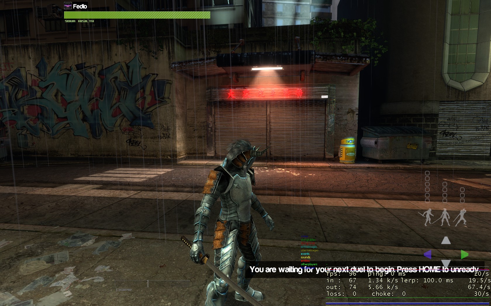
Some color change experiments by Fedio
fix the life bar it looks plain
The Life Bar is meant to give you information not to make you stare at it =P, Idk thats what I think.
the life bar looks fine imo, fits the minimalistic style of the rest of the HUD
I believe he has a point, it needs to be re-done in a style that matches the game. And @ Icedecknight, just because it has a lack of attention doesn't mean it has to have a lack of quality.
I didn't say it had a lack of attention, but I'd prefer them to focus on the game rather then making something better when its suitably fine. Then again I haven't been able to play it for a while so I don't know how it reacts and look in game.
One more thing, maybe you can change it from saying "Your Health" to players name, "Fedio's Health".
I think it'd be cool and fitting if the life bar was some sort of sword covered in blood and the blood represented your health
Why thumb that comment down? It's a good idea. Plus it fits the style of the game pretty well.
Though I'd stay away from physical looking HUDS. THey just seem cheesy to me. Huds like Vanquish and Dead Rising. Hate em.
The HUD is currently WIP. Don't stop discussing it though as we are keen to hear your ideas.
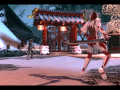
all the small details haven't gone unnoticed, good ****
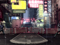
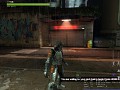
Stock HL2 apartment prop in the background ararrraghhh
Also, the rain particle looks a tad plain.
God.
I believe that entire shot is fine. I'd rather the game mechanics be finished before graphics.
Sick